Two-Tone Nail Palettes: Pairing Warm and Cool Colours
Compare colour temperature, depth and placement when choosing a two-tone manicure with warm and cool shades.
Key takeaways
- Hue: name the two colour families.
- Depth: compare lightness and darkness separately from warmth.
- Finish: decide whether reflection should match or contrast.
- Proportion: choose equal areas or one main colour with an accent.
In this guide
- Key takeaways
- Separate colour family from warmth and depth
- Use complementary colours as one option
- Compare coral and blue with finish in mind
- Use quieter pairings when contrast feels too strong
- Set the proportions before choosing every detail
- Four checks for a two-colour set
- Test the pair with something you actually wear
- Common questions
- Sources and further reading
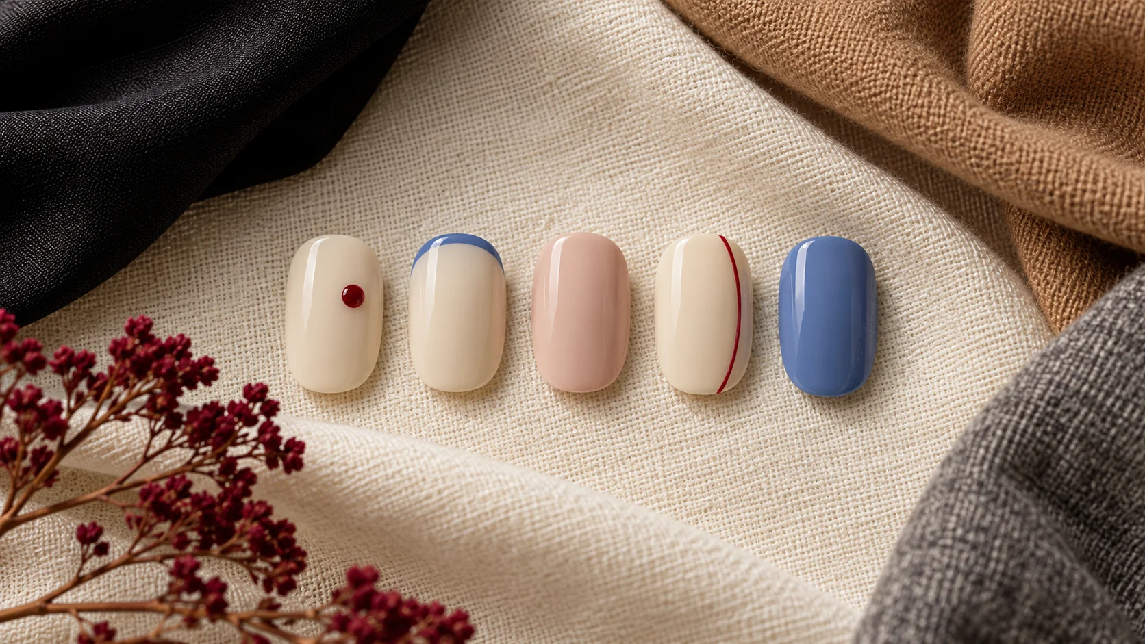
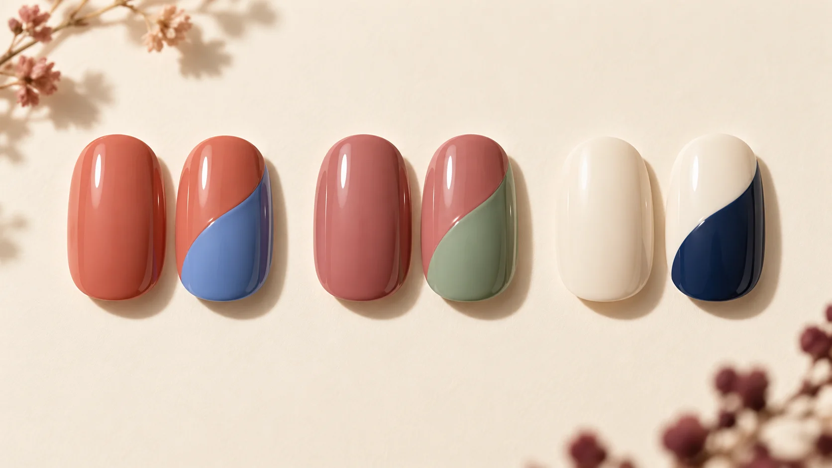
A two-tone manicure can bring together colours that feel warm and cool without turning the hand into a complicated palette. Coral beside blue, softened rose beside sage or cream beside navy each creates a different balance. The result depends on more than the names of the colours: depth, coverage, finish and the amount of space given to each shade all affect the design.
This guide uses basic colour vocabulary to make those choices easier. It does not classify your skin tone, decide which colours you are allowed to wear or provide a recipe for mixing nail products. The pairings are original editorial suggestions, and named products supply manufacturer descriptions rather than independently tested swatches.
Separate colour family from warmth and depth
The National Gallery describes hue as the colour family, tone as lightness or darkness, and temperature as a relative quality. That last distinction matters: a colour can look warmer or cooler in relation to the one beside it. The labels are tools for comparison, not a fixed verdict on every pink, green or blue.
Try describing a pair in ordinary language before deciding on a design. One might be a light softened orange with a medium blue; another could be a pale cream with a very dark navy. These descriptions reveal the depth contrast as well as the warm-cool impression. Two equally vivid colours may feel different from a muted colour beside a bright one.
Keep the actual samples separate while comparing them. Choosing colours for neighbouring areas does not mean mixing their formulas together. Different products and systems can have different requirements, so follow their instructions and discuss the intended combination with the service provider when needed.
Use complementary colours as one option
The National Gallery explains traditional painter’s complementary pairs such as blue and orange, red and green, and yellow and violet. They occupy opposing positions on a colour wheel. This is useful inspiration for contrast, but it does not mean every warm-and-cool pair is complementary.
You can soften the idea by choosing muted versions, reducing the area of one colour or introducing a lighter base through the design. A broad blue field with a small orange tip has a different balance from equal blue and orange halves. The relationship can remain clear even when the colours are not used in equal amounts.
Do not treat the colour wheel as an obligation. Nearby or less contrasting colours may be more appealing for your wardrobe. Use the complementary idea when you want a noticeable difference, then judge the actual samples and placement rather than expecting theory to choose the manicure for you.
Compare coral and blue with finish in mind
Coral and blue provide a useful first comparison because the contrast can be easy to recognise. OPI describes Cajun Shrimp as a coral-orange shade. It is one warm colour reference, not a claim that every coral has the same depth or that the product is required for this pairing.
For the cooler-looking partner, Essie’s Bikini So Teeny is described as cornflower blue with shimmer. The finish is part of the comparison. If you pair a plain colour with shimmer, you are changing reflection as well as hue. Decide whether that extra difference is something you want.
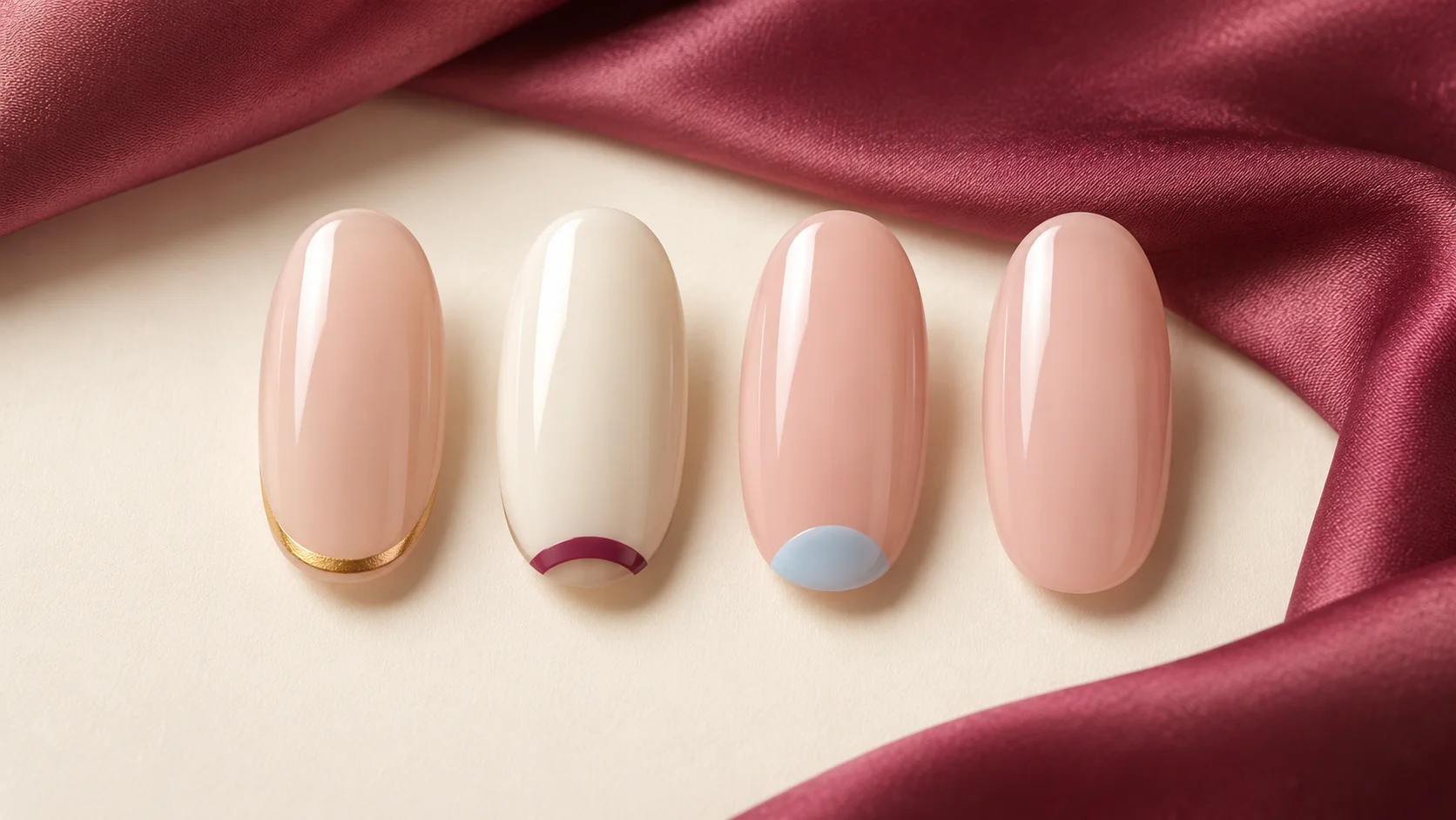
A muted coral base with a fine blue tip can feel quite different from alternating full-colour nails. Try both on a sketch or display sample. The generated article image offers broad colour ideas only and should not be used to predict the exact appearance of these named products.
Use quieter pairings when contrast feels too strong
Dusty rose and sage can provide a softer warm-cool conversation, depending on the actual shades. Here those names describe generic colour directions, not specific products. Compare how greyed, pale or saturated each sample appears. One very bright shade can dominate a partner that seemed similar on a screen.
Cream and navy offer a different kind of comparison: the light-dark contrast may be the most obvious feature. That is useful if you want two colours without a strongly multicoloured appearance. A small navy curve on cream can carry the pair clearly, while a full navy nail beside cream creates a bolder division.
If a pairing feels uneasy, adjust one variable at a time. Try a lighter version of the darker colour, make the brighter shade a smaller accent or use the same finish on both. You do not need to abandon the entire colour family before testing those simpler changes.
| Pairing idea | Main contrast to notice | Possible placement | Adjustment if it feels too strong |
|---|---|---|---|
| Coral and blue | Colour-family and temperature contrast | A full base with a narrow opposite-colour tip | Reduce the accent area or soften one shade |
| Dusty rose and sage | A quieter pink-green relationship | Two gently curved areas | Choose similar depth or a shared finish |
| Cream and navy | Strong light-dark contrast | One fine navy line over cream | Use less navy rather than changing both colours |
| Two full accent colours | The balance across the whole hand | Planned alternating nails | Make one shade dominant and repeat the other less often |
Set the proportions before choosing every detail
Equal halves make the relationship between two colours explicit. A narrow border or tip gives one shade a supporting role. Alternating full nails distributes the colours across the hand instead of within each nail. Choose the structure that best expresses what you like about the pair.
On short nails, a complex division can make both areas too small to read clearly. Simplify to one curve, a tip or an accent nail if needed. A longer shape offers more space, but it does not require additional lines. The amount of detail should follow the design you want, not merely the surface available.
Plan the second hand before application. You can repeat the sequence, mirror it or reverse the dominant colour deliberately. Write down the order if the set alternates colours; a simple note is easier to follow than deciding each finger independently during the appointment.
Test the pair with something you actually wear
Place the samples beside a sleeve, bag or piece of jewellery you use regularly. View them in ordinary light and decide whether the combination still appeals when it is not isolated on a white background. Your preference is the relevant outcome; the exercise is not a pass-or-fail test of colour theory.
Explore our nail-art guides for borders and curved layouts, Polish & Tools for finish differences, and Seasonal & Bridal for occasion palettes. Keep the two-colour idea clear, then adjust the amount of contrast until it feels like a combination you want to wear.
For the related design decisions, compare Skittle Nails: Building a Five-Colour Palette That Feels Cohesive, Colour Block Nails: Simple Layouts for Two or Three Shades and Cherry Red Nails: Finding a Warm, Cool or Deep Red. For the practical details, use Choosing a Nude Nail Polish: Undertones, Coverage and Personal Preference.
Common questions
Are warm and cool colours fixed categories?
They are useful comparative descriptions, but colour temperature can be relative to the shade beside it. Separate that impression from colour family and lightness or darkness. Looking at actual samples together is more informative than assuming every blue, pink or green must behave identically because it shares a broad name.
Are all warm-and-cool pairs complementary?
No. Traditional painter complementary pairs occupy opposing positions on a colour wheel, such as blue and orange or red and green. A warm-and-cool combination may have another relationship. Use complementary contrast as one source of inspiration rather than as a requirement or a guarantee that you will like the result.
Can I make coral and blue look less contrasting?
Try muted versions, reduce the area of one colour or choose a shared finish. A small blue tip over coral has a different balance from equal halves or alternating full nails. Change one variable at a time so you can see which adjustment makes the pair more appealing.
Should both shades have the same finish?
They do not have to, but matching finishes makes colour comparison simpler. Pairing plain gloss with shimmer introduces another difference in reflection. Decide whether that is part of the design you want, and check the actual product descriptions rather than assuming a colour name tells you its finish.
Can I mix the two nail products together?
This article recommends visual pairings, not physical mixing. Keep the products separate and follow the instructions for the actual system, including any compatibility requirements. A colour-wheel relationship does not establish that two formulas can be combined. Ask the service provider when the planned design involves products you do not understand.
What is the easiest two-tone layout to explain?
A main colour with a narrow contrasting tip or one accent nail can be straightforward to describe. Equal halves are another clear option if you want both shades to carry similar emphasis. Specify which colour is dominant, where the division sits and how the design repeats across both hands.
Do short nails need paler two-tone colours?
No. Short nails can carry dark or bright colour if you enjoy the result. The more useful adjustment is often the complexity and scale of the division. One curve, tip or accent may read more clearly than several small areas crowded onto a limited surface.
How do I know whether a pair suits my wardrobe?
Compare the actual samples beside a sleeve, bag or piece of jewellery you use regularly, in ordinary light. Decide whether you enjoy the relationship outside an isolated product photograph. This is a preference exercise rather than a colour-analysis diagnosis, and no shade is required simply because theory suggests a pairing.
Sources and further reading
- National Gallery — Colour glossary — checked 2026-10-23
- National Gallery — Complementary colours — checked 2026-10-23
- OPI — Cajun Shrimp Nail Lacquer — checked 2026-10-23
- Essie UK — Bikini So Teeny — checked 2026-10-23