Colour Block Nails: Simple Layouts for Two or Three Shades
Build a colour-block layout by choosing the boundary, colour proportions and repeated pattern before adding a third shade.
Archive edition: 2026-09-07 · This is an editorial allocation, not the first-publication date.
Key takeaways
- Draw: make five nail outlines close to your preferred shape.
- Divide: repeat one diagonal, vertical or curved boundary.
- Fill: use two colours and compare equal versus unequal areas.
- Edit: add a third-colour accent only where it improves the complete arrangement.
In this guide
- Key takeaways
- Distinguish blocks, gradients and separate coloured nails
- Choose one boundary before choosing three colours
- Set the colour proportions
- Build a two-shade palette with enough separation
- Add a third colour only when it has a role
- Plan the rhythm across both hands
- A five-minute paper plan
- Translate the drawing into a manicure
- Common questions
- Sources and further reading
Colour block nails divide the nail into distinct areas of colour. The boundary might be diagonal, vertical, curved or stepped, but the regions remain recognisable rather than fading into one another. A good starting plan uses two shades, one boundary shape and a clear idea of which colour should occupy most of the nail.
You do not need a complicated pattern to make the design interesting. Changing the proportions can have as much impact as adding another shade. This guide uses original layout exercises and manufacturer examples to help you plan a set, without presenting an untested combination of products as a guaranteed technique.
Distinguish blocks, gradients and separate coloured nails
A block layout keeps a visible division between colours on the same nail. An ombré blends the transition, while a skittle manicure usually assigns different colours to different nails. These ideas can be combined, but saying which structure you want makes a reference much easier to interpret.
Essie’s nail-art guide discusses contrasting stripes separately from a sponge-blended ombré. That distinction is helpful when choosing the boundary: do you want a clean division or a softened transition? A photograph with a blurred edge may not communicate a crisp block even if you like its colours.
Negative space is another optional element. An open-looking gap between colours creates a different layout from two colours that meet. Essie’s Between the Lines design uses two blue shapes with space between them. Use that as a reference for separated regions, rather than assuming all colour blocking must cover the entire nail.
Choose one boundary before choosing three colours
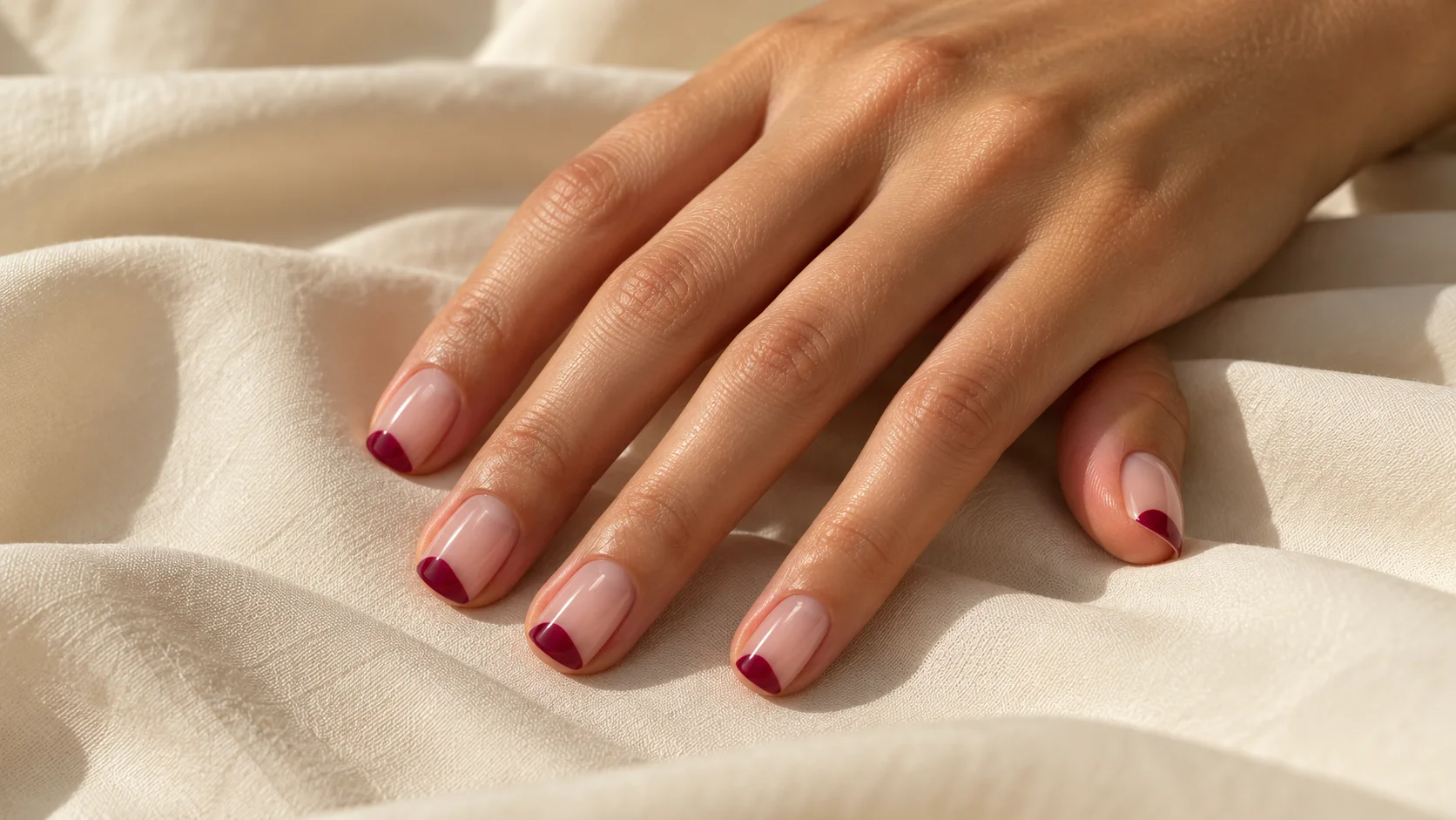
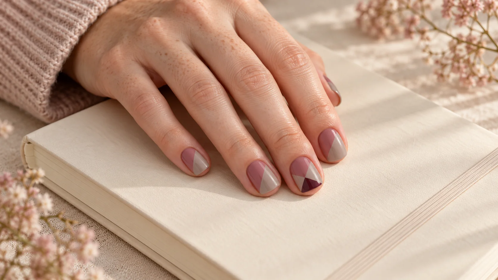
A diagonal split gives each colour a clear area and changes direction across the nail. A vertical split creates two side-by-side regions. A curved division can echo the outline of the tip or form a rounded area near one side. A stepped boundary produces a more angular composition.
Draw each option on the same simple nail outline using just two pencils. This removes the distraction of product finishes and shade names. Look at the drawings from a little distance and choose the boundary you recognise most clearly. You can then adapt it to the actual nail length.
A short nail may suit a simpler division than a long reference containing several intersecting shapes. That is a composition choice, not a rule prohibiting detail. If you want to keep a complex idea, identify its defining feature and simplify the surrounding regions so that feature still has space.
| Layout | Starting arrangement | Main decision |
|---|---|---|
| Diagonal split | Two colours meeting across a slanted line | Equal areas or one dominant colour |
| Vertical split | Two side-by-side colour regions | Central boundary or a narrower side panel |
| Curved block | A rounded area against a larger field | How deep the curve reaches into the nail |
| Small third-colour corner | Two main shades with one compact extra area | Where the accent repeats, if anywhere |
Set the colour proportions
An approximately even split gives the two colours similar visual space. A larger field with a smaller contrasting region makes one colour the background and the other an accent. Neither arrangement needs a precise percentage, but choosing the relationship before the appointment helps avoid an unexpectedly busy result.
Try drawing the same two colours in three versions: roughly equal, mostly the first colour and mostly the second. Keep the boundary shape unchanged. You may discover that the pair works well but only when the darker shade occupies a smaller area. That is a proportion issue rather than a reason to abandon both colours.
Check the thumb separately because its width may make an equal division feel different. Ask for a similar visual balance across the hand rather than a rigid measurement. If one nail uses a different proportion on purpose, mark it in the plan so the variation looks intentional.
Build a two-shade palette with enough separation
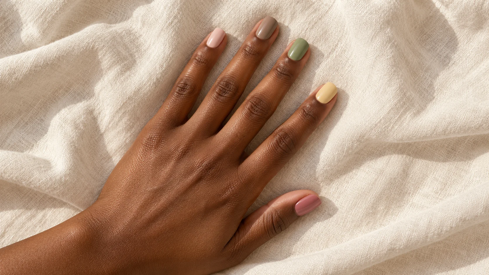
Two colours can differ in depth, hue or both. A pale neutral beside a deep berry gives obvious contrast. Dusty rose beside warm taupe creates a quieter relationship. Compare the actual samples next to each other, because two attractive colours can become difficult to distinguish when their depth and tone are very close.
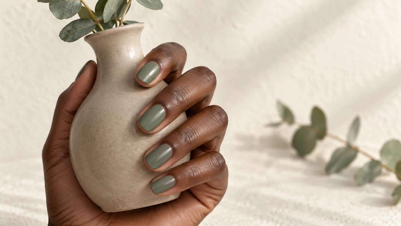
For muted options, the Essie UK Gourmet Grocery collection includes examples described as pale yellow, seafoam and dusty grey-beige. These descriptions show how a subdued palette can still contain distinct colour families. They are reference vocabulary, not a claim that a particular combination has been tested by us.
Keep finish consistent while choosing the first pair. If one sample is highly reflective and the other plain, the finish may affect your judgement as much as the colour. Once you like the relationship, decide whether you want both areas glossy or another clearly specified surface effect.
Add a third colour only when it has a role
A third shade can form a small corner, a narrow separating band or one repeated accent region. Decide what it contributes. If it simply fills a leftover space, the design may be clearer without it. A small dark triangle can create a focal point without requiring every nail to contain three equal regions.
Try adding the third colour to just one or two nails in the paper plan. Then compare it with a version where the same feature appears everywhere. The first arrangement may feel more open; the second may create a stronger repeating pattern. Choose the one that matches your intended level of detail.
If the third colour is metallic or glittery, recognise that you are adding a new finish as well as a new shade. Ask to see that relationship in a finished sample. A thin reflective band may draw more attention than a larger plain-colour block beside it.
Plan the rhythm across both hands
The same boundary can repeat on every nail, alternate direction or appear only on accents. A repeated layout is easiest to describe; alternating direction creates more movement. Keep a record of which way the diagonal runs so the two hands are not left to interpretation.
Mirrored hands and matching hands are different arrangements. In a mirrored plan, the design reverses across the hands. In a matching plan, each corresponding nail uses the same orientation in your drawing. Show both hands from the same viewing direction when explaining which version you mean.
A five-minute paper plan
- Draw: make five nail outlines close to your preferred shape.
- Divide: repeat one diagonal, vertical or curved boundary.
- Fill: use two colours and compare equal versus unequal areas.
- Edit: add a third-colour accent only where it improves the complete arrangement.
Translate the drawing into a manicure
Take the sketch and a small colour shortlist to your technician. Ask which product system and method they would use for the defined edges, what design time is needed and whether the quoted service includes every planned nail. The drawing specifies the result; the provider determines a compatible process.
A concise brief might be: “Short squoval nails, dusty rose and warm taupe divided diagonally, with a small berry corner only on the ring nails.” Confirm the colours on samples, then save the finished arrangement with its product details. If you revise it later, change one element at a time so you know whether the improvement came from the palette, the proportions or the boundary.
For the related design decisions, compare Skittle Nails: Building a Five-Colour Palette That Feels Cohesive, Negative Space Nail Art That Works on Short Nails and Tiny Polka Dot Nails: Spacing, Scale and Colour Ideas. For the practical details, use Nail Polish Brush Shapes: Wide, Rounded and Fine Brushes Compared.
Common questions
What counts as colour block nail art?
In this guide, colour blocking means distinct colour regions on the same nail with a visible boundary. The boundary can be straight, diagonal or curved. A blended ombré and a set with one different colour per nail use different structures, though they can be combined intentionally.
Are two colours enough for a colour-block manicure?
Yes. Two shades let the boundary and proportions do the visual work without adding another decision. Compare an even split with a larger field and smaller accent. You may find that changing the areas makes the design interesting without needing a third shade.
Which layout should I try on short nails?
Start by sketching one clear division, such as a diagonal or a rounded block, on an outline near your actual length. Choose the version whose regions remain readable. A complicated long-nail reference can be simplified while keeping the colour relationship you liked.
How do I stop two muted colours blending together visually?
Compare the samples side by side and check whether they differ enough in depth or colour direction for your preference. Try making one area larger or choosing a slightly lighter or darker partner. Keep the finish consistent while judging the colour relationship.
Where should a third colour go?
Give it a defined role, such as a small corner, narrow band or repeated accent region. Add it to the paper plan before applying it to every nail. If it only fills spare space without improving the arrangement, the two-colour version may be clearer.
Can colour blocks include negative space?
Yes, an open-looking gap can separate the coloured regions instead of letting them meet. Clarify whether that gap should use a clear or sheer base. The size and position of the gap are design choices and should be included in the reference.
Should the two hands mirror one another?
That is a preference to decide in advance. Mirrored layouts reverse across the hands, while another plan may keep corresponding nails oriented the same way in your drawing. Sketch both hands from the same viewing direction so the technician can see which arrangement you mean.
How do I explain a colour-block design at an appointment?
Bring a simple full-hand sketch, the two or three colour choices and a note about finish and coverage. State which colour should dominate and where any accent repeats. Let the technician recommend a compatible process for producing the defined boundaries with their products.
Sources and further reading
- Essie UK — Between the Lines — checked 2026-10-21
- Essie UK — Mastering nail art — checked 2026-10-21
- Essie UK — Gourmet Grocery collection — checked 2026-10-21