Tiny Polka Dot Nails: Spacing, Scale and Colour Ideas
Build a small-dot design with consistent scale, deliberate spacing and a palette that stays readable.
Archive edition: 2026-09-29 · This is an editorial allocation, not the first-publication date.
Key takeaways
- Scale: compare small and slightly larger marks on the same outline.
- Spacing: choose scatter, staggered rows or one dotted line.
- Contrast: test the tiny mark against the finished base.
- Repeat: keep a similar visual density across different nail widths.
In this guide
- Key takeaways
- Choose the size before the pattern
- Pick a spacing pattern you can explain
- Use colour contrast deliberately
- Distinguish crisp dots from deliberately irregular ones
- Make a small practice swatch
- Decide how much of the set should carry dots
- Small dots, clear decisions
- Save a useful reference
- Common questions
- Sources and further reading
Tiny polka dot nails depend more on spacing than on the number of dots. A few separate marks can look deliberate and light; tightly packed marks can become a much denser pattern. Start with a base colour, one dot colour and a layout you can recognise at normal hand distance.
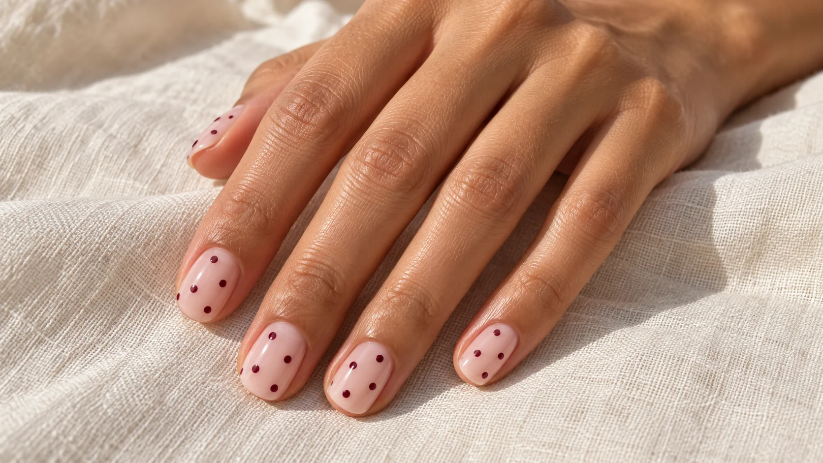
This guide focuses on small, flat painted dots. Raised pearl details, irregular pebbled effects and flowers built from dots are different designs. The featured image is an original illustration of a possible arrangement, not a verified polish swatch or evidence that a specific product will create the same result.
Choose the size before the pattern
Draw a simple nail outline and place three dots inside it. Then draw the same outline with slightly larger dots. Compare how much background remains visible. The larger version may need fewer marks to achieve a similar balance, so do not decide the size and count independently.
A very tiny mark can disappear from a distance, especially if the dot colour is close to the base. If the pattern feels faint, compare a slightly stronger contrast before making every dot larger. Increasing size changes the amount of nail covered, while increasing contrast changes how clearly the existing shape stands out.
For a salon reference, describe the visual scale rather than relying on a tool name. Different tools and product behaviour can produce different marks. A sketch with small dots and generous gaps communicates the intended result even if the technician uses a different method from the one shown in your saved video.
Pick a spacing pattern you can explain
A scattered arrangement can still be planned. Aim for visible gaps and avoid placing every dot at the same edge unless that is the design you want. A staggered arrangement offsets the dots rather than placing them in straight rows. A single row makes the dots read as a line or border.
For a restrained starting point, use a few dots across the centre of the nail and let the outer space remain quiet. If you prefer a regular pattern, sketch the first row and then offset the next one. The aim is an understandable rhythm, not mathematical perfection on every differently sized nail.
Check the thumb separately. Its wider surface may need a different count to maintain a similar impression. A consistent density can connect the set even when one nail has fewer dots. Do not force the same number onto every nail if that makes the narrowest one feel crowded.
| Layout | Appearance | Planning priority |
|---|---|---|
| Sparse scatter | A few separate marks with open space | Keep the dots away from accidental clusters |
| Staggered repeat | A more regular all-over rhythm | Offset neighbouring rows and keep scale similar |
| Single dotted line | A contained border or central detail | Choose its direction and endpoints |
| One dotted accent | A focal nail beside plain colour | Repeat the base or dot colour elsewhere only if useful |
Use colour contrast deliberately
Deep berry dots on a milky pink base offer a clear but related palette. Black dots on a pale neutral make a stronger graphic combination. A pale dot on a darker base reverses that relationship. These are styling suggestions, not rules tied to a particular skin tone or season.
Compare the colours on a finished sample rather than beside each other only in bottles. A tiny area of colour can read differently from a full nail. If you want the dots to remain subtle, reduce their number or choose a closer colour pairing; you do not have to make them almost invisible.
Keep the finish simple while making the first colour decision. A metallic dot adds reflection as well as colour, which can make it harder to judge the spacing from a photograph. Once the layout works, compare a reflective version if that is part of the look you want.
Distinguish crisp dots from deliberately irregular ones
Essie’s nail-art guide describes dotting over a base that has dried and using a light touch. That is a useful ordinary-polish reference for separate marks. It is not a universal instruction for gel products or a guarantee that every formula behaves identically.
Essie’s Pebbled Polka Dots design deliberately uses a different, more irregular effect. If you want neat tiny circles, do not assume that a wet-on-wet pebble tutorial is the same technique. Choose the edge quality you like before selecting an application reference.
Dots can also become components of another motif. Essie’s The Bride Wore Pink design uses different dot sizes within a floral-and-dot arrangement. That example illustrates scale variation, but its flowers are an additional design element rather than a requirement for plain polka dots.
Make a small practice swatch
If you are using ordinary air-drying polish at home, work on a spare swatch before committing to the full manicure. Follow your chosen product’s directions for the base and drying stages. Test a small amount of the dot colour and compare the resulting mark with your intended size.
Practise a short row, lifting the tool away between marks. Observe whether the dots become smaller as the product on the tool runs down. If they do, adjust how consistently you reload rather than trying to correct each finished dot by repeatedly adding more product.
Let the practice sample reach the stage specified by its product directions before finishing it. Dragging a brush over an unsuitable surface can change the shape you were trying to preserve. A sample lets you learn how your particular combination behaves without turning the whole set into a correction exercise.
Decide how much of the set should carry dots
For an all-over set, keep the base, dot colour and approximate scale consistent. Variation in count is reasonable where nail widths differ. Look at the hand as a whole and check whether any single nail appears much denser than the others.
For an accent arrangement, use one or two dotted nails and leave the others plain. You can repeat the dot colour as a solid companion nail, but it will create a much larger dark area than the dots themselves. Compare that version with a set where every plain nail uses the lighter base.
Small dots, clear decisions
- Scale: compare small and slightly larger marks on the same outline.
- Spacing: choose scatter, staggered rows or one dotted line.
- Contrast: test the tiny mark against the finished base.
- Repeat: keep a similar visual density across different nail widths.
Save a useful reference
A concise salon brief could be: “Short oval nails, milky blush base and a sparse arrangement of tiny berry dots, with clear gaps and no raised decorations.” Show the complete-hand plan, not just one close-up. Save a photograph of the final spacing so a repeat appointment can preserve the part you liked.
If the result feels too busy, reduce the count before changing every other element. If it feels too faint, compare the contrast or scale. Changing one decision at a time makes the design easier to refine. More simple layouts are available in the nail art edit.
For the related design decisions, compare Minimal Floral Nail Art: Small Details and Balanced Placement, Negative Space Nail Art That Works on Short Nails and Colour Block Nails: Simple Layouts for Two or Three Shades. For the practical details, use Dotting Tools for Nail Art: Sizes and Simple Design Uses.
Common questions
How many dots should I put on each nail?
There is no fixed count. Choose the dot size and spacing first, then use enough marks to create the pattern you want. Different nail widths may need different counts to maintain a similar visual density. Include the thumb in the plan rather than treating it as an afterthought.
How do I keep tiny dots from looking crowded?
Leave clear gaps and compare the design at normal hand distance. If it feels busy, reduce the number before changing every colour and finish. A few well-separated dots can communicate the pattern without filling every available space on the nail.
Should polka dots be perfectly aligned?
They can be aligned, staggered or deliberately scattered. Choose the arrangement you prefer and show it in a sketch. A scattered design can still have balanced spacing; it does not require every mark to be placed without any consideration of neighbouring dots.
Why do my practice dots change size?
One possible reason is a changing amount of product on the tool as you make successive marks. Test your chosen ordinary polish on a spare swatch and observe the result. Adjust the consistency of loading and touch rather than repeatedly enlarging each finished dot.
Are pebbled dots the same as crisp polka dots?
They are different visual directions. A pebbled effect may deliberately create softer or more irregular marks, while tiny crisp dots are separate defined circles. Choose the edge quality you want before following a product-specific tutorial, especially where a wet-on-wet effect is involved.
Can I use metallic dots on a pink base?
That is a possible colour and finish pairing, but inspect a small sample rather than only a full metallic nail. Reflection can make tiny marks appear different at different angles. Decide whether you like that effect before adding more motifs or varying the dot sizes.
Can I make a dotted accent instead of a full set?
Yes. One or two dotted nails can sit beside plain companion colours. Compare using the pale base on all plain nails with using the darker dot colour on one of them. A solid dark nail contributes much more colour than a few tiny dots.
What makes a useful small-dot salon brief?
Specify the base coverage, dot colour, approximate scale, spacing style and accent positions. State whether you want flat painted marks rather than raised decorations. A complete-hand sketch helps communicate the pattern more clearly than a tightly cropped photograph of a single nail.
Sources and further reading
- Essie UK — Mastering nail art — checked 2026-10-21
- Essie UK — Pebbled Polka Dots — checked 2026-10-21
- Essie UK — The Bride Wore Pink — checked 2026-10-21