Negative Space Nail Art That Works on Short Nails
Plan the space around your nail art, simplify a reference and choose a clear or sheer base deliberately.
Archive edition: 2026-06-04 · This is an editorial allocation, not the first-publication date.
Key takeaways
- Negative space is part of the design, so decide what stays visually open before adding colour.
- A clear or sheer base gives a different result from an opaque neutral base.
- One dot, corner or line can be enough on a short nail.
- Choose a method you can repeat with both hands and practise the layout first.
In this guide
- Key takeaways
- Understand what the empty area contributes
- Choose clear, sheer or opaque deliberately
- Start with one small mark
- Use a curved corner when you want more colour
- Decide whether freehand or a guide suits the design
- Plan the space before the paint
- Adapt a complicated reference without losing its character
- Make a repeatable manicure brief
- Common questions
- Sources and further reading
Negative-space nail art asks you to look at what surrounds a painted detail as carefully as the detail itself. A small berry corner, a single dot or an off-centre curve can feel complete when the remaining nail is deliberately quiet. On short nails, that approach offers a useful way to adapt an elaborate reference without squeezing every element into a smaller area.
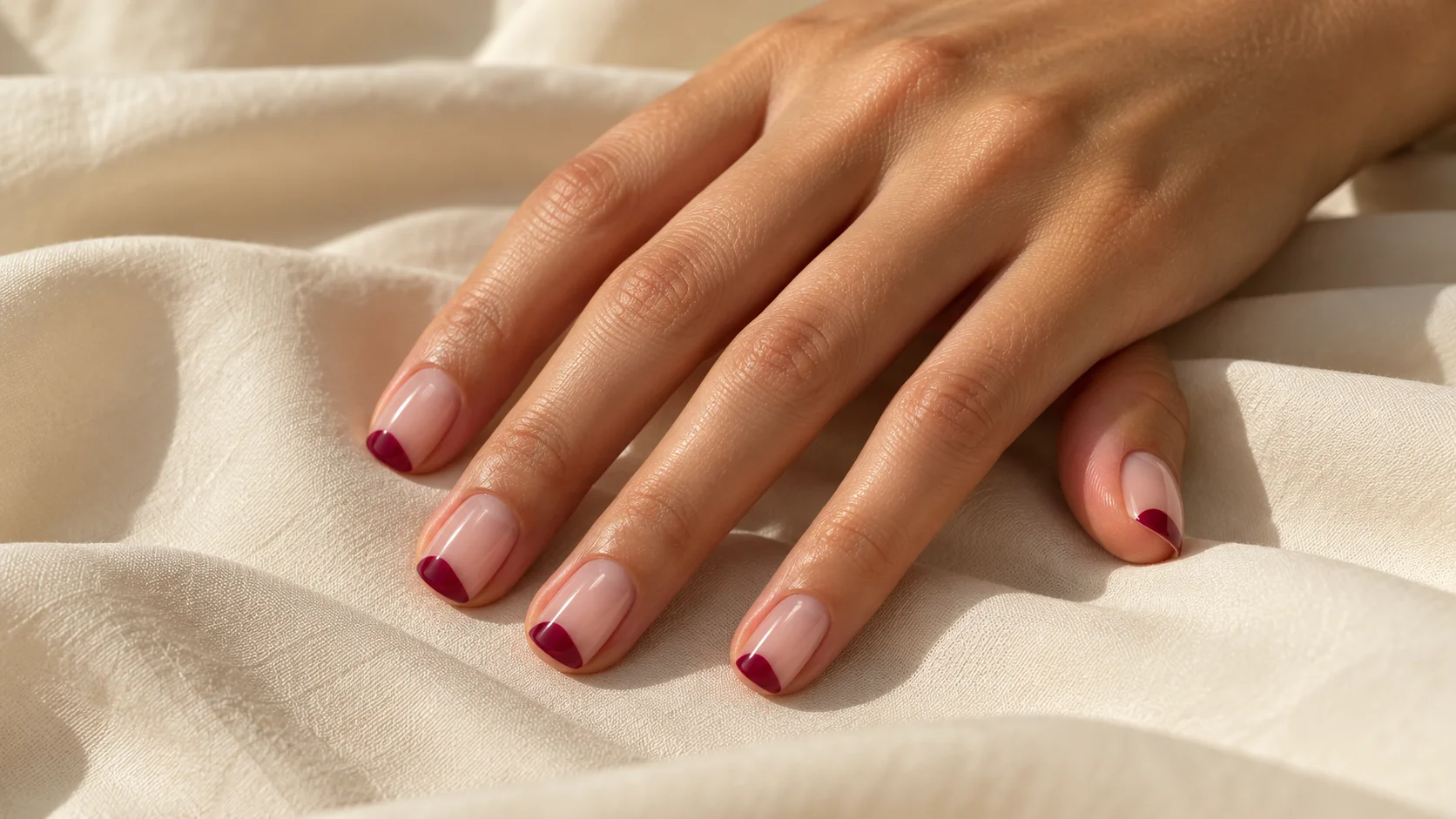
The starting point is a layout, not a list of tools. Decide which part of the nail you want to remain visible, choose a clear or sheer base if that suits your brief, then add the smallest amount of colour needed to express the idea. This guide focuses on design planning and ordinary air-drying polish. It does not provide a gel application or curing procedure. The featured manicure is an AI-generated illustration, not a documented salon result.
Understand what the empty area contributes
In its negative-space nail art challenge, OPI explains that the uncoloured-looking area should receive attention alongside the painted design. That historical example uses a sheer base; it shows that a visually open area does not have to mean completely bare nail. We are referring to the design principle, not inviting entries to the old challenge or reproducing its gel instructions.
For your own design, imagine the coloured area and the space around it as two shapes. A broad coloured stripe leaves narrow strips of space; a small dot leaves a large continuous area. Neither is automatically better, but they create different layouts. If you like the lightness of a reference, preserve its open area before copying the exact motif. Adding more decoration can remove the very feature that appealed to you.
Choose clear, sheer or opaque deliberately
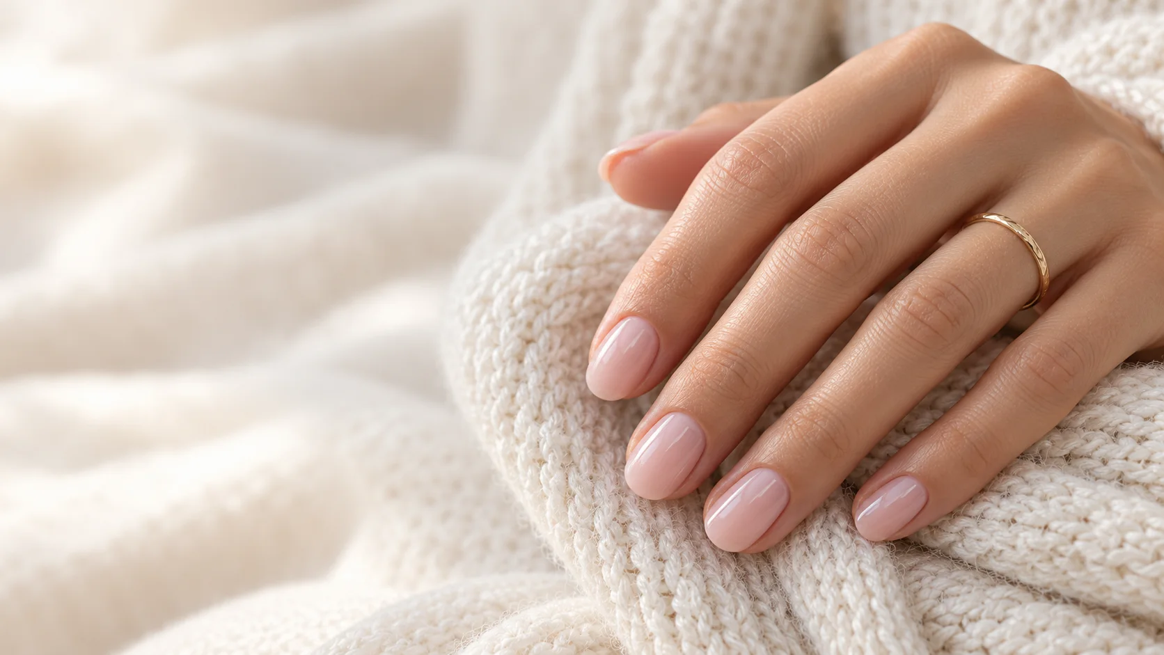
A clear-looking base keeps the natural nail appearance prominent. A sheer pink adds colour while still allowing some of the nail underneath to contribute to the result. An opaque neutral gives you a painted background instead. That last option can still make an attractive minimal manicure, but it may not deliver the transparency you meant when you asked for negative space.
Check product descriptions rather than assuming every pale pink is sheer. For example, Essie’s Inside Scoop page identifies a sheer pink product. This is an example of finish vocabulary, not a tested recommendation or a promise that it will match your natural nail colour. Use the selected product’s own directions for the base, colour and finishing layers; a general design guide cannot establish compatibility between arbitrary products.
| Layout | Area left open | Useful planning question |
|---|---|---|
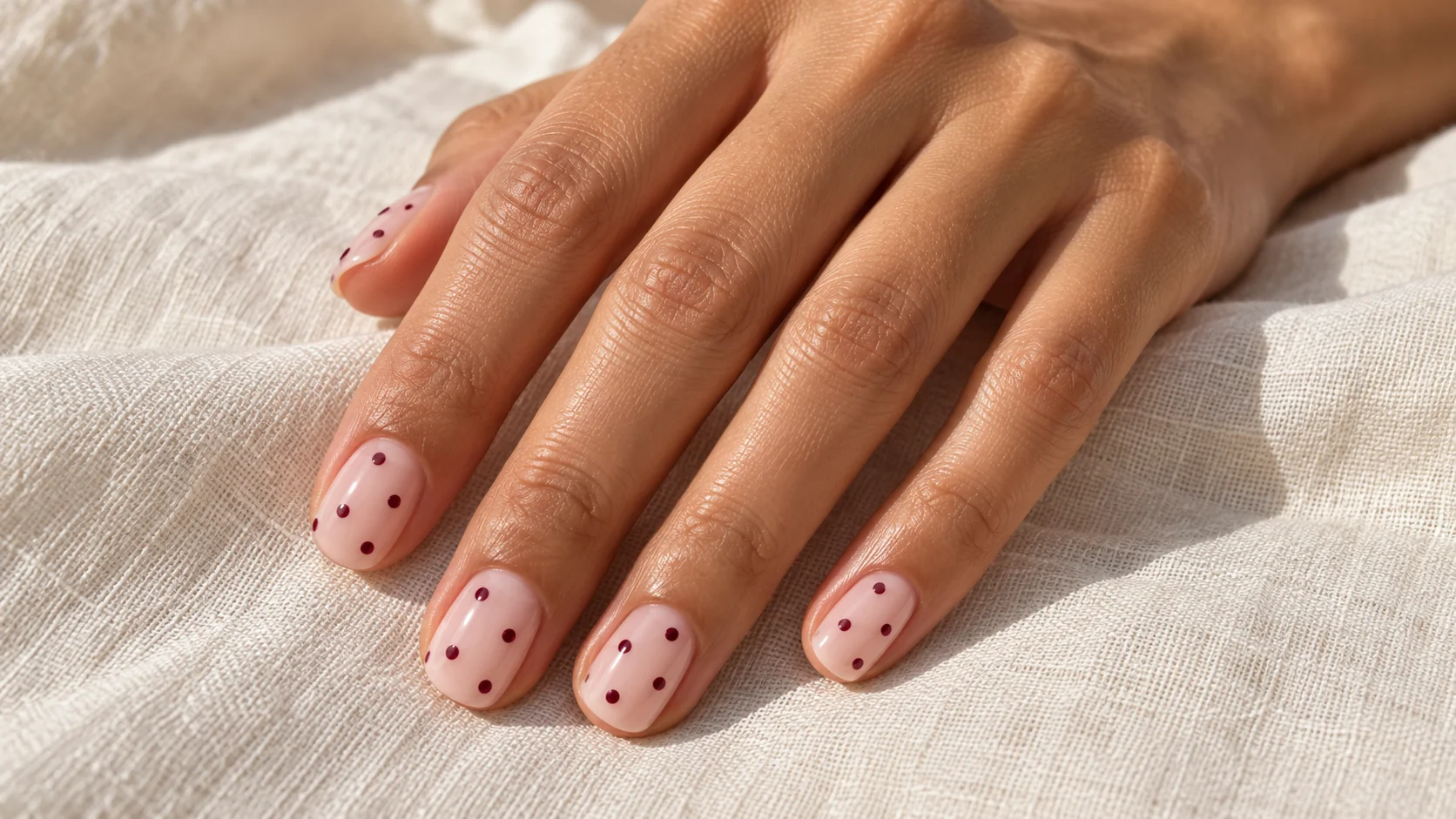
| Single small dot | Almost the whole nail | Can you repeat the placement without needing identical measurements? |
| Curved corner | The centre and opposite side | How large should the coloured corner be? |
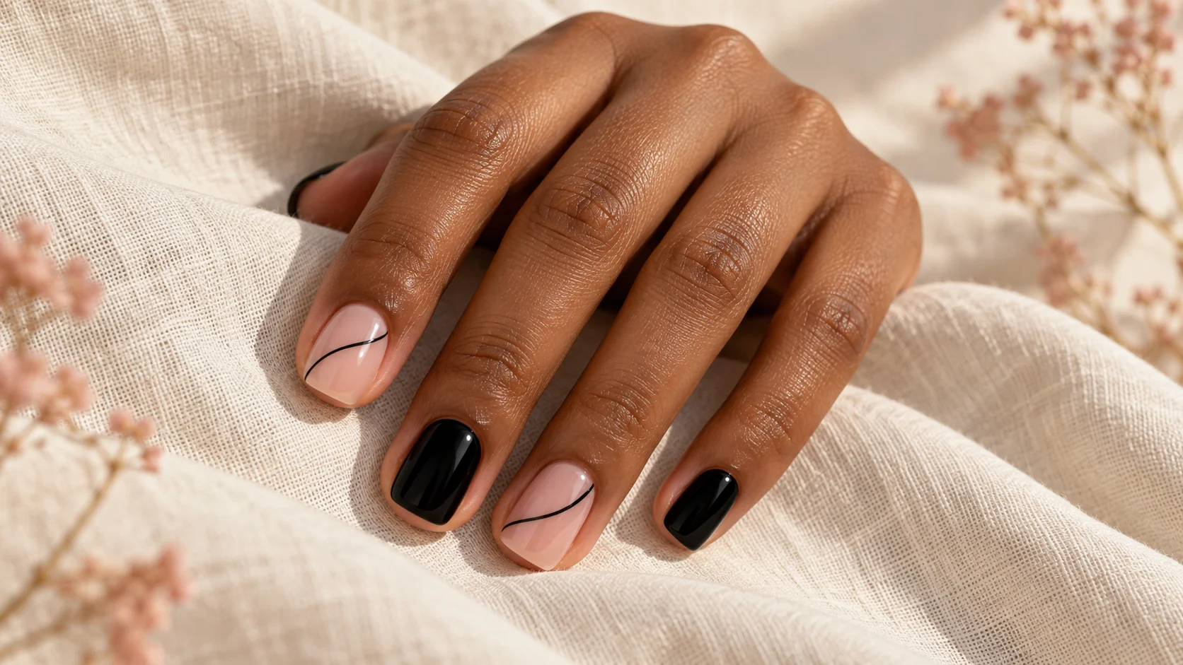
| Off-centre line | Two unequal areas | Is the line clear without becoming a wide stripe? |
| Simple edge accent | Most of the base | Does the accent follow the nail outline or deliberately cross it? |
Start with one small mark
A dot is a useful layout exercise because it makes placement easy to see. Draw several nail outlines on paper and put one dot in a different position on each. Compare a central dot, a lower dot and one near a corner. Choose the version you enjoy at normal viewing distance, then repeat it across five outlines. The point is to choose a visual rhythm before dealing with polish.
For a practice tip, use a tool intended for the product and technique you have chosen, and follow its instructions. Test the size of the mark first. You do not need to keep adding dots to correct a slightly different placement; a single clear detail often gives you a better comparison than several attempts layered together. If your second hand is harder to paint, simplify the design until it is comfortable to repeat.
Use a curved corner when you want more colour
A corner accent lets you introduce a larger patch of colour while leaving much of the nail visible. Decide whether all corners should point in the same direction or whether the two hands should mirror each other. Mark that choice on your paper sketch. Without a plan, a small change of direction can make the set feel busier than you intended.
Keep the coloured patch in proportion to the nail you are working on. A thumb has a different surface from a little finger, so the same physical patch size may not look balanced across both. Use the overall relationship between colour and open space as your guide. If the colour becomes the whole focus, shrink the patch on the next sample instead of adding another decorative border.
Decide whether freehand or a guide suits the design
A relaxed curve may be easier to interpret freehand than a perfectly straight boundary. If your brief depends on a geometric line, a suitable nail-art guide may help you explore that look. OPI’s nail art tricks page includes a link to a tape-based negative-space approach. Its page does not by itself establish one removal time for every tape and polish combination.
Use the instructions supplied with the guide and your chosen polish, then test the combination on a practice tip. Check whether lifting the guide leaves the boundary you wanted before trying a full set. Avoid turning an uncertain experiment into a thick stack of corrective layers. If the process feels fiddly, choose a small dot or a softer curve that does not depend on a perfectly masked edge.
Plan the space before the paint
- Leave. Mark the area you want to remain visually open.
- Place. Add one coloured shape and check its position on all five nail outlines.
- Reduce. Remove any extra detail that makes the open area hard to notice.
Adapt a complicated reference without losing its character
Choose the one feature that makes the reference recognisable to you. It might be a diagonal movement, a tiny fruit motif or a contrast between a dark mark and a transparent-looking base. Keep that feature and remove secondary lines, extra colours or repeated symbols. This is more useful than shrinking every part equally, especially when small details become difficult to distinguish.
For example, a reference with several cherries and leaves could become one small motif on an accent nail, with simpler marks elsewhere. A complex crossing-line design could become one off-centre line. These are original adaptation suggestions, not copies of a particular artist’s composition. If you take a saved artist reference to a salon, credit its creator where known and explain which feature you want to reinterpret.
Make a repeatable manicure brief
Record the base appearance, detail colour, placement and finish. A useful sentence might be: short softly squared nails, translucent pink base, one small berry corner on each nail, glossy surface. Add a simple sketch if the direction of the corners matters. A nail professional can then discuss the products and technique needed for that result without having to infer everything from a filtered close-up.
After a sample, view the whole arrangement with your hand relaxed. If it still feels crowded, remove an element rather than searching for another colour to tie it together. Save the shade names and the layout you liked for next time. You can explore more ways to simplify a manicure in our nail art and trends edit, using the same principle: the design should remain readable at the scale you actually wear.
For the related design decisions, compare Short Nail Designs That Leave Room for Everyday Life, Black Nail Art with Fine Lines, Gloss and Negative Space and Tiny Polka Dot Nails: Spacing, Scale and Colour Ideas. For the practical details, use Dotting Tools for Nail Art: Sizes and Simple Design Uses.
Common questions
Does negative-space nail art mean leaving the nail completely bare?
Not necessarily. The design can use a clear-looking or sheer base while keeping areas visually open around the coloured detail. Explain the transparency you want rather than assuming bare means no products. Follow the selected system’s directions for any base and finishing layers used in the manicure.
What is a simple negative-space design for short nails?
A small dot, a curved corner or one off-centre line is a useful starting point. Sketch the placement before painting and preserve enough open area to notice it. Choose a mark you can repeat comfortably rather than trying to shrink every detail from an elaborate long-nail reference.
Can I use an opaque neutral base?
You can create an attractive minimal design over an opaque neutral, but it will give a different background from a transparent-looking negative-space manicure. Compare both samples if you are unsure. Tell your nail professional whether seeing the natural nail through the base is part of your preference.
Do I need tape to create negative-space nails?
No. Some layouts use guides, while simple dots or relaxed curves can be planned freehand. Choose the method around the shape you want and the tools you can use comfortably. If you use a guide, follow its instructions and test it with the chosen polish on a practice tip.
How much of the nail should stay open?
There is no fixed percentage in this guide. Start by marking the area you want to remain visually quiet, then add a single coloured shape. View the sample at a normal distance; if the open space has disappeared from the overall impression, reduce the coloured area or remove an element.
Why does a simple design look crowded on my shorter nails?
A mark copied at the same physical size occupies more of a smaller nail surface. Several small motifs may also merge visually at ordinary viewing distance. Keep the most important feature of the reference, reduce secondary details and compare the whole layout before adding another colour or border.
Must every nail have an identical design?
No, but decide how the variation should work before painting. You might repeat the same corner direction, mirror the two hands or use one accent nail. A quick five-nail sketch helps distinguish an intentional arrangement from differences that appeared only because the placement was not planned.
Can I use this guide for a gel manicure?
The layout ideas can help explain a desired appearance, but this article does not give gel preparation, product compatibility or curing instructions. Discuss the design with a qualified nail professional using the chosen system. Do not transfer ordinary-polish practice steps or another brand’s curing times into a gel routine.
Sources and further reading
- OPI UK — Negative Space Nail Art challenge — checked 2026-10-21
- OPI UK — Stay at Home Tips: Nail Art Tricks — checked 2026-10-21
- Essie — Inside Scoop — checked 2026-10-21