Cherry Red Nails: Finding a Warm, Cool or Deep Red
Compare the colour direction, depth and finish of red polish, then make a useful sample shortlist.
Archive edition: 2026-06-19 · This is an editorial allocation, not the first-publication date.
Key takeaways
- Cherry red is a starting description, not one standard colour.
- Compare warm or blue-leaning colour direction separately from how light or deep the red appears.
- Finish and coverage can change the impression as much as the shade name.
- Shortlist physical samples using the same lighting and the clothes you actually wear.
In this guide
- Key takeaways
- Separate colour direction from depth
- Use manufacturer names as clues, not colour standards
- Make a shortlist around one real reference
- Compare the samples fairly
- Choose the amount of red you want to wear
- Turn a red reference into a clear brief
- Record the finish as well as the shade
- Bring a specific request to the appointment
- Common questions
- Sources and further reading
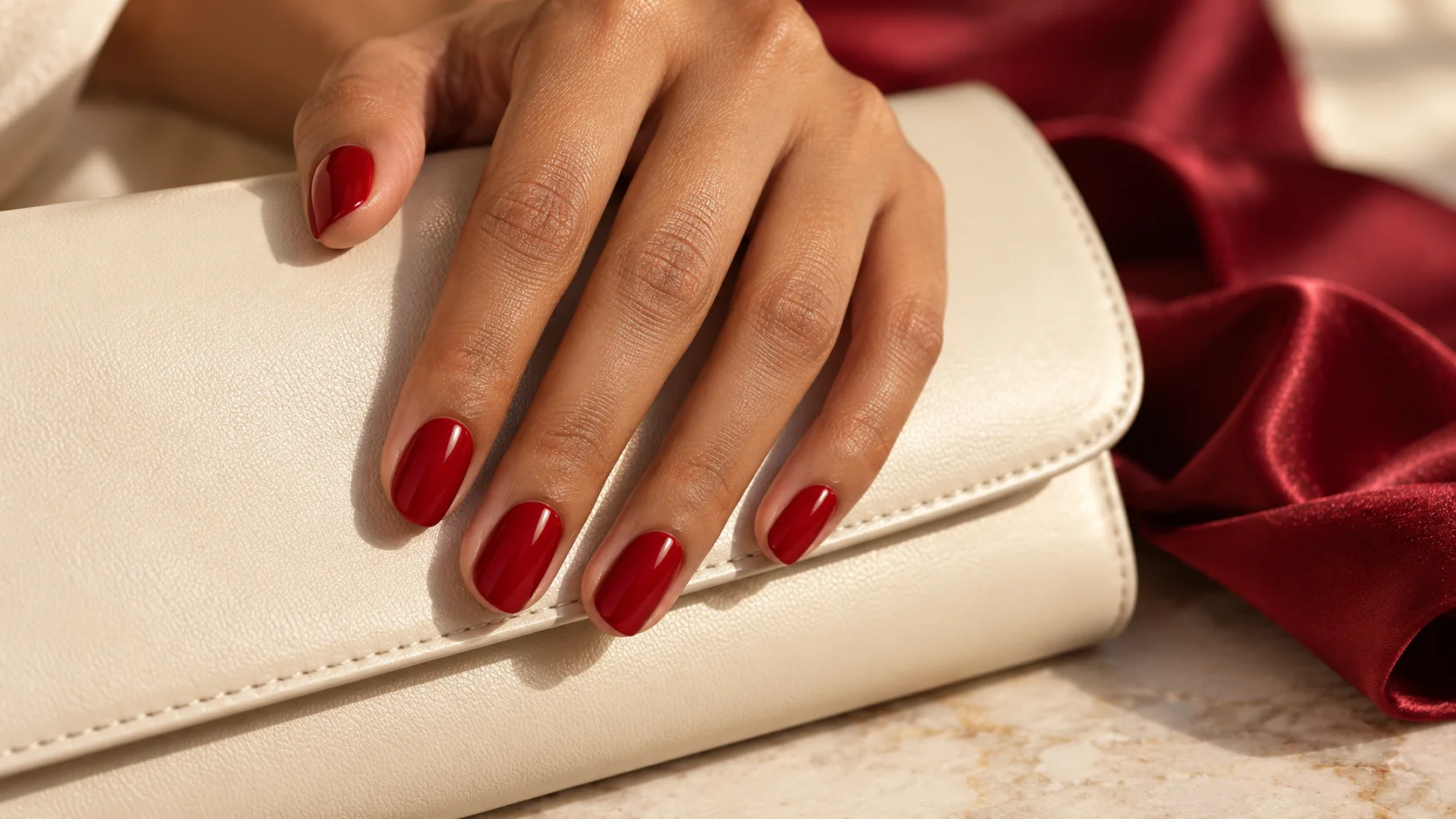
A red manicure can feel bright, restrained, playful or dramatic without changing its basic layout. Much of that difference comes from the particular red and the way it reflects light. A cherry-red photograph may show a vivid plain colour, a translucent tinted finish or a much deeper wine shade. Before looking for an exact bottle, identify which of those qualities makes you want to save the picture.
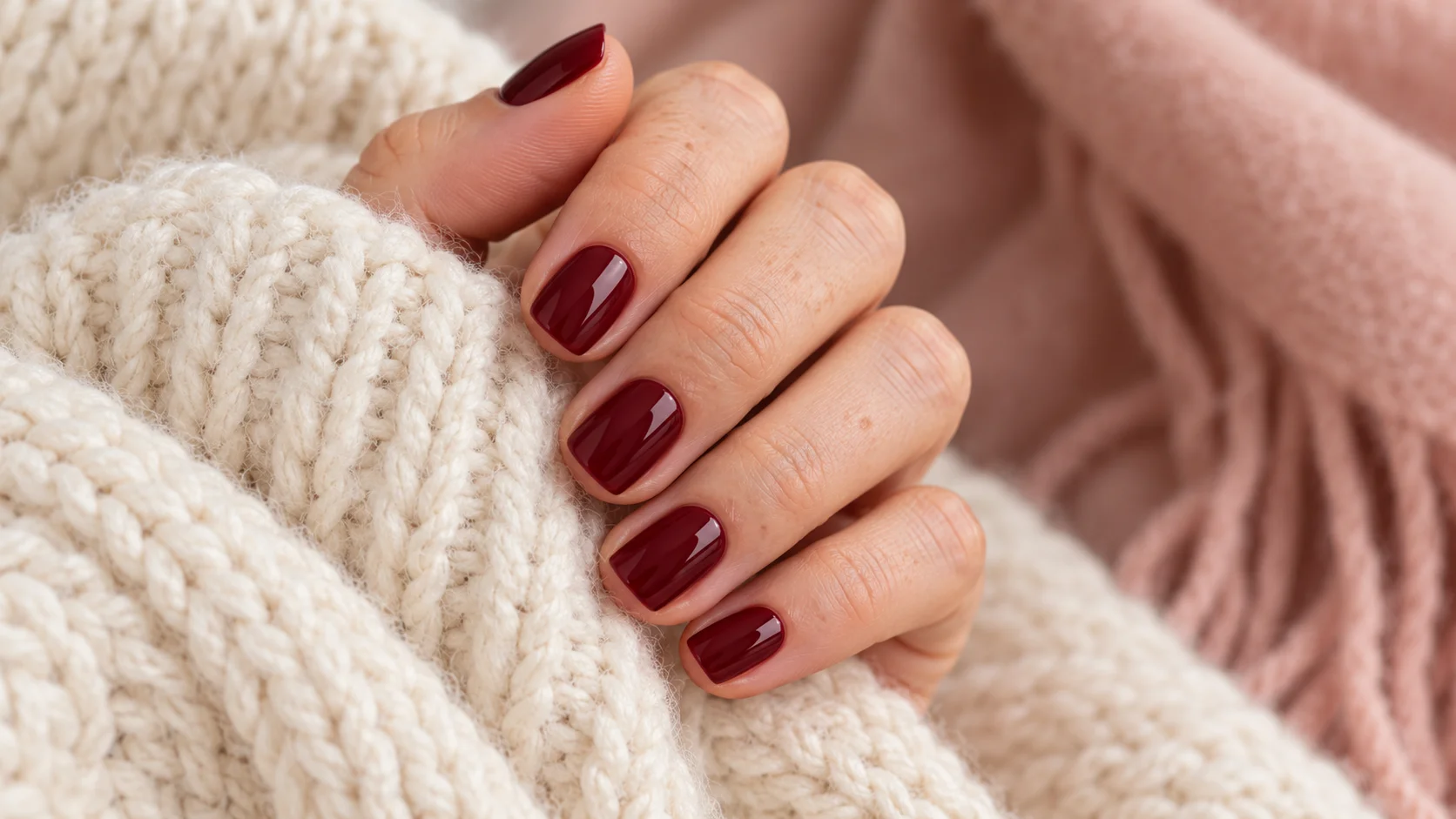
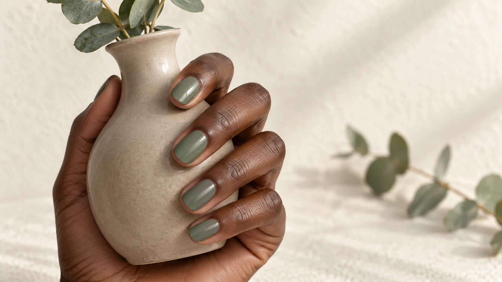
This guide helps turn a broad red reference into a practical colour brief. It offers a comparison method rather than a rule about which skin tones are allowed to wear particular reds. Manufacturer examples illustrate colour descriptions; they are not products we have personally tested. The featured image is an AI-generated manicure illustration, so it cannot establish an exact shade match or a real-world polish result.
Separate colour direction from depth
When comparing two reds, first ask whether one looks more orange, pink, blue or brown beside the other. Then ask a different question: which looks lighter or deeper? Keeping those comparisons separate prevents a common problem with reference boards. You may think you want a cooler red when the feature you actually prefer is simply the darker appearance of the second photograph.
You do not need to assign a precise undertone to every sample. Relative notes are enough: less orange than this one, brighter than that one, or closer to the red in this scarf. Compare two or three candidates together instead of remembering one bottle while looking at another. If you are choosing at a salon, ask to see the available finished samples before deciding which description best fits your preference.
Use manufacturer names as clues, not colour standards
Different brand descriptions show the range within red. Essie calls Seize the Minute a blue-toned red. In its UK Gourmet Grocery collection, Tomato, Tomahto is described as a dusty red with yellow undertones. OPI describes Malaga Wine as a wine-red colour with a crème finish. Those examples provide vocabulary, not a three-product recommendation or a measured comparison.
Two of those references are US product pages, and none establishes that a bottle is currently available from your UK retailer or salon. Check the actual product range and sample you are offered. Similar shade names across ordinary lacquer, gel and other systems should not be treated as proof that the application, formula or finished appearance is identical.
| Decision | What to compare | A useful note |
|---|---|---|
| Colour direction | Orange-leaning, blue-leaning or another visible cast | Less orange than my first sample |
| Depth | Brighter red against a darker wine direction | Still visibly red in my usual indoor light |
| Coverage | Translucent colour against an opaque block | I want the natural nail edge hidden |
| Finish | Plain gloss, shimmer or another specified effect | Glossy surface without a sparkly effect |
Make a shortlist around one real reference
Choose a reference that gives you something concrete to compare: a favourite red accessory, a fabric swatch or a previous manicure whose product name you recorded. If you only have a photograph, use it to explain the direction while allowing for camera and display differences. A heavily filtered close-up should not become a promise that a particular bottle will look exactly the same on you.
Limit the first comparison to three reds with clearly different qualities. For example, try a brighter warm direction, a blue-leaning red and a deeper wine direction. This is a way to identify preferences, not an obligation to buy three polishes. Salon sample sticks, existing bottles and a retailer’s appropriately labelled swatches can help you narrow the field before choosing a full manicure.
Compare the samples fairly
Place the samples beside the same neutral background and look at them in the same light. A red shown beside black fabric can give a different impression from one surrounded by blush silk, so do not change every part of the comparison at once. Hold the samples near your hand if you are choosing for yourself, then check them beside the sleeve or accessory you expect to wear.
Look near a window and under your usual indoor lighting. Notice whether a deeper red still gives you the colour impression you wanted when the light is softer. If you photograph the shortlist, keep the samples together in one frame and avoid adding a colour filter. The image can record your decision, but the physical comparison is the better basis for choosing between closely related reds.
Choose the amount of red you want to wear
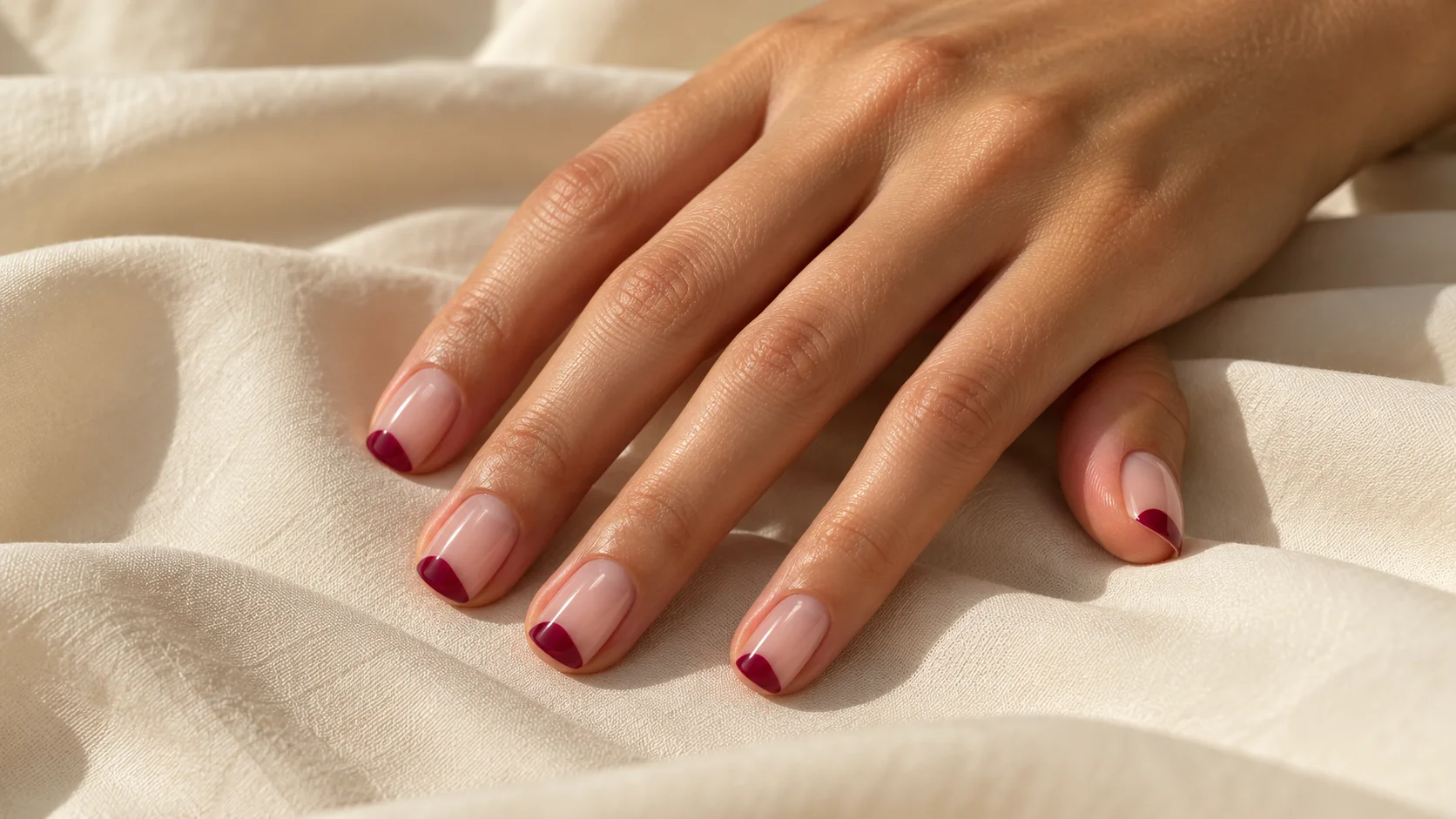
A full red set makes the colour the main feature. If you like a shade but find the overall effect stronger than expected, reduce its area before assuming you need a different red. A small tip, one accent nail or a simple painted detail can keep the colour in the manicure while changing its visual weight. Compare the smaller layout against a full-colour sample.
Keep the base colour in that comparison too. A red detail over sheer pink does not have the same background as the same detail over ivory. For a first experiment, use one red and one base rather than adding a second red, glitter and a border simultaneously. With fewer variables, you can identify whether the issue is the colour, the contrast or the amount of decoration.
Turn a red reference into a clear brief
- Compare direction. Identify which sample looks warmer, cooler or more muted beside the others.
- Set the depth. Choose how bright or deep the red should appear in your normal lighting.
- Choose the layout. Decide between full colour, a tip or a small accent before adding extra effects.
Record the finish as well as the shade
If you make an ordinary-polish practice sample, record the exact range, shade, colour-coat count and finishing product. Follow the manufacturer’s directions for that combination rather than assuming a red polish needs the same routine as another bottle. A sample marked only red is difficult to reproduce later, particularly if you own several related colours or change the top coat.
Do not keep adding layers just to make a sheer red resemble an opaque reference. Decide whether transparency is part of the product and whether it suits the result you want. Similarly, a glossy photograph does not tell you how long the manicure will last. Appearance, application and wear are different questions, and this colour-planning exercise only addresses the first two at a general level.
Bring a specific request to the appointment
A useful brief might be: short oval nails, an opaque red that looks less orange than this sample, plain gloss and no extra artwork. If you want a deeper red, add that it should remain recognisably red in your usual indoor light. A nail professional can then show the nearest available options and explain any limits of the chosen system.
Keep a note of the final shade and what you liked about it. If the next version needs changing, alter one part of the brief rather than starting from another vague cherry-red search. You can explore tip placement and simpler accents in our nail art and trends edit. The aim is a repeatable colour decision that fits your own taste, not a supposedly universal perfect red.
For the related design decisions, compare Burgundy Nails: Finish and Shape Ideas for a Deep Red Manicure, Skittle Nails: Building a Five-Colour Palette That Feels Cohesive and Colour Block Nails: Simple Layouts for Two or Three Shades. For the practical details, use Building a Small Nail Polish Collection with Versatile Colours.
Common questions
Is cherry red a fixed nail polish colour?
No single fixed shade is established by that description. Use it as a starting point, then compare whether you want a brighter, warmer, blue-leaning or deeper red. A physical sample and a note about the finish communicate more clearly than the colour name alone.
How do I compare a warm red with a cool red?
Place the samples together under the same light and describe the difference you see, such as more orange or more blue. Keep depth separate from that comparison. You may prefer a darker sample without necessarily preferring its colour direction, so change one decision at a time.
Must red polish match my skin undertone?
There is no compulsory matching rule in this guide. Compare the actual samples near your hand and with the clothes you want to wear, then choose the contrast you enjoy. Styling preferences should help you make a decision rather than exclude colours based on your natural skin tone.
Can a deeper red still look bright in a photograph?
A photograph can change the impression through lighting, surroundings, processing and display settings. Use it to explain the general direction, then check a physical sample under your usual lighting. Record what you like in words instead of treating the picture as an exact colour standard.
What if a full red manicure feels too strong?
Try the same colour as a small tip, one accent nail or a simple detail. Reducing its area changes the overall balance without requiring a different shade. Compare that layout with the intended base colour before adding another red, shimmer or extra decorative border.
Does a glossy red finish mean the colour is opaque?
No. Surface reflection and colour coverage are separate qualities. A sheer red can look glossy while still showing the nail underneath, and an opaque red can also have a reflective finish. Specify both the coverage and the surface appearance when choosing a sample or discussing a salon brief.
How can I repeat a red manicure I liked?
Keep the exact brand, range, shade, colour-coat count and finishing product alongside an unfiltered reference photo. A note such as red gloss is too broad to identify the result later. If you want a change next time, adjust one specific part of that recorded brief.
Are the named red polishes ranked recommendations?
No. The examples illustrate manufacturer colour descriptions and have not been compared in a personal application or wear test. They do not establish UK stock or an exact match to the generated image. Choose from the actual products and finished samples available to you.
Sources and further reading
- Essie — Seize the Minute — checked 2026-10-21
- Essie UK — Gourmet Grocery collection — checked 2026-10-21
- OPI — Malaga Wine Nail Lacquer — checked 2026-10-21