Choosing a Nude Nail Polish: Undertones, Coverage and Personal Preference
Compare colour depth, tint and coverage to choose a neutral manicure you enjoy, without treating one shade as everyone’s nude.
Archive edition: 2026-06-16 · This is an editorial allocation, not the first-publication date.
Key takeaways
- Decide whether you want a match, tint or contrast.
- Compare depth and colour direction separately.
- Choose the amount of natural nail visibility.
- View labelled samples in similar light.
- Confirm the product system and record your preference.
In this guide
- Key takeaways
- Define the relationship you want between nail and hand
- Separate depth from colour direction
- Use official descriptions to build a shortlist
- Keep manufacturer wording separate from a personal match
- Decide how much transparency you want
- Compare the colour near your hand in consistent light
- Use clothing and jewellery as optional reference points
- Read the formula and finish before purchasing
- Keep a useful record of what you prefer
- Common questions
- Sources and further reading
Nude nail polish is a broad shopping label, not one colour that matches every hand. You might want a shade close to your skin, a tint close to your natural nail or simply a quiet neutral that works with your wardrobe. Start by deciding which of those effects you mean.
Then compare colour depth, tint and coverage separately. This guide offers a practical way to make that choice without assigning a compulsory shade to a skin tone or claiming that a photograph can diagnose your undertone.
Define the relationship you want between nail and hand
A close colour match creates a different visual effect from a deliberately lighter or darker manicure. Neither is the correct definition for everyone. You can enjoy a beige, rose, taupe or brown polish without requiring it to disappear against your skin.
Try describing your aim in plain language: “I want a soft pink tint”, “I want a neutral with visible contrast”, or “I want something close to my skin’s depth”. That brief is more useful than asking for the single best nude.
Also consider whether your natural nail should remain visible. A sheer tint and a solid neutral colour may both be sold under the nude label while giving very different results. Coverage belongs in the brief from the beginning.
Separate depth from colour direction
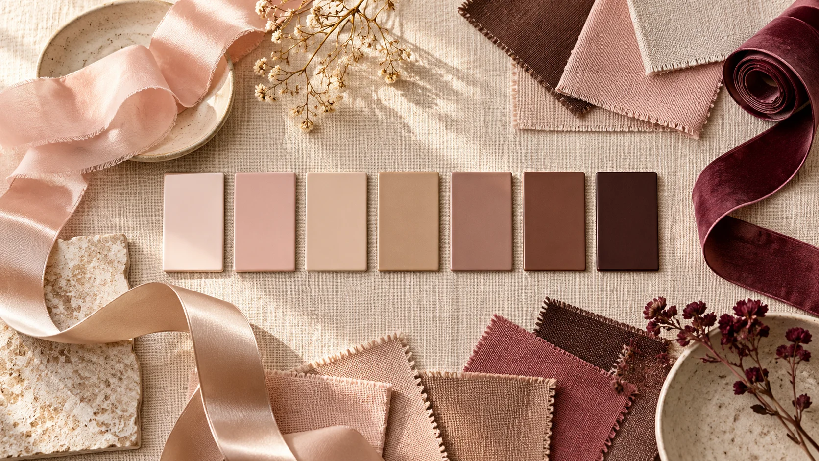
Depth describes how light or dark the colour appears. Colour direction describes the pink, beige, yellow, grey, taupe or brown character you notice. Two polishes can be similar in depth while looking quite different beside the same hand.
When comparing candidates, change one question at a time. First ask whether you prefer the lighter or deeper option. Then compare the tints within the depth you like. This makes a large neutral display easier to navigate without turning the choice into a rigid undertone test.
You do not need to classify yourself permanently as warm, cool or neutral before choosing nail colour. Those words can help describe a product, but your preference can change with the outfit, finish and contrast you want.
Use official descriptions to build a shortlist
OPI describes Bubble Bath Nail Lacquer as a sheer light pink. That gives you a pink-led, translucent candidate rather than a promise of a skin match.
Essie’s Sand and Sea colour example describes Sand Tropez as a soft sandy beige. That is a different colour family to consider when your brief calls for beige rather than pink.
OPI’s You Don’t Know Jacques Nail Lacquer description places it in a darker, warm taupe direction with a crème finish. These examples illustrate variety within neutral shopping; they are not tested recommendations or a complete range of shades for all skin depths.
Keep manufacturer wording separate from a personal match
A brand’s description can identify the intended colour family, but it cannot tell you exactly how you will perceive the polish beside your own hand. We have not measured these products or photographed controlled swatches across different wearers.
Do not assume that a product called nude has been designed to match your skin, or that a shade described as universally flattering must be your preference. Treat broad marketing language as a reason to inspect the colour, not as a verdict on the choice.
Likewise, a model photograph is one visual example with its own lighting and application. It is useful inspiration, but it does not establish the result of every bottle, number of coats or manicure routine.
| Decision | Question to ask yourself | Useful comparison |
|---|---|---|
| Depth | Do I want a lighter, similar-depth or darker colour? | Two labelled samples viewed together |
| Tint | Do I prefer pink, beige, taupe or another direction? | Similar depths with different colour families |
| Coverage | Should the natural nail remain visible? | A sheer product versus a stated full-coverage option |
| Finish | Do I want gloss, a soft effect or another supported finish? | The complete product routine and finish description |
Decide how much transparency you want
A sheer polish lets the underlying nail contribute to the overall appearance. A more opaque product places greater emphasis on the colour layer itself. That difference can matter as much as whether the bottle is labelled beige or pink.
If you want to see the natural free edge, say so when asking for a sample or salon recommendation. If you want it concealed, ask about the stated coverage category rather than relying on the general word natural.
Do not assume that every sheer neutral will become a solid colour after an arbitrary number of extra coats. Follow the product’s directions and choose a different coverage brief if necessary. This guide does not provide a universal opacity recipe.
Compare the colour near your hand in consistent light
Where labelled samples are available, view them together in the same lighting. A warm room lamp and daylight can create different impressions, so avoid comparing one candidate from a shop display with another remembered only from a photograph.
Look at the overall effect beside your fingers rather than judging the bottle in isolation. You may prefer a slight contrast even when a closer match is available. That is a styling decision, not evidence that your undertone has been identified incorrectly.
If you photograph a sample for later, save its name and range as well. Camera processing and screen settings can alter the impression, so treat the image as a reminder rather than a calibrated colour record.
Use clothing and jewellery as optional reference points
If the manicure is for an occasion, compare your shortlist with the outfit you intend to wear. A neutral can repeat a colour in a fabric or provide a quiet contrast. You do not need to match every accessory exactly.
Jewellery can also help you see which overall combination you enjoy, but it is not a diagnostic tool that dictates your nail colour. Wearing silver does not prohibit a warm-looking beige, and wearing gold does not require one.
For everyday wear, think about whether you want the manicure to blend with many outfits or stand out as a consistent accent. A deeper neutral can be a deliberate statement just as a pale sheer can be understated.
Read the formula and finish before purchasing
The same colour family can appear in ordinary lacquer, gel-like lacquer, lamp-cured gel or a press-on design. Keep the product system in the decision so that the application and removal routine matches what you want.
A beautiful sample from a salon’s gel collection is not automatically evidence of the finish from a similarly named lacquer. Ask which exact range produced the sample, and confirm the base and top layers if those are relevant.
Check the actual listing and packaging in your market rather than assuming every source example is currently stocked locally. The examples here explain colour vocabulary; they are not a live shopping basket or a claim about price and availability.
Keep a useful record of what you prefer
After choosing a shade, note the exact product and the effect you liked: a pink tint, a similar depth to your skin, a taupe contrast or the amount of nail visibility. That helps the next choice more than recording only “good nude”.
If you dislike the result, identify which part differs from your brief. Was it too light, too pink, too opaque or simply a finish you did not enjoy? A specific observation makes the next comparison easier without judging your hand against an idealised shade rule.
Choose your version of neutral
- Decide whether you want a match, tint or contrast.
- Compare depth and colour direction separately.
- Choose the amount of natural nail visibility.
- View labelled samples in similar light.
- Confirm the product system and record your preference.
Explore more colour choices in the Polish & Tools section. A neutral manicure can be personal without needing a universal shade assignment or an exact match to anyone else’s photograph.
To compare the connected product and routine choices, read OPI Bubble Bath vs Funny Bunny: Colour, Coverage and Finish, Essie Ballet Slippers vs Mademoiselle: Comparing Sheer Pink Shades and Sheer White vs Opaque White Polish: Finding the Finish You Want. For the related care or design question, see Mocha Nails: Choosing Chocolate, Taupe and Coffee Tones.
Common questions
Is nude nail polish one specific colour?
No. The shopping label can include pink, beige, taupe, brown and other neutral directions. Decide whether you want a close match, a sheer tint or deliberate contrast. That personal brief is more useful than expecting one shade to function as everyone’s nude.
Do I need to know my skin undertone first?
You do not need a permanent undertone classification to choose a polish you enjoy. Compare colour depth, tint and coverage directly, preferably with labelled samples. Warm and cool can describe impressions, but they should not become rules that prevent you choosing a combination you prefer.
Should my polish match my skin exactly?
Only if that is the effect you want. A lighter, darker or differently tinted neutral can be an intentional style choice. Decide how much contrast you enjoy and consider whether you want the natural nail to remain visible before judging a product against an exact-match expectation.
What is the difference between depth and undertone?
For this comparison, depth means how light or dark the colour appears, while colour direction means the pink, beige, grey, taupe or other tint you notice. Compare those questions separately. Two products can have similar depth yet create different impressions beside the same hand.
Can a sheer nude hide the natural nail completely?
Do not assume that a product described as sheer will provide solid coverage at an arbitrary coat count. Follow its directions and decide whether transparency belongs in your design. If concealment is essential, compare products expressly described for fuller coverage rather than building thick layers.
Are the named shades tested recommendations?
No. They are examples of manufacturer colour descriptions used to explain different neutral directions. We have not measured their colours or tested them across wearers. Check the actual product, regional availability and a real labelled sample where possible before making your own choice.
Can jewellery tell me which nude I must wear?
Jewellery can be part of a styling comparison, but it does not dictate a compulsory shade or diagnose your undertone. Look at the overall combination if that matters to you. You can choose contrast or repetition without following a rule based only on gold or silver.
What should I record after trying a neutral shade?
Save the exact range and colour, then describe what you liked or would change: depth, pinkness, beige direction, coverage or finish. A specific note helps the next purchase more than a general good-or-bad judgement, and avoids treating one result as a universal rule about your skin.
Sources and further reading
- OPI UK — Bubble Bath Nail Lacquer — checked 2026-10-22
- Essie — Sand and Sea colour example — checked 2026-10-22
- OPI — You Don’t Know Jacques Nail Lacquer — checked 2026-10-22