Burgundy Nails: Finish and Shape Ideas for a Deep Red Manicure
Choose the depth, coverage and outline of a burgundy manicure, from a short solid set to restrained deep-red accents.
Archive edition: 2026-09-22 · This is an editorial allocation, not the first-publication date.
Key takeaways
- Depth: choose visibly wine red or a darker near-black direction.
- Coverage: confirm sheer or opaque on a finished sample.
- Outline: agree the length, shape and corners.
- Finish: distinguish plain gloss, matte and reflective effects.
In this guide
- Key takeaways
- Choose how deep the red should be
- Separate red direction from darkness
- Decide on coverage before judging the final depth
- Choose the outline you want to wear
- Compare glossy, matte and reflective finishes
- Use less colour when you want a smaller statement
- Four checks for a deep-red manicure
- Record the details that make it yours
- Common questions
- Sources and further reading
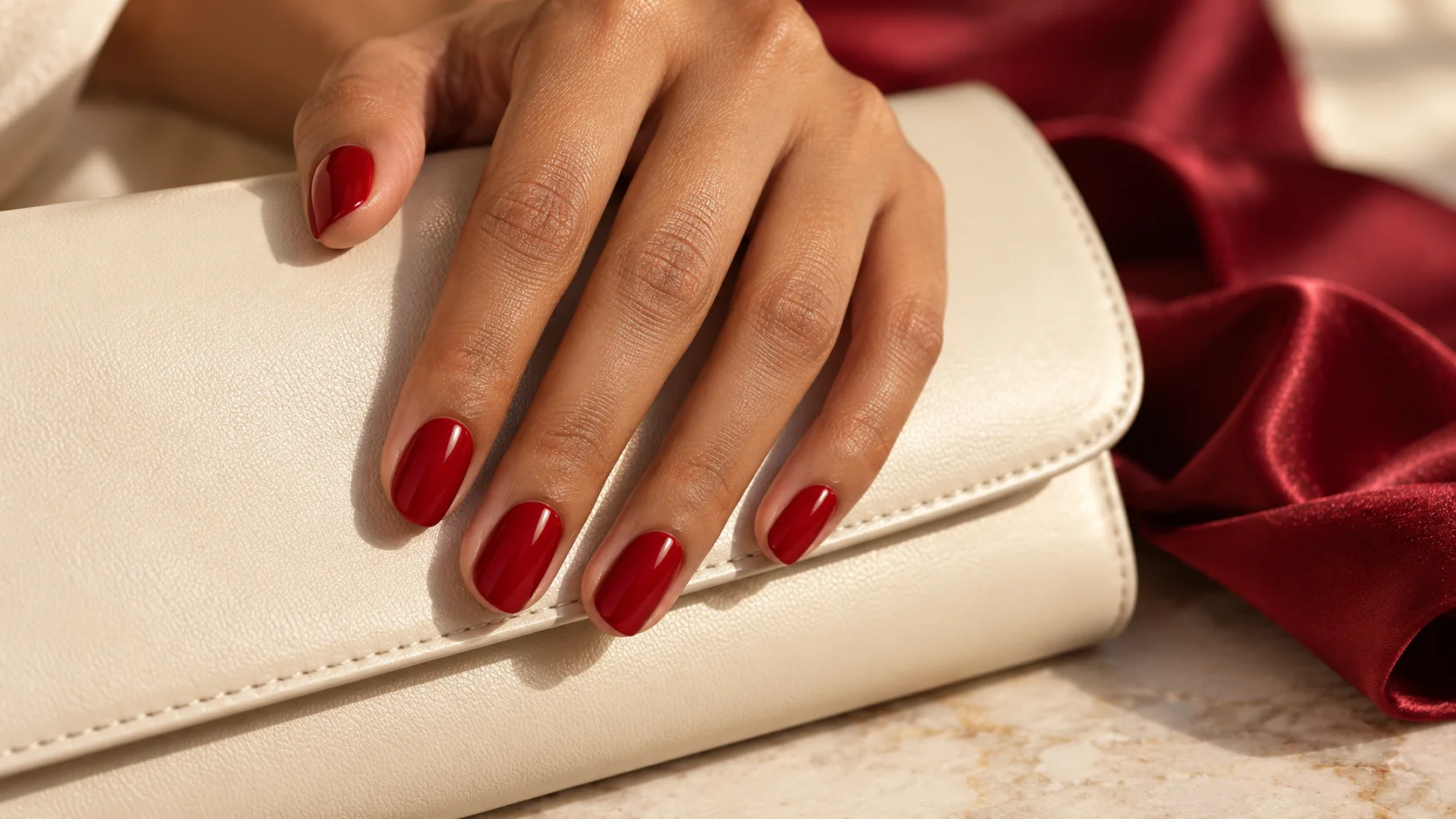
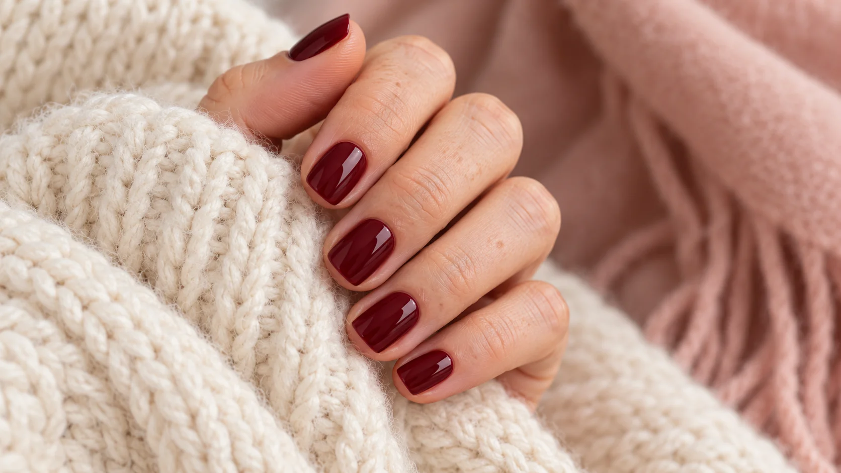
Burgundy nails sit within a broad family of deep reds, from visibly wine-coloured shades to very dark versions that can look nearly black in some light. The name alone does not tell you the exact depth, coverage or finish. A useful choice starts with how much red you want to see, then considers the nail outline and the amount of colour in the design.
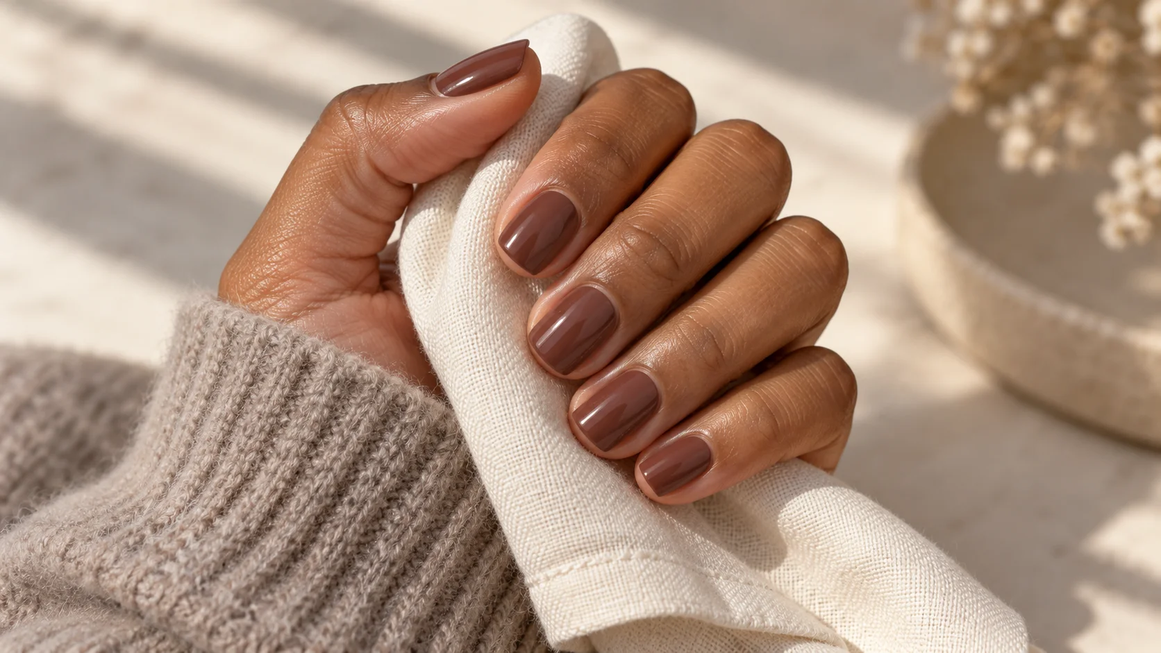
A short solid manicure, a narrow burgundy tip and a translucent deep-red finish are different interpretations of the same colour family. Compare them as complete designs rather than assuming there is one correct burgundy look. The examples below are colour references and original styling suggestions, not product rankings based on personal testing.
Choose how deep the red should be
Begin with two or three samples arranged from lighter to darker. Look at the centre and edges of each nail sample in ordinary room light. If the darkest one loses the red quality you wanted, a slightly lighter wine shade may be a better starting point than adding decorative elements to make the colour more visible.
Essie UK describes Bordeaux as a deep red wine colour with a cream finish. That description offers a useful starting direction, but the actual sample should make the decision. A product name, bottle photograph or display screen cannot guarantee the same appearance in every setting.
For comparison, Essie UK describes Wicked as a very deep red. These descriptions show that the dark-red category contains different depths. We are not claiming a fixed number of shades between them or an independently measured colour match.
Separate red direction from darkness
Two equally dark samples may still differ in colour direction. One may look more brown-red to you, another more berry-like or purple-red. Compare them side by side rather than trying to identify undertones from memory. Use plain observations that your technician can act on, such as “less purple” or “more visibly red.”
Do not feel obliged to choose a shade according to a universal skin-tone rule. Hold the samples beside your own hand and decide which relationship you prefer. If you are choosing for a specific outfit, compare the fabric as well so the manicure is considered in its intended setting.
A warm room lamp and clear daylight may produce different impressions. The goal is not to find a colour that never changes appearance; it is to understand the range you will see. Save a photograph in ordinary light if you want a useful record for a repeat appointment.
Decide on coverage before judging the final depth
A sheer deep red lets more of the underlying nail remain visible, while a more opaque result gives a continuous colour field. Those effects can differ even when the bottle looks similar. Ask whether a sample represents the intended finished coverage and the actual product system you will receive.
Do not use an arbitrary coat count to chase a picture. Follow the directions for your product, or let the technician explain how the selected system achieves its intended finish. If you dislike visible variation in a sheer colour, discuss an opaque alternative instead of assuming extra layers are always the answer.
Check the nail tip as well as the centre. In a translucent design, the natural free edge may remain visible through the colour. That can be part of the look, but it should be chosen deliberately. A reference photographed against a dark background may make this detail difficult to see.
| Direction | Main visual feature | Useful sample check |
|---|---|---|
| Solid wine red | Continuous deep-red colour | Is the red still visible in ordinary room light? |
| Very dark burgundy | A near-black impression at some angles | Do you like both the dark and red appearances? |
| Sheer deep red | Translucent colour with the nail visible beneath | Is the coverage even enough for your preference? |
| Burgundy accent | A small dark-red area beside a quieter base | Does the accent remain recognisable at the chosen size? |
Choose the outline you want to wear
Shape frames the colour. A short squoval nail gives burgundy a different outline from an oval or almond nail. OPI’s nail-shape guide is useful for distinguishing the names and outlines before discussing a reference.
Choose a realistic length first. If you like a long almond photograph mainly because of its colour, you can keep the colour and choose a shorter shape. If you like its tapered silhouette, ask what version is possible at your available length and with the service you intend to book.
For a plain dark set, check the shape across all five nails rather than focusing on the ring finger alone. The thumb may show a much wider area of colour. Decide whether you want softly rounded corners or a more squared outline before selecting any fine tip details.
Compare glossy, matte and reflective finishes
A glossy burgundy surface shows a clear light reflection. Matte changes that surface appearance, while shimmer or a magnetic effect adds another kind of visual detail. Start with the finish you actually want rather than assuming every deep red in a saved photograph is a plain cream colour.
If you like a reflective or velvet-looking burgundy, ask for a moving sample. A still photograph may capture only the brightest highlight. For a plain colour, view the sample away from a strong reflection so the shine does not hide the red you are trying to compare.
Use less colour when you want a smaller statement
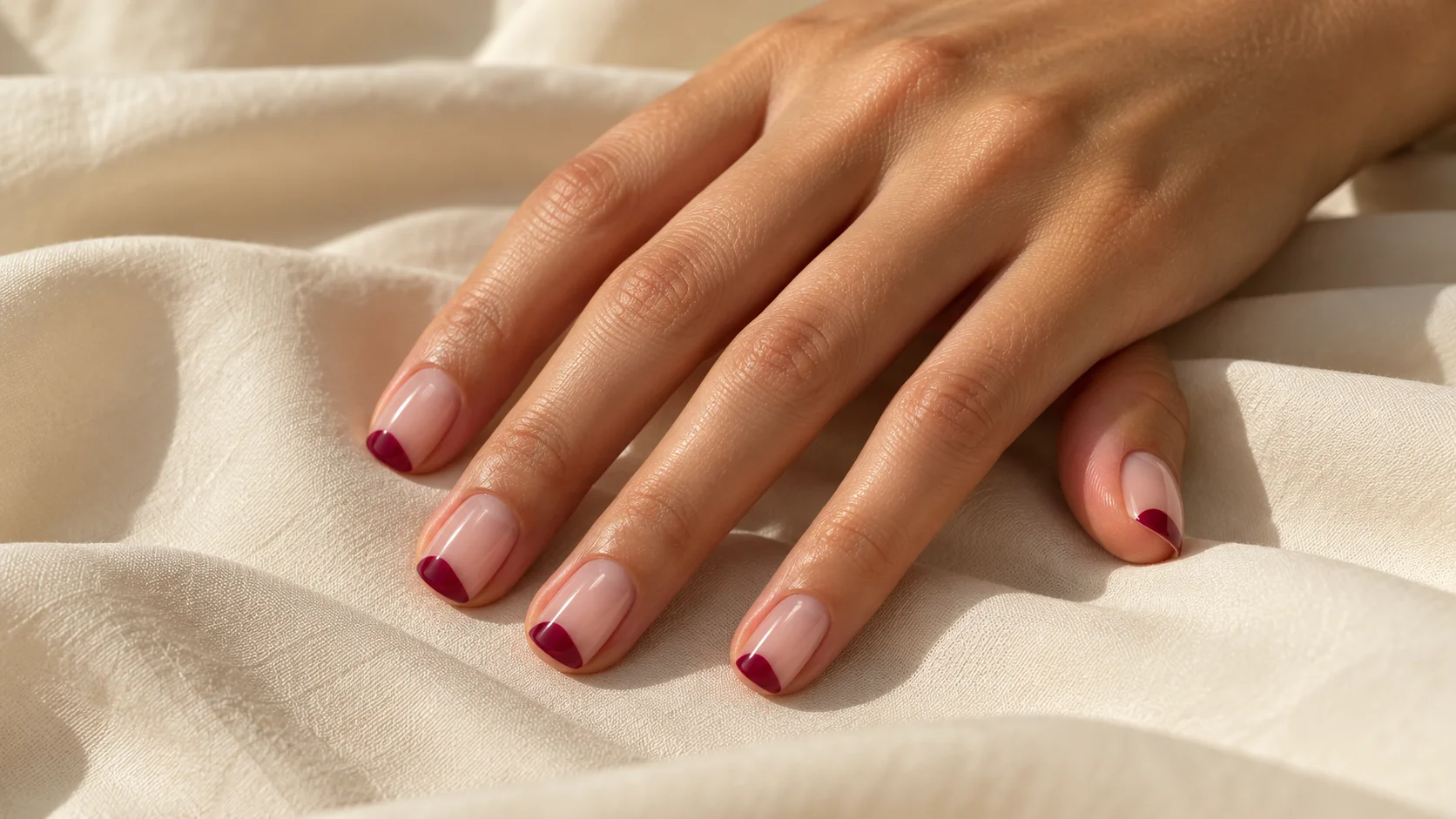
A narrow burgundy French tip can preserve a quiet base while keeping a dark-red edge. On a short nail, compare the tip width carefully: a broad band may occupy more of the nail than you intended. A small accent is not automatically less noticeable if its contrast is strong.
Another option is one solid burgundy nail beside a neutral set. Repeat a tiny amount of the same colour elsewhere only if it helps the arrangement. For a two-tone design, compare burgundy with a muted pink, taupe or cream sample, then choose which colour should dominate.
Four checks for a deep-red manicure
- Depth: choose visibly wine red or a darker near-black direction.
- Coverage: confirm sheer or opaque on a finished sample.
- Outline: agree the length, shape and corners.
- Finish: distinguish plain gloss, matte and reflective effects.
Record the details that make it yours
A clear brief could be: “Short squoval nails in an opaque wine red that remains visibly red indoors, with a plain glossy finish.” Ask for the brand, range and shade used, plus any finishing product that changes the appearance. Keep those details with a photograph instead of saving the word burgundy alone.
If you want a change next time, identify the specific issue: too dark, too purple, too translucent or too reflective. That makes the next comparison more useful and avoids replacing a colour you otherwise enjoyed. Browse the nail art edit for other ways to use deep colour in a restrained design.
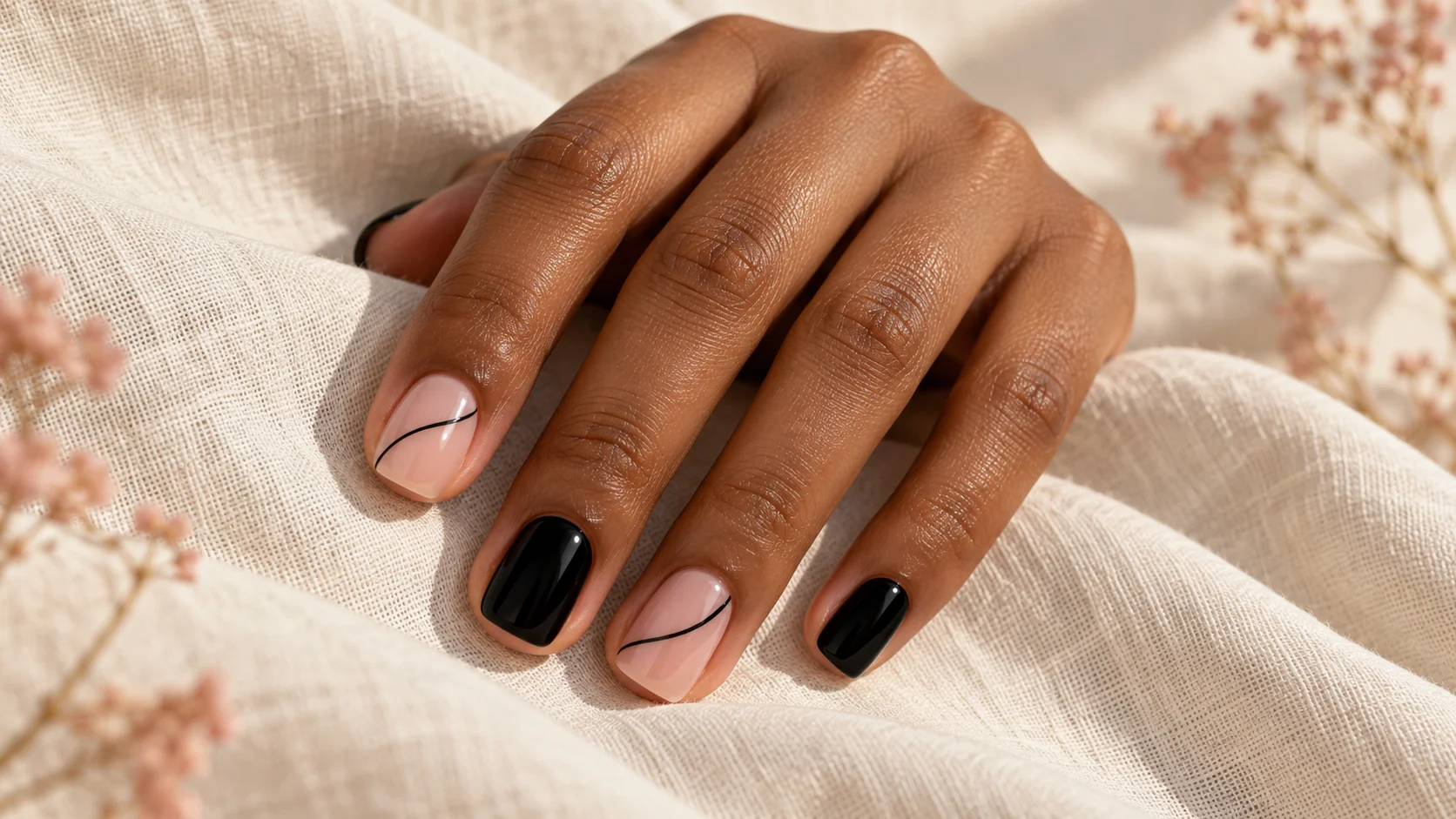
For the related design decisions, compare Cherry Red Nails: Finding a Warm, Cool or Deep Red, Mocha Nails: Choosing Chocolate, Taupe and Coffee Tones and Black Nail Art with Fine Lines, Gloss and Negative Space. For the practical details, use Matte vs Glossy Top Coat: How Finish Changes the Same Colour.
Common questions
Is burgundy one exact nail colour?
No. The term covers a range of deep-red directions, and brand names do not provide a universal colour standard. Compare actual samples for depth, colour direction and coverage. Decide how visibly red you want the manicure to remain in ordinary room light.
Why do some burgundy nails look almost black?
A very dark shade can read close to black in some lighting or photographs. If that is not the effect you want, compare a slightly lighter wine red at the same finish. Check it away from a strong display light before making the final choice.
How can I choose a less purple-looking burgundy?
Compare two samples of similar depth and describe the difference you notice. Ask for a redder or less berry-like direction rather than simply requesting a lighter colour. Keeping the depth similar helps separate the undertone preference from the amount of darkness.
Do burgundy nails need to be long?
No particular length is required by the colour. A short squoval, oval or another preferred outline can frame it differently. Choose the length you want to wear first, then adapt the reference instead of copying a long shape just because you like its colour.
Should burgundy be sheer or opaque?
That is an appearance choice. A sheer deep red leaves more of the underlying nail visible, while an opaque version creates a more continuous colour field. Ask to see the intended finished coverage rather than assuming every dark bottle gives the same result.
Is matte burgundy the same colour as glossy burgundy?
The underlying shade may be the same, but the surface finish changes how it appears in light. Compare finished samples of the versions you are considering. Do not judge a matte result solely by mentally removing the reflection from a glossy photograph.
Can I use burgundy only on the tips?
A narrow burgundy tip is one way to keep a quieter base while adding a deep-red detail. Compare the band width at your actual nail length. A small dark accent can still be quite visible when the contrast with the base is strong.
What should I record for a repeat burgundy manicure?
Save the brand, range, shade, coverage and finishing product with a clear photograph. Include the length and shape if those contributed to the look. If you want a change, describe it specifically, such as less darkness or more opacity, rather than starting from the broad colour name again.
Sources and further reading
- Essie UK — Bordeaux — checked 2026-10-21
- Essie UK — Wicked — checked 2026-10-21
- OPI — Finding the best nail shape for your hands — checked 2026-10-21