Espresso and Cream Nails: Simple Ways to Combine Dark and Light
Compare dark brown and light cream through plain colour, tips and curved divisions, with attention to coverage and balance.
Key takeaways
- Brown: choose the depth and warmth you actually want.
- Light shade: specify cream colour and sheer or opaque coverage.
- Balance: make light, dark or equal areas the starting point.
- Layout: use plain colour, a tip or one clear curve.
In this guide
- Key takeaways
- Decide what espresso means to you
- Separate cream colour from crème finish
- Choose which colour should dominate
- Try plain colour before a complex pattern
- Adapt a tip or curve to the nail size
- Build the dark-light pair
- Check the pair with your everyday materials
- Common questions
- Sources and further reading
Espresso and cream nails use a simple contrast: a dark coffee-brown colour beside a light creamy one. The pair can appear as alternating plain nails, a fine brown tip or two curved areas on the same nail. What changes the result most is often the proportion of dark to light, not the number of decorative details.
This guide treats espresso and cream as colour ideas, not ingredients to mix into nail products. It offers original layout comparisons and limited manufacturer references. We have not independently tested the named products, and the generated samples are not exact commercial swatches. Choose the actual shades and system separately from the visual inspiration.
Decide what espresso means to you
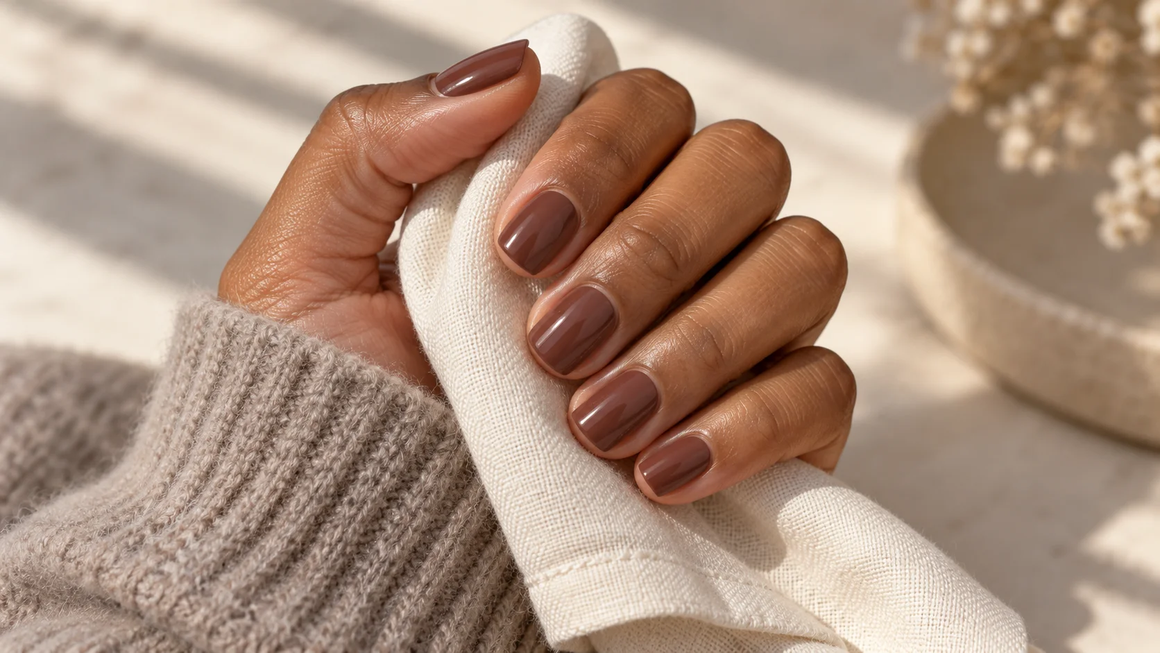
A coffee-brown description can suggest a very dark neutral, a warmer reddish brown or something lighter and milkier. Look at an actual sample rather than expecting the name to settle the choice. A shade that appears brown in a bright display may look much closer to black in a dimmer room.
OPI describes Espresso Your Inner Self as a deep espresso brown. That gives you one vocabulary reference for the dark side of the pair. It does not establish a match to every coffee-inspired photograph or make the product interchangeable with similarly named shades in other ranges.
Compare the brown with the light colour you intend to use, not only with your skin or a white background. A warm cream may emphasise a different aspect of the brown than a cooler white. If the pair feels too stark, try a lighter brown before adding a third colour.
Separate cream colour from crème finish
Cream as a colour usually suggests a pale off-white direction. Crème as a nail-polish finish describes a different concept: a plain colour appearance without the visible shimmer or glitter you may see in other finishes. For example, OPI describes Not Afraid of the Dark as a dark brown crème: the colour and finish are separate parts of that description.
State both colour and coverage when discussing the light shade. You might want a warm opaque cream, a sheer milky white or a pale beige. These are not interchangeable backgrounds for dark detail. If the natural free edge remains visible through the base, it becomes another part of the visual composition.
OPI’s Funny Bunny is described as a soft white with sheer, layerable coverage. It is a useful contrast to the opaque cream concept, not a claim that it is the exact cream shade in the illustration. Choose the coverage deliberately rather than expecting a sheer white to behave like a different formula.
Choose which colour should dominate
A mainly cream manicure with fine brown detail feels different from a mainly brown set with one pale accent. Decide which impression you want first. If you already wear dark nails regularly, brown may feel like the familiar starting point. If you prefer pale finishes, keep more cream visible and use the brown in smaller areas.
The National Gallery identifies lightness and darkness as a separate colour attribute from hue. That is useful for this pair because the strongest relationship may be tonal rather than a dramatic difference between colour families. You can change the amount of light-dark contrast while keeping the coffee-and-cream idea.
Compare three sketches: mostly light, roughly equal areas and mostly dark. There is no required ratio. Looking at all three makes it easier to identify whether you like the palette itself or a particular balance that happened to appear in a reference photograph.
Try plain colour before a complex pattern
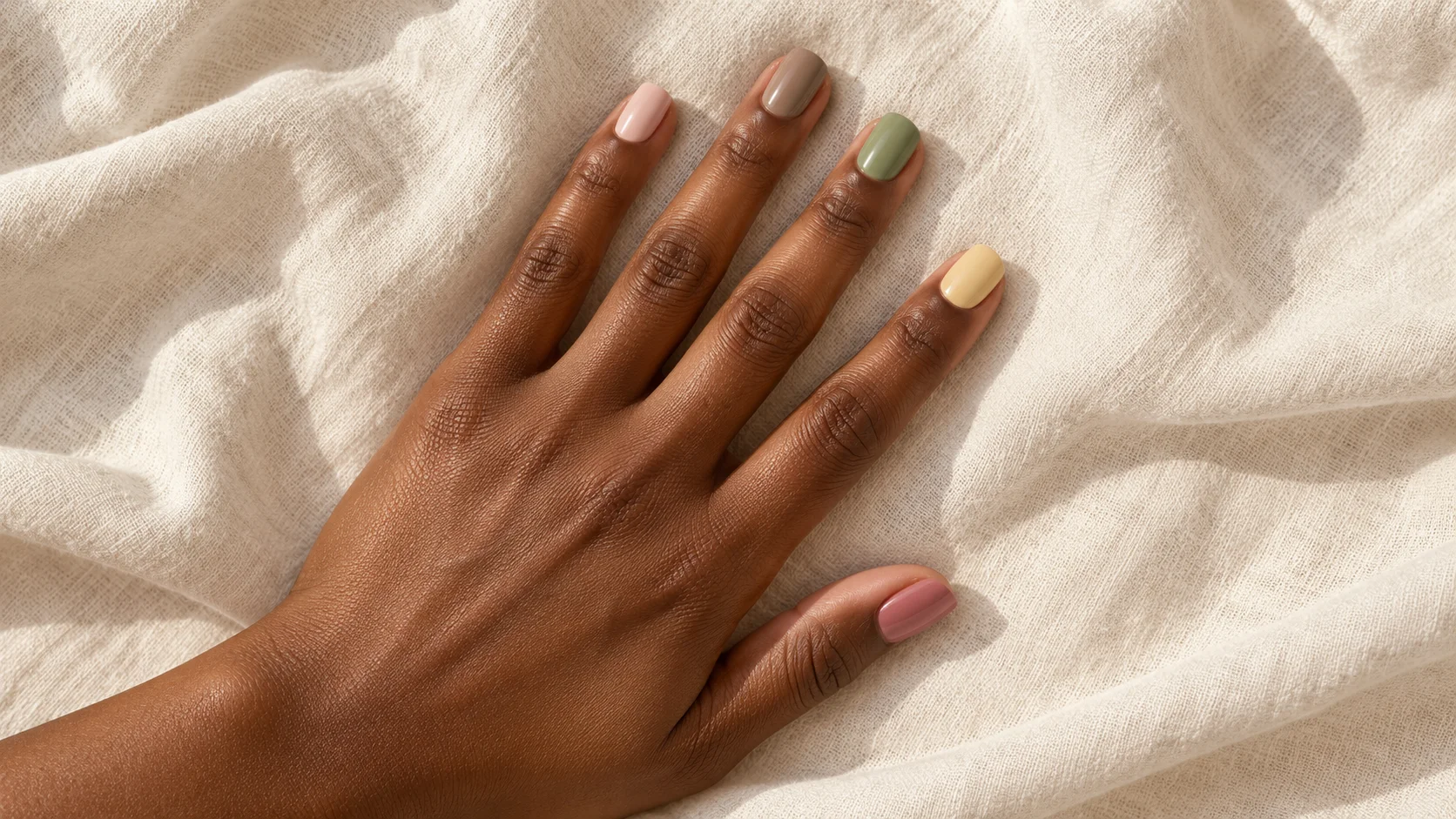
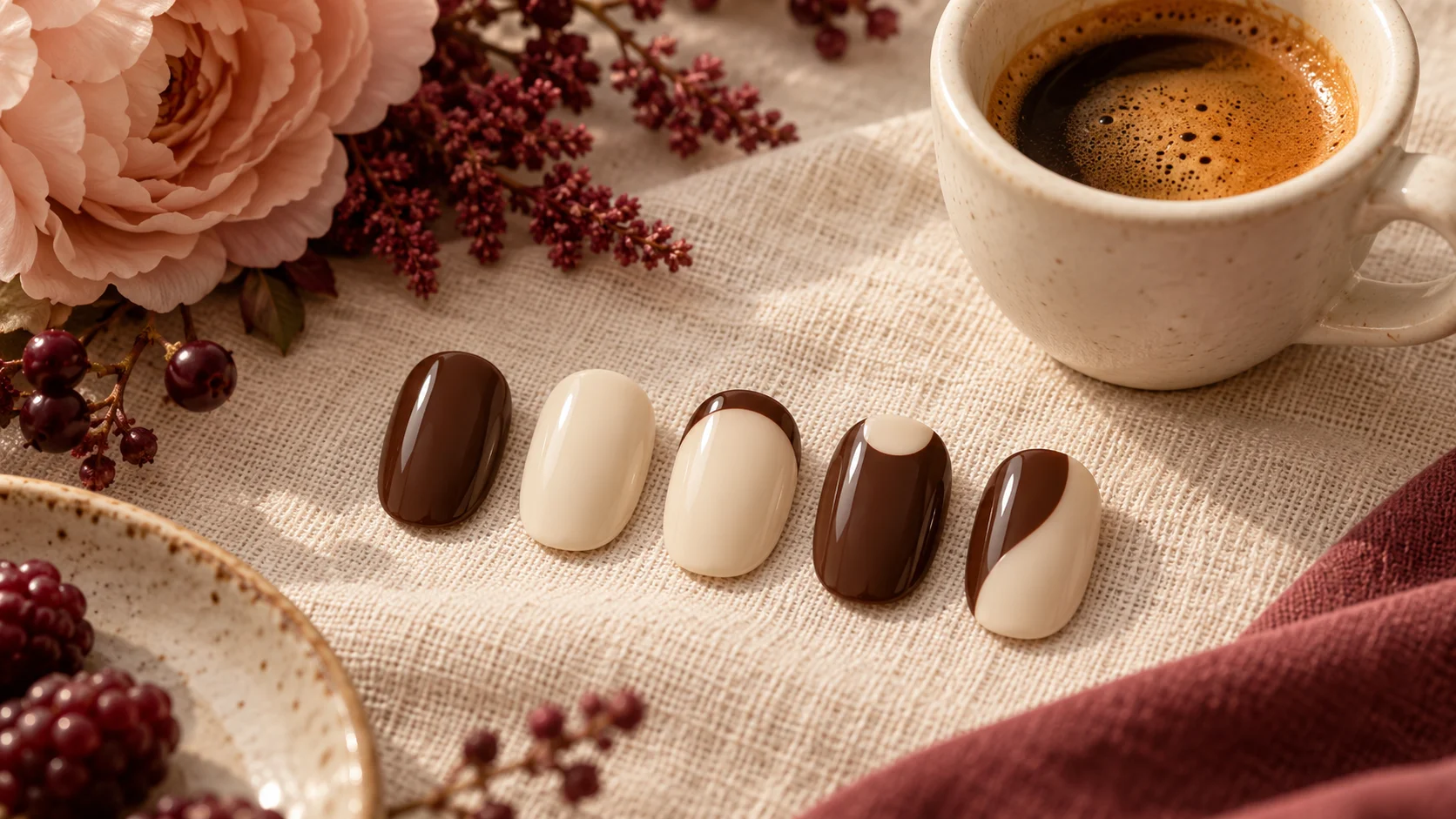
Alternating brown and cream across the nails is a direct way to show the pair. Decide the order for both hands so that the balance is intentional. You can mirror the sequence or let one hand carry more brown, provided that difference is something you want.
A single cream accent in a brown set creates a focal point. A single brown accent in a cream set reverses it. These arrangements let you compare the colours without requiring a fine painted border or a detailed motif. They can also help you decide whether you want more art at a later appointment.
If the plain pairing already feels complete, there is no need to add coffee-bean shapes, swirls or lettering to explain the theme. The colour relationship can carry the idea by itself. Keep a literal motif only if it is a feature you actively enjoy.
| Layout | Main visual effect | Decision to make first |
|---|---|---|
| Alternating full colours | A clear contrast across the hand | The order and balance on both hands |
| Cream base, brown tip | A light set with a dark edge | Tip width at your chosen length |
| Brown base, cream accent | A darker set with a pale focal point | Whether the accent is a whole nail or a small area |
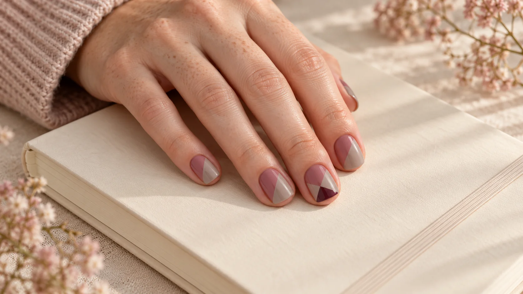
| Curved two-colour division | Both shades within each nail | The proportion and direction of the curve |
| Small half moon | A base-area colour contrast | The amount of central space that remains |
Adapt a tip or curve to the nail size
A fine brown tip can give the light base a defined edge. On a short nail, a broad tip may occupy a large proportion of the visible surface. Compare a narrower version before deciding that the palette itself is too dark. The same principle applies to a cream tip over brown.
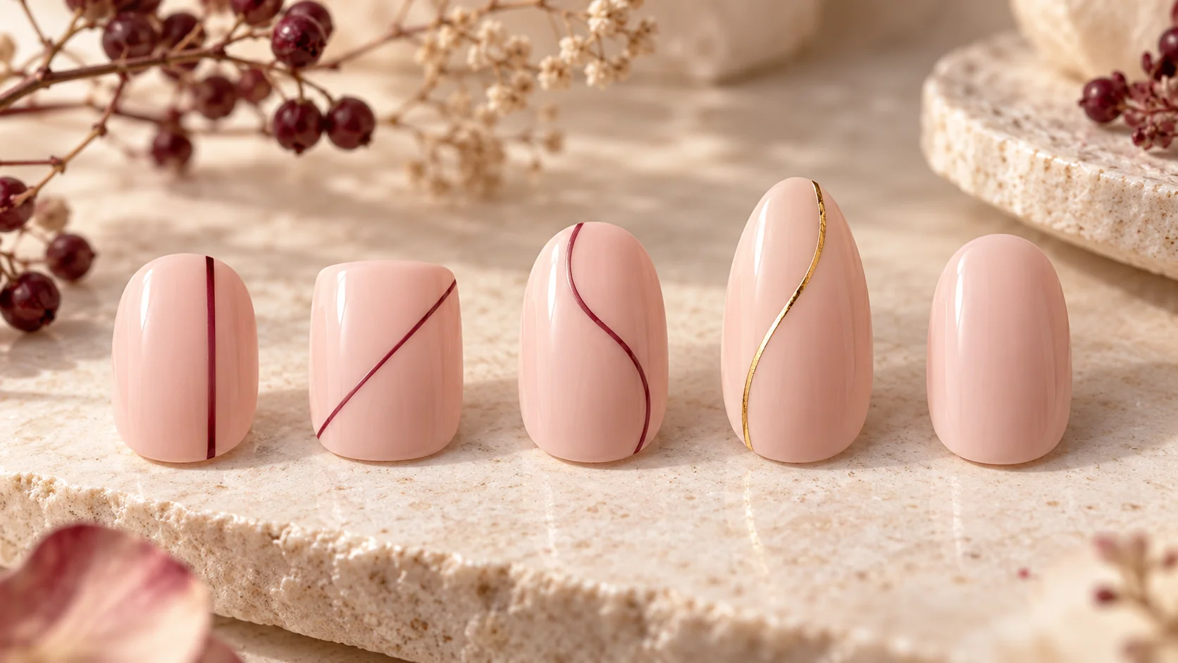
A curved division can be shallow or more sweeping. Keep it simple enough that both colour areas remain readable at actual size. If you want a half moon near the base, make its position clear in the reference rather than presenting it as an ordinary French tip.
Discuss the intended system with the provider or use a familiar home product according to its instructions. Two compatible-looking colours do not automatically belong to the same process. Do not physically mix formulas or add coffee, food colouring or other household ingredients to create the palette.
Check the pair with your everyday materials
Hold the samples beside a coat, knit or bag you often use. Exact matching is optional; different browns can work together if you like their relationship. If they feel awkward, a lighter cream or a more neutral brown may be a simpler adjustment than changing every accessory.
For more two-colour layouts, browse Nail Art. The polish guides explain finish and system distinctions, while Seasonal & Bridal offers occasion palettes. Keep the coffee-inspired name as a useful starting point, then judge the real shades, coverage and proportions that you will actually wear.
For the related design decisions, compare Mocha Nails: Choosing Chocolate, Taupe and Coffee Tones, Colour Block Nails: Simple Layouts for Two or Three Shades and Skittle Nails: Building a Five-Colour Palette That Feels Cohesive. For the practical details, use Choosing a Nude Nail Polish: Undertones, Coverage and Personal Preference.
Common questions
Are espresso and cream exact nail-polish colours?
No. They are broad colour directions in this guide. Espresso may suggest different depths and warmth of brown, while cream can range from off-white to a pale beige. Compare actual samples together and specify coverage, rather than expecting the names or generated illustration to establish an exact commercial match.
Does crème finish mean cream-coloured polish?
No. The finish term and the colour description are separate. A dark brown product can be described as a crème finish, while a cream-coloured product may have another finish. Check colour, coverage and reflection independently so that an opaque cream idea is not confused with a sheer white or shimmer.
Can I use sheer white instead of opaque cream?
Yes, if you prefer that appearance, but it changes the design. A sheer base leaves more of the natural nail visible, while an opaque cream creates a more uniform background. Compare both under the proposed brown detail and choose deliberately rather than assuming extra coats make two different formulas identical.
How can I make the dark-light contrast softer?
Try a lighter brown, a smaller dark area or a warmer and slightly deeper light shade. Change one feature at a time. A fine brown tip over cream can feel different from equal halves or alternating full nails, even when the same two colours are used throughout.
Do both hands need the same alternating colour order?
They can match, mirror or use a deliberate difference. Plan the order before application so the balance does not become accidental. If one hand carries more brown, consider whether the other still feels connected through the same colours, finish or placement rather than deciding each nail independently.
Can I add coffee to polish to create the shade?
No. Espresso and cream are visual references, not ingredients for a homemade formula. Do not add coffee, food colouring or household materials to nail products, and do not assume different formulas can be mixed. Choose an appropriate existing shade and follow the instructions for the actual product or service.
Should the brown match my bag or shoes?
Only if you want an exact-match effect. Several browns can look intentional together, while a cream accent can create separation between them. Compare the real materials in ordinary light before deciding. A digital picture or a colour name cannot guarantee that polish will match a particular leather or fabric.
Is a coffee-themed motif necessary for this palette?
No. Plain colours, a fine tip or one curved division can communicate the dark-light idea without literal beans, cups or lettering. Add a motif only if you actively want it. Keeping the layout simpler may make it easier to compare the actual shades and their proportions.
Sources and further reading
- OPI — Espresso Your Inner Self Nail Lacquer — checked 2026-10-23
- OPI UK — Funny Bunny Nail Lacquer — checked 2026-10-23
- National Gallery — Colour glossary — checked 2026-10-23
- OPI — Not Afraid of the Dark Infinite Shine — checked 2026-10-23