Single-Line Nail Art: Placement Ideas for Short and Long Shapes
Choose the direction, position and weight of one painted line, then adapt it to your actual nail length.
Key takeaways
- Route: vertical, diagonal or gently curved.
- Position: central, offset or crossing part of the surface.
- Weight: consistent width or an intentional taper.
- Contrast: a quiet colour relationship or a clearer light-dark difference.
In this guide
- Key takeaways
- Choose a route before choosing a colour
- Adapt the path to a short nail
- Use extra length deliberately
- Decide whether the line stays even or tapers
- Choose enough contrast for the result you want
- One line, four decisions
- Repeat the idea without forcing identical geometry
- Common questions
- Sources and further reading
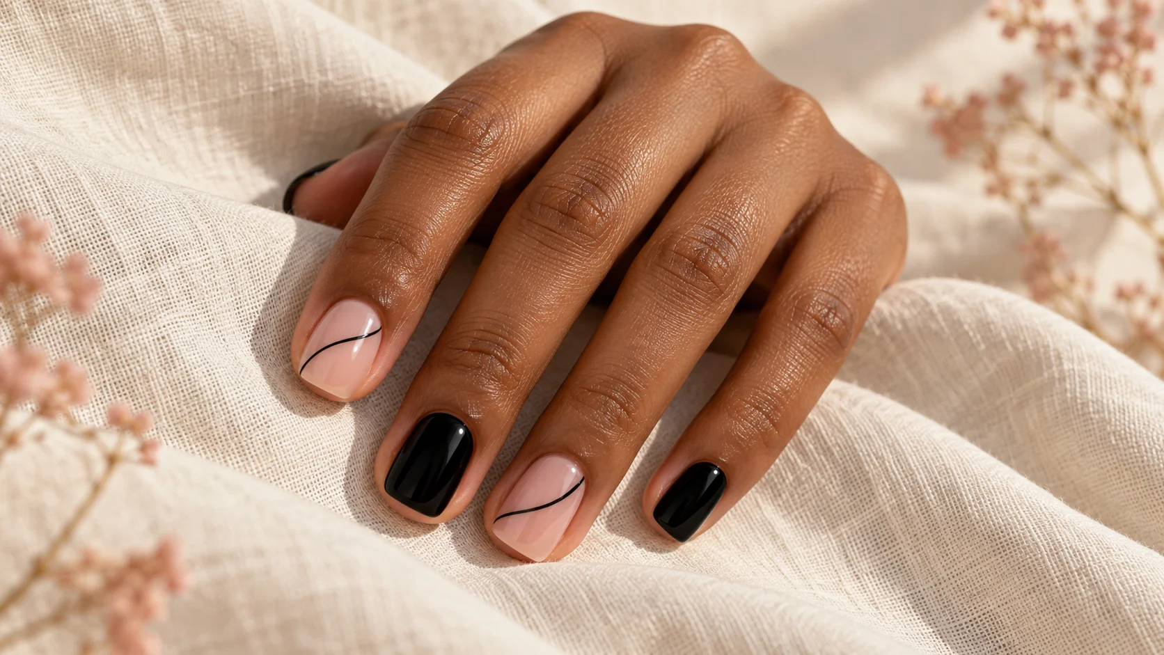
One painted line can change the balance of a manicure without adding a complete pattern. A vertical mark, a diagonal or a loose curve each gives the eye a different route across the nail. The important decisions are where the line begins, where it ends and how much plain space remains around it.
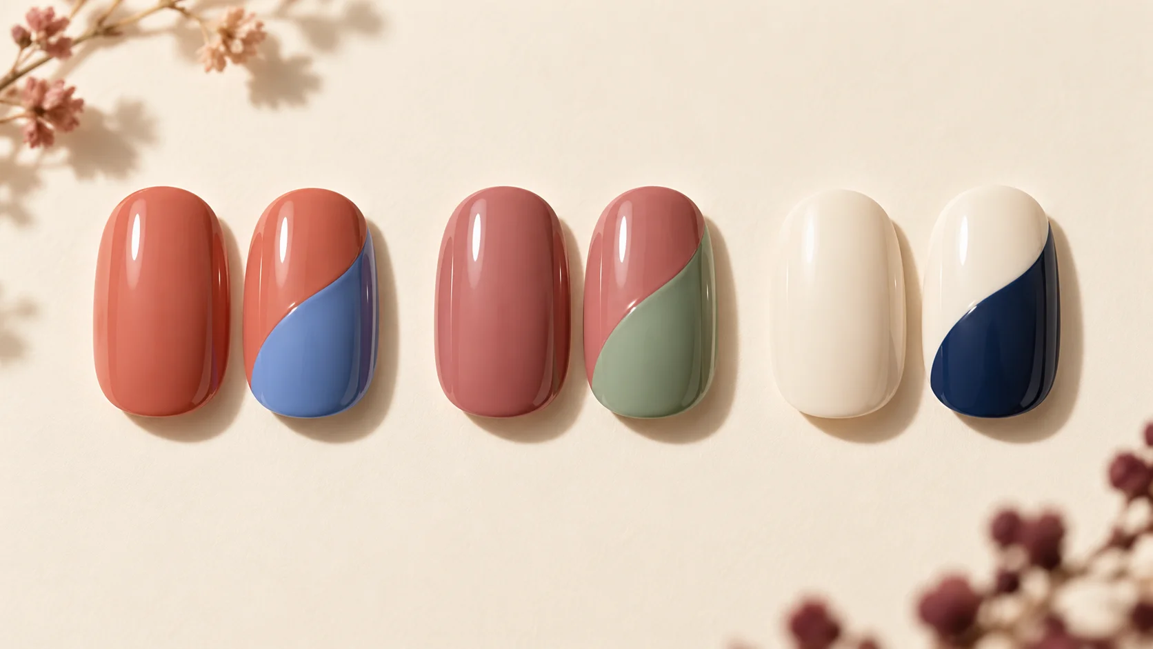
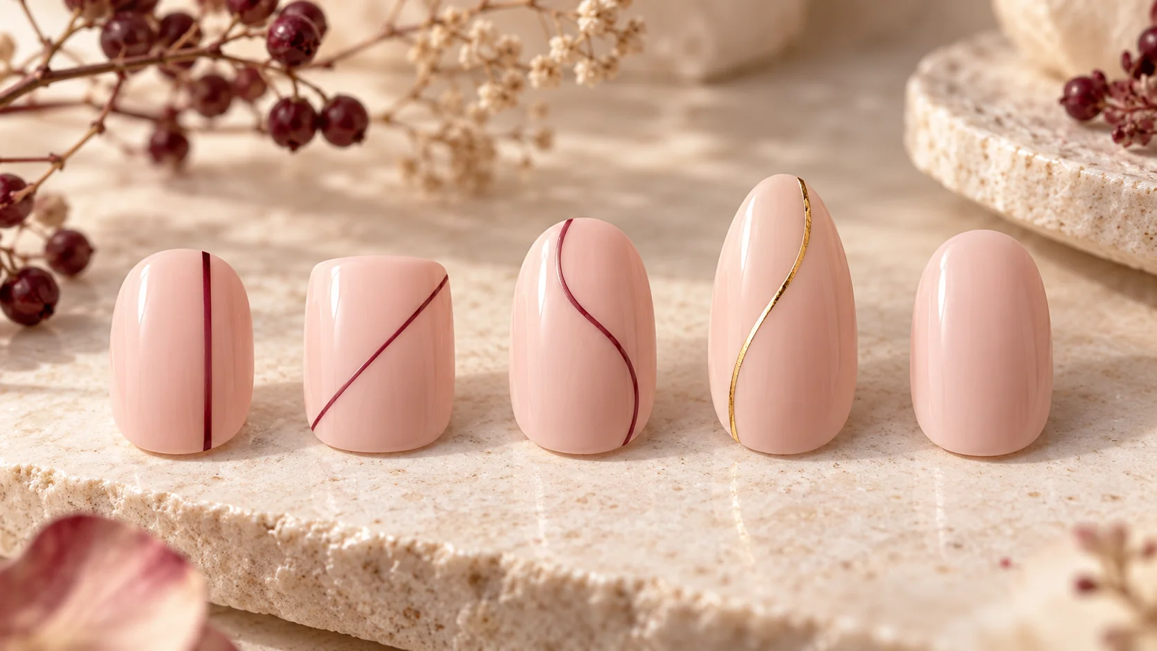
This guide compares original placement ideas for short and longer shapes. It does not promise that a line will make fingers look a particular length, and it is not a professional gel tutorial. The reference image shows generic display samples. Use it to discuss direction and proportion, then adapt the idea to your own nails and the product or service you choose.
Choose a route before choosing a colour
A lengthwise line can run through the centre or sit closer to one side. A diagonal crosses between different points on the outline. A curve can pass gently across the surface without enclosing an area. Start by drawing those three routes on paper so you can compare their structure without being distracted by colour.
The endpoints are part of the design. A line that finishes inside the painted area feels different from one that visually continues to an edge. A short central mark leaves open space at both ends, while a longer line divides more of the surface. Neither has to run from the base all the way to the tip.
For a first comparison, keep the base and line colour the same across the samples. That allows you to decide whether it is the direction you like. If every sample also changes shape, colour and finish, a favourite may be difficult to explain or reproduce.
Adapt the path to a short nail
A short nail can carry a line clearly when the mark has room around it. You might choose an off-centre vertical, one diagonal or a shallow curve. The goal is not to fit a reduced version of every detail from a long-nail image onto a smaller surface.
If the line looks crowded, shorten its route or move it away from another strong boundary, such as a coloured tip. A broad stripe may occupy much of the nail, while an extremely fine pale line may be difficult to see. Compare the amount of contrast and width together instead of assuming thinner is always better.
A softly squared outline and a rounded outline will frame the same line differently. Try the mark on a sample close to your intended shape. You do not need to file the nail into an unfamiliar form just to reproduce the geometry of a reference.
Use extra length deliberately
A longer nail gives a line more distance to travel, but that space does not have to be filled. A short mark near the centre can be intentional on a long shape. Alternatively, one curve can follow part of the length while leaving a substantial plain area beside it.
Look at the line from a normal viewing distance rather than only through a close-up camera. Several bends that look interesting when enlarged may read as a more complicated squiggle on the hand. If you want a single clear gesture, reduce the number of direction changes.
A design reference should separate the length from the mark. Tell the technician if you like the curve but want a shorter or more rounded shape. That lets the route be adjusted to the actual surface instead of treating the photograph as an all-or-nothing choice.
Decide whether the line stays even or tapers
A uniform-width line looks different from one that becomes gradually finer. A deliberate taper can create a sense of direction, while a constant width gives a more regular outline. These are visual choices; a line does not have to be mathematically perfect to look considered.
OPI’s Waves for Days example uses a detail brush for a thin wavy line and contrasts line thickness. The useful point here is that width and direction can be designed separately. We are not reproducing its complete pattern or treating its product-specific drying instructions as universal.
OPI’s professional Give it a Swirl example includes curved and tapering linework. That provides another shape reference, but its professional gel procedure belongs to that system. A visual idea from it does not supply a safe general curing method for other products.
| Line route | Where it places emphasis | What to adjust first |
|---|---|---|
| Central lengthwise line | Along the middle of the surface | Its length and the space left at each end |
| Off-centre line | Towards one side | The amount of plain base on each side |
| Diagonal | Between two different edge positions | The angle and whether it reaches the outline |
| Loose curve | Along a softer changing route | The number of bends and their depth |
| Tapered line | Towards the finer endpoint | Whether the taper looks deliberate at actual size |
Choose enough contrast for the result you want
A dark line on a pale base is usually easy to distinguish, while two similar colours can create a quieter detail. The National Gallery’s colour glossary separates hue from lightness and darkness. That distinction helps when a line is the right colour family but does not stand out as much as you expected.
You can change the depth of the line without changing its route. A deeper berry may be more visible over blush than a pale pink, while a cream line on a dark brown base reverses the relationship. Metallic or shimmer finishes introduce reflection as another variable, so compare them separately from plain colour.
Use a real sample when the distinction is subtle. Screen brightness and surrounding colour can change your impression of a fine mark. The generated illustration is useful for placement but cannot establish the exact contrast of the products you will wear.
Repeat the idea without forcing identical geometry
For a full set, you can repeat one route on every nail or use the line on selected accents. If you vary the placement, keep another feature consistent, such as colour or width. That gives the set a relationship without requiring every nail to carry the same mark.
Sketch both hands before application and consider how rings affect the focal point. One line beside a ring can be enough. If several fingers already carry jewellery, plain nails between the accents may give the design more space rather than making it feel unfinished.
Explore more layouts in Nail Art and compare finishes in Polish & Tools. Keep your reference note specific: one off-centre berry line on a short blush nail communicates more than a large collection of unrelated minimalist images. A single-line design succeeds as a clear choice when its route and surrounding space are both intentional.
For the related design decisions, compare Black Nail Art with Fine Lines, Gloss and Negative Space, Negative Space Nail Art That Works on Short Nails and Colour Block Nails: Simple Layouts for Two or Three Shades. For the practical details, use Nail Polish Brush Shapes: Wide, Rounded and Fine Brushes Compared.
Common questions
Which direction should a single nail-art line follow?
Choose the route you enjoy rather than assuming one direction is always more flattering. Compare a lengthwise line, a diagonal and a gentle curve on similar outlines. Keep colour and base consistent while deciding, so you can see whether the route itself is the feature you prefer.
Does a vertical line guarantee longer-looking nails?
No. This guide does not promise a particular visual change to your nails or fingers. A vertical line directs attention along one route, but shape, contrast, width and viewing angle also affect the impression. Choose it because you like the design rather than relying on a guaranteed lengthening effect.
Can a short nail carry a curved line?
Yes. Use a curve with enough space around it and reduce unnecessary bends if the design feels crowded. You may shorten the route or move it away from another strong boundary. Compare a sample at your actual nail length instead of shrinking every detail from a much longer reference.
Should the line touch both ends of the nail?
It does not have to. A short interior mark leaves space at both ends, while a longer route can visually continue towards an edge. Decide the endpoints as part of the design. The product should remain on the nail surface rather than extending onto surrounding skin to imitate a photograph.
What is the difference between an even line and a tapered line?
An even line keeps a similar visual width along its route, while a tapered line becomes finer towards an endpoint. Either can look deliberate. Decide which effect matters before application, and judge it at normal viewing distance rather than requiring mathematical uniformity from every curve on differently shaped nails.
Can I use professional gel artwork as a layout reference?
Yes, for the visual idea, but the photograph does not provide a universal application or curing method. The professional example in the article illustrates curved and tapering lines only. Use an appropriate service or a familiar product process, and follow the requirements of the actual system involved.
Should each nail have exactly the same line?
Only if you want a repeated pattern. You can also use the line on selected accents or vary placement while keeping colour or width consistent. Sketch both hands together so the differences feel planned, and leave plain nails where they help the overall design rather than filling every surface.
What should I explain when asking for this design?
Describe the length and base, the line colour, its route, its position and whether it tapers. One clear sentence can be more useful than several unrelated minimalist images. If the reference has a nail shape you do not want, state that you are borrowing the line placement only.
Sources and further reading
- OPI UK — Waves for Days — checked 2026-10-23
- OPI UK — Give it a Swirl — checked 2026-10-23
- National Gallery — Colour glossary — checked 2026-10-23