Nails for a Linen Outfit: Soft Whites, Terracotta and Muted Greens
Compare soft white, terracotta rose and sage nail colours beside linen fabrics, with attention to texture, coverage and accessories.
Archive edition: 2026-07-14 · This is an editorial allocation, not the first-publication date.
Key takeaways
- Set out the full outfit and accessories.
- Compare soft white, terracotta rose and muted green.
- Choose the coverage you want.
- Decide whether gloss, matte or shimmer adds to the look.
- Keep the design plain unless a detail has a purpose for you.
In this guide
- Key takeaways
- Read the whole outfit, not only the fabric colour
- Soft white: compare coverage before committing
- Terracotta rose: add warmth without copying the outfit
- Muted green: use contrast with a quieter intensity
- Let texture and finish have separate roles
- Adapt the idea to the occasion
- Fabric, colour, finish
- Use the comparison to make a smaller shortlist
- Common questions
- Sources and further reading
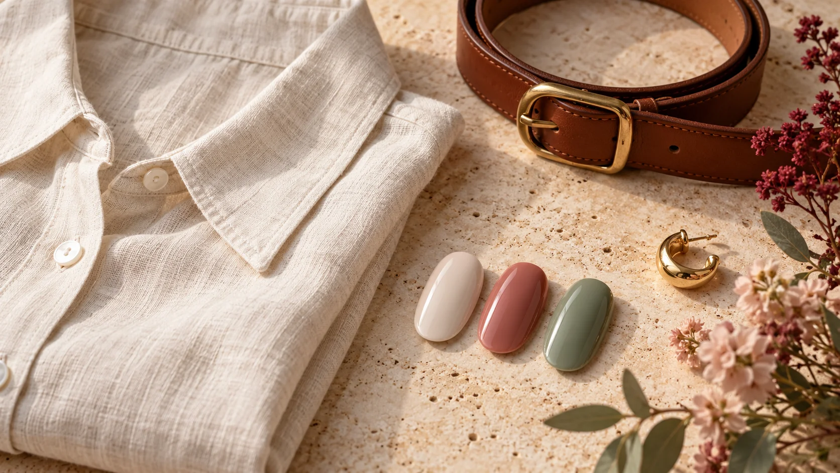
A linen outfit gives you several useful directions for nail colour: a soft white that stays close to the fabric, a terracotta rose that adds warmth or a muted green that introduces a quieter contrast. The most useful starting point is the actual outfit, including the shoes and accessories, rather than a rule that natural-looking fabric must always be paired with neutral nails.
These are editorial styling suggestions. They do not claim that linen has one correct palette, that a particular colour flatters every hand or that the generated illustration shows tested nail products. Use the ideas to compare what you already own and decide how much colour you want the manicure to contribute.
Read the whole outfit, not only the fabric colour
Place the linen piece beside the other items you plan to wear. An ivory shirt with dark trousers creates a different combination from an ivory dress with tan sandals, even though the fabric reference is similar. A bright bag, patterned scarf or large ring may already provide the accent you would otherwise add through nail colour.
Notice whether the outfit feels mostly light, mostly deep or strongly contrasting. Then decide whether the manicure should stay within that balance or deliberately interrupt it. A dark nail colour can be a clear accent beside pale linen, while a soft tint can leave the clothes and jewellery as the more noticeable parts.
Do not treat a fabric photograph as an exact colour reference. Natural light, indoor light and screen settings can change what you see. If possible, hold an actual nail sample beside the fabric and look at your whole hand. You are deciding whether you enjoy the combination, not trying to certify that lacquer and cloth are identical.
Soft white: compare coverage before committing
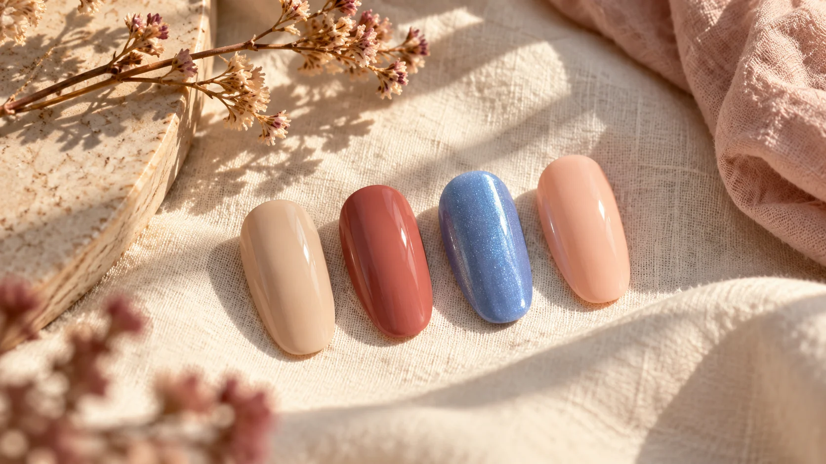
A soft white manicure can stay close to a pale outfit without matching every shade of cream or ivory. Decide whether you want a translucent milky effect or a stronger solid white. Those two choices can create quite different amounts of contrast, particularly when the outfit includes darker accessories.
OPI describes Funny Bunny Nail Lacquer as soft white with sheer, layerable coverage. That description illustrates a finish direction rather than guaranteeing the exact appearance on your nails. It is not the same as saying every white polish will remain translucent or look like the generic sample in this article.
If the fabric is warm ivory, compare whether you like a cooler-looking white beside it or prefer a creamier direction. Neither choice is automatically wrong. A subtle difference can be part of the styling, while someone seeking a closer tonal relationship may want to compare another sample before choosing.
Terracotta rose: add warmth without copying the outfit
A terracotta or dusty rose direction can introduce colour beside cream, beige, olive or brown clothing. It may connect to a leather belt, sandal or warm-toned accessory without needing to duplicate it. Decide whether you want the manicure to feel like a small accent or a stronger block of colour across the hand.
Essie describes Mrs. Always Right as terracotta rose pink. The brand’s US description gives you a reference for a warmer, muted pink family. It does not establish current UK stock, comparative wear or a universal match for every wearer or piece of linen.
Compare the colour beside both the fabric and any jewellery. A warm rose can sit differently beside a silver ring than beside a gold one, but that does not create a rule about which metal you must choose. Look at the relationship and decide whether the contrast is something you enjoy rather than trying to satisfy a fixed undertone formula.
Muted green: use contrast with a quieter intensity
A sage or grey-green can introduce a different colour family without the intensity of a very bright green. You might compare it with ivory linen, a tan accessory or a dark trouser. The idea is to test a relationship between colours, not to assume that every shade described as natural belongs together.
Essie UK describes Caught in the Rain as a muted sage green with grey undertones. That is a specific manufacturer description. If you want a more yellow-green or a deeper olive, make that distinction in your brief rather than expecting all muted greens to create the same effect.
Try a plain green manicure first in the mood board before adding botanical artwork. The colour may already supply the connection you wanted. A leaf motif can be a separate choice, but it is not required simply because the shade is green or the outfit is made from linen.
| Direction | What it can contribute | Question to answer |
|---|---|---|
| Soft white | A light tonal relationship | Do I prefer sheer or solid coverage? |
| Terracotta rose | A warmer colour accent | How much contrast do I want beside the fabric? |
| Muted sage | A quieter green contrast | Do I prefer grey-green or a warmer green? |
| A personal favourite | A deliberate departure from the suggested palette | Does it work with the whole outfit for me? |
Let texture and finish have separate roles
Linen’s visible texture and a smooth nail surface do not need to look alike. A glossy manicure can provide a small contrast beside textured cloth, while a matte finish can create another relationship. Decide whether you want that contrast instead of assuming that a fabric with a relaxed appearance requires a particular top coat.
Keep finish separate from colour when comparing samples. A shimmery sage and a plain sage may not play the same role even if their colour names sound similar. If you want a quiet colour without sparkle, say so. If you enjoy a reflective accent, decide whether it belongs on every nail or only one small detail.
Adapt the idea to the occasion
For an ordinary daytime outfit, a plain colour or translucent tint may be all you want. For an evening event, you might keep the same colour and let jewellery or a different bag change the overall look. There is no need to replace the manicure every time the linen piece is styled differently.
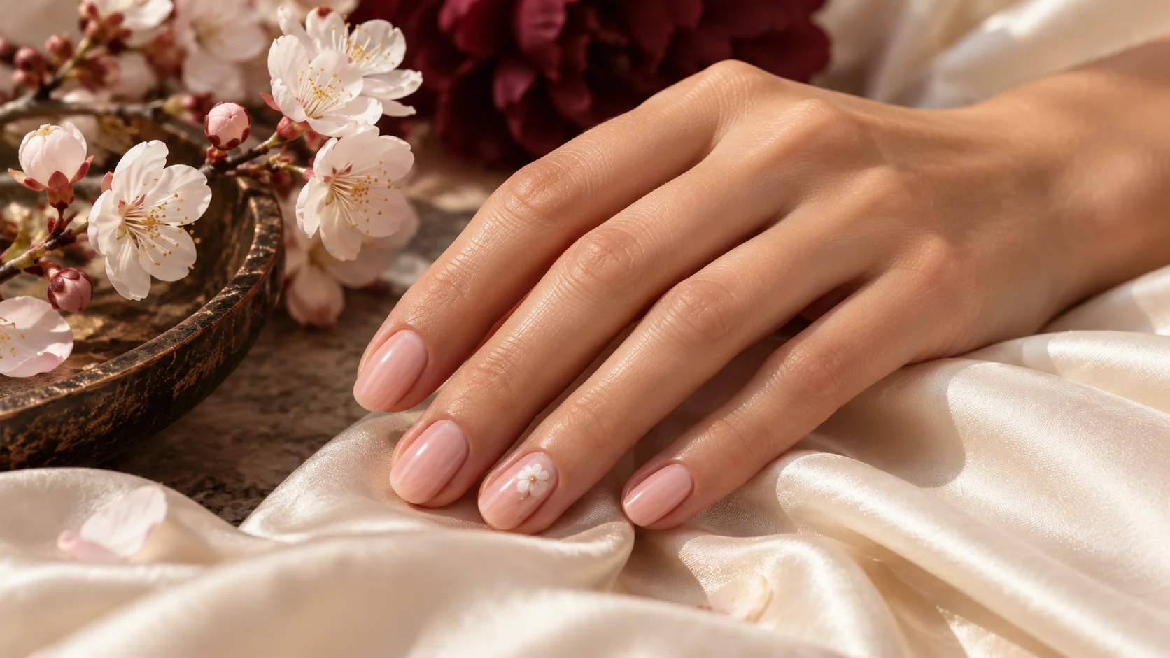
If you are planning artwork, keep the motif connected to a clear preference. A fine line in a second colour can be enough; a detailed floral pattern is a separate commitment of time and products. Ask what the service includes and choose a length you can use comfortably, rather than treating the fabric style as a reason to change your usual nail shape.
Take an unfiltered photograph of the hand beside the outfit if it helps you decide between two options. Compare the overall balance rather than magnifying tiny differences until both choices feel wrong. The photograph is a reminder of your preference, not proof of exact colour accuracy.
Use the comparison to make a smaller shortlist
You do not need all three colour directions in your collection. Choose the one you would enjoy wearing with more than a single outfit, or adapt the palette around a bottle you already own. If a particular shade is unavailable, identify the colour and coverage you liked rather than assuming only one named product can create the idea.
Explore Polish & Tools for coverage and finish comparisons, and Seasonal & Bridal for other outfit palettes. A useful match is one that makes sense to you with the clothes you actually wear, without turning a relaxed outfit into a complicated colour rule.
To adapt the plan to related occasions and outfits, compare Wedding Guest Nails: Choosing Colour Around Your Outfit, Late Summer Nails: Warm Neutrals and Faded Pastels and Early Autumn Nail Colours: Olive, Chestnut and Dusty Rose. For the underlying care, colour or service choice, see Sage Green Nails: Colour Pairings for a Muted Manicure.
Common questions
Do linen outfits require neutral nail colours?
No. Soft white, terracotta rose and sage are options to compare, not requirements. A bright or dark favourite can also be a deliberate accent. Set out the whole outfit with accessories and decide how much colour you want the manicure to contribute rather than following a fabric-based rule.
Should white polish match ivory linen exactly?
It does not have to. You may enjoy a small tonal difference or prefer a closer relationship. Compare actual samples beside the fabric where possible, and decide on sheer or solid coverage separately. Photographs and screens are not reliable guarantees of an exact match between cloth and lacquer.
What does terracotta rose add to a pale outfit?
It offers a warmer colour accent that you can compare with leather accessories, jewellery or other outfit details. You do not need to repeat every warm tone exactly. Decide whether you want the manicure to stand out clearly or sit more quietly within the complete combination.
Is every muted green the same as sage?
No. Muted greens can differ in depth and in their balance of grey, yellow or other tones. The linked Essie example is described as sage with grey undertones. If you want a warmer green or deeper olive, specify that rather than relying only on the broad word muted.
Must a manicure look matte beside textured linen?
No. A glossy surface can provide a deliberate contrast, while a matte or shimmery finish creates another relationship. Choose the effect you enjoy rather than assuming the nail finish must copy the fabric texture. Compare finish separately from colour before selecting the actual product or service.
Can I keep the same manicure from day to evening?
Yes. You can let jewellery, shoes or a bag change the outfit while keeping the nail colour. A manicure does not need replacing every time the linen piece is styled differently. Choose a shade you enjoy across the combinations you actually expect to wear.
Do I need all three suggested colours?
No. The palette is a comparison tool, not a shopping list. Pick the direction you would enjoy wearing with several outfits, or adapt the idea around a suitable colour you already own. A single shade can provide the complete effect without additional artwork or products.
Are the illustrated samples exact brand colours?
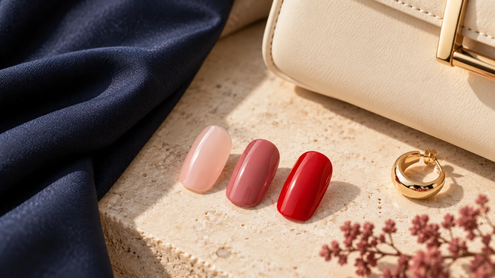
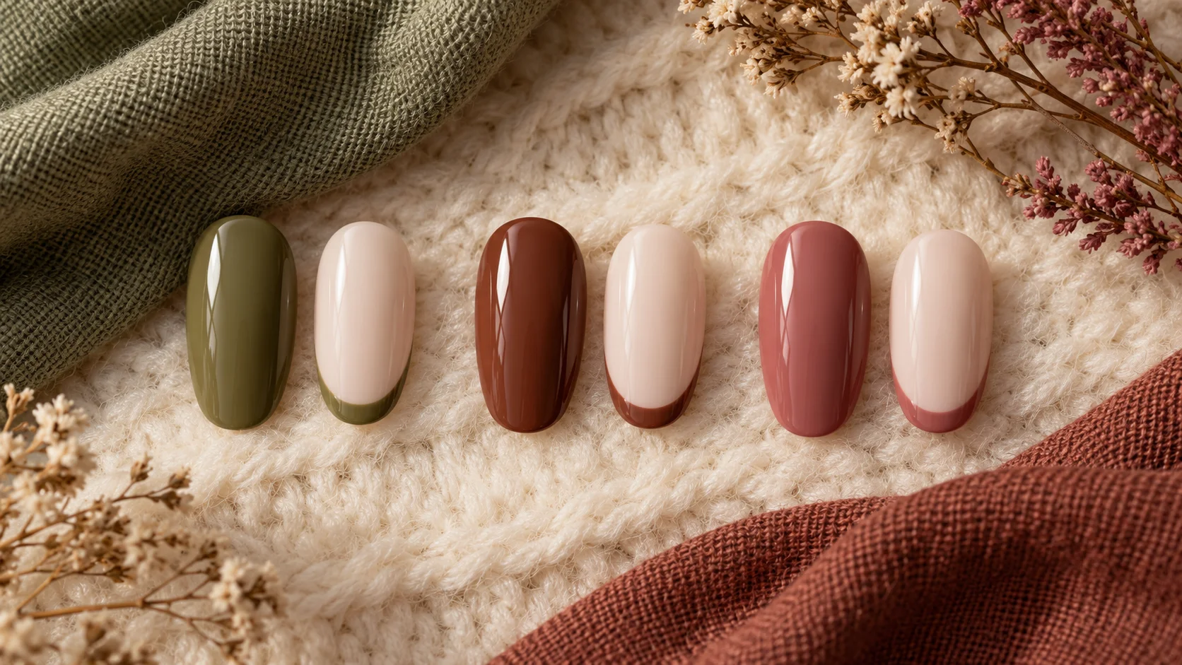
No. They are generic AI-generated samples arranged for editorial inspiration. Manufacturer links support limited descriptions of named products, not a claim that the illustration reproduces them. Inspect real samples where exact colour or coverage matters, and follow the instructions for the system you choose.
Sources and further reading
- OPI UK — Funny Bunny Nail Lacquer — checked 2026-10-23
- Essie US — Mrs. Always Right — checked 2026-10-23
- Essie UK — Caught in the Rain — checked 2026-10-23