Late Summer Nails: Warm Neutrals and Faded Pastels
Explore creamy neutrals, dusty rose and soft blue as a late-summer palette, with faded describing the colour mood rather than damaged polish.
Archive edition: 2026-07-28 · This is an editorial allocation, not the first-publication date.
Key takeaways
- Choose the change you want: depth, warmth, finish or less detail.
- Compare a creamy neutral, dusty rose and soft blue.
- Check the finish rather than relying on the colour name.
- Let one shade lead if you combine colours.
- Use products as directed, with no artificial fading or mixing.
In this guide
- Key takeaways
- Decide what you want to change from high summer
- Creamy neutrals as a starting point
- Dusty rose for a warmer colour presence
- Soft blue without assuming a matte finish
- Use one contrast rather than every transition at once
- Keep the polish itself in proper condition
- Soften the palette deliberately
- Keep what still feels right
- Common questions
- Sources and further reading
Late-summer nails can sit between bright holiday colour and deeper autumn shades without following a strict seasonal boundary. Creamy neutrals, dusty rose and soft blue offer a quieter palette if that is what you feel like wearing. You can keep the lighter mood of summer while changing the amount of contrast or the finish.
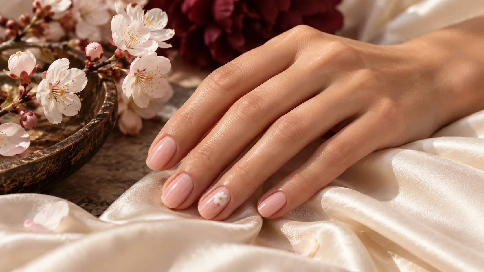
In this guide, faded pastels describes an aesthetic impression: softer, less vivid colours or combinations that feel gently muted. It does not mean using damaged polish, leaving bottles in sunlight or trying to alter a formula. The suggestions are original editorial styling ideas, not a claim about measured trends or a requirement to change colour when the calendar moves on.
Decide what you want to change from high summer
If you have been wearing bright colours, you might want a quieter shade while keeping a familiar shape. If you have preferred pale tints, you may want a little more depth. Make one change at a time in the mood board so you can see what appeals: lower contrast, a warmer colour, a cream finish or a smaller amount of artwork.
You do not need to replace every element of the manicure. The same short rounded shape with a creamy beige can feel different from the same shape in vivid orange. A soft blue with a plain finish can also be a change from a multicoloured design, without moving immediately to dark autumn colours.
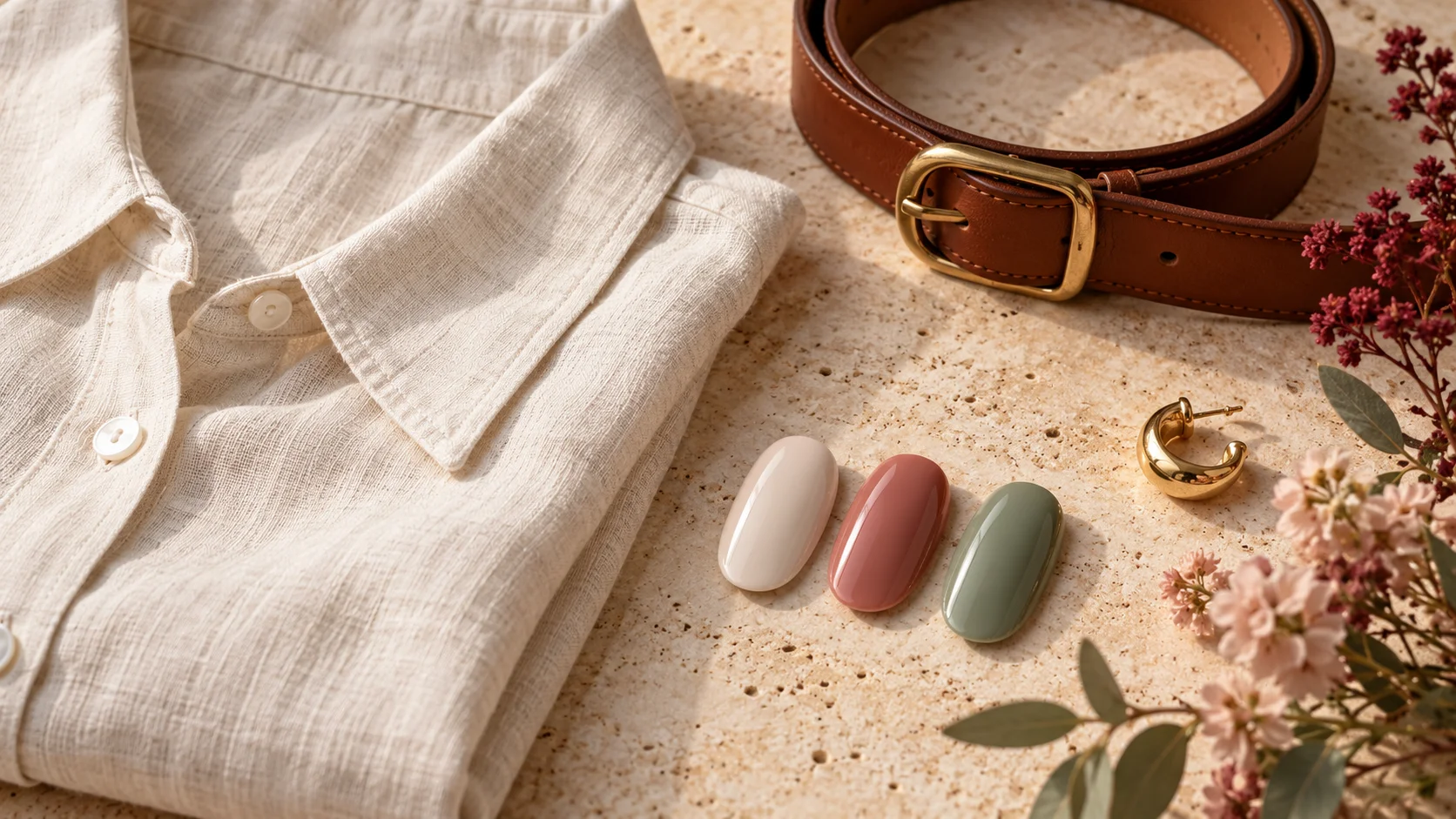
Look at the clothes you are actually wearing now. A linen shirt, denim jacket and lightweight knit may give you a more useful palette reference than an abstract list of seasonal shades. Choose a colour you enjoy with those pieces, not one selected only because it has been labelled transitional.
Creamy neutrals as a starting point
A beige, taupe or another creamy neutral direction can give the manicure a quieter presence. Decide whether you want it close to the tones in the outfit or clearly distinct from them. Neutral is a broad colour category rather than a promise that a shade will disappear against every hand or match every fabric.
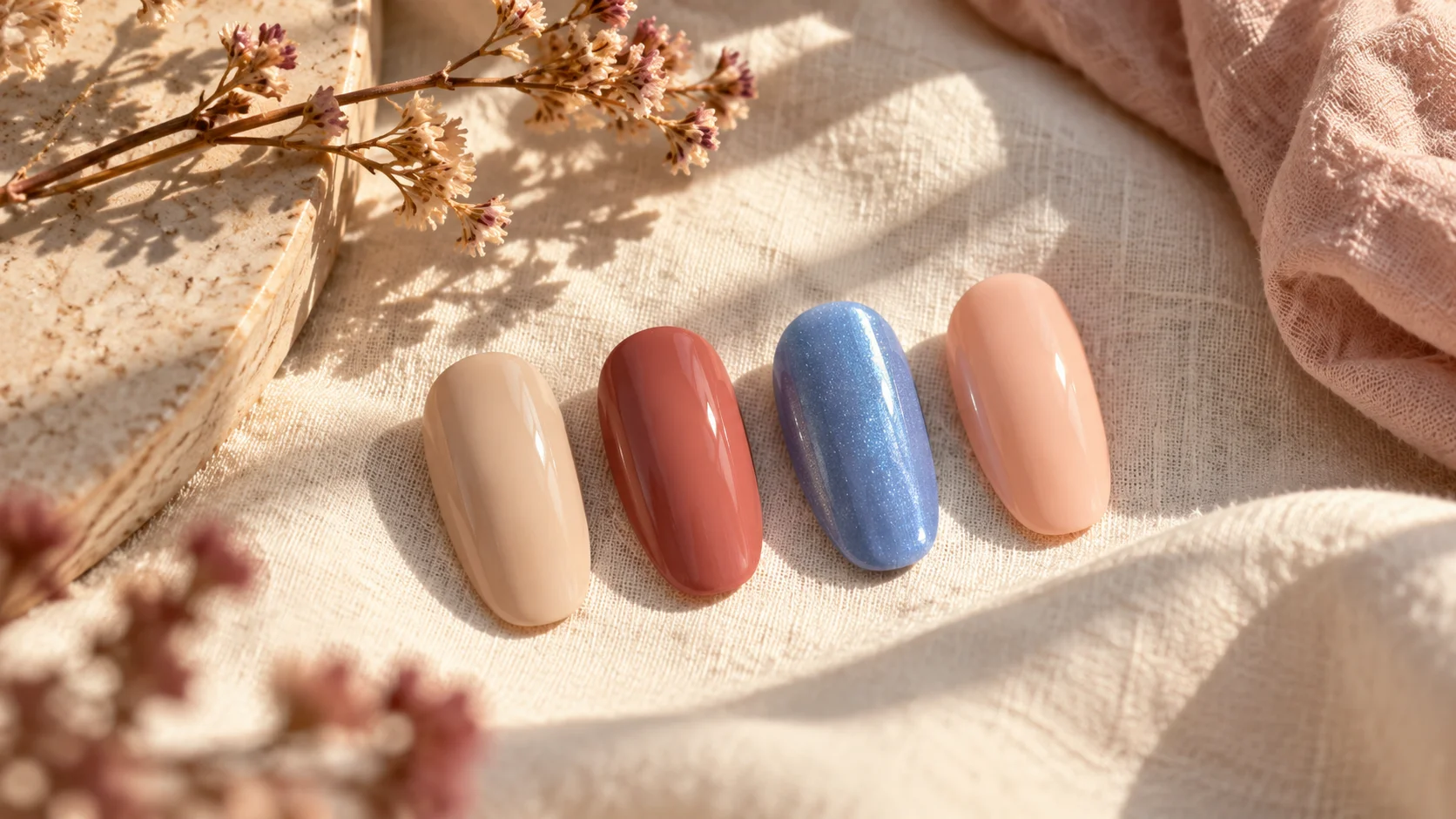
OPI describes Dulce de Leche Nail Lacquer as a creamy nude neutral. That provides one manufacturer reference for the category. It is not a universal skin-tone recommendation, and the generated beige sample accompanying this article is not a verified swatch of the product.
Compare the proposed colour beside both a light and a darker outfit. A shade can feel subtle beside cream and more prominent beside navy, which may be exactly what you want. Decide whether that flexibility appeals to you rather than searching for a colour that has the same visual effect in every setting.
Dusty rose for a warmer colour presence
A muted rose can add more visible colour while staying within a quieter palette. You might pair it with ivory, brown, olive or denim, then decide whether the manicure should be plain or carry a small contrasting detail. These are options to compare, not fixed combinations that every wearer should follow.
Essie describes Mrs. Always Right as a terracotta rose pink. That is a useful example of a warmer rose direction. It does not establish that all dusty pinks have the same depth, opacity or undertone, so be specific when choosing a sample or discussing a salon colour.
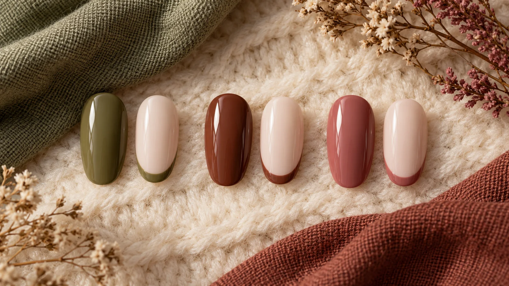
If a rose feels stronger than you expected, try reducing the amount used in the design rather than abandoning the family immediately. A fine tip or one accent nail can introduce the colour beside a lighter background. Alternatively, keeping all nails plain in the same shade may make the overall arrangement feel clearer than mixing several colours.
Soft blue without assuming a matte finish
A pale or softened blue offers a cooler alternative to beige and rose. Consider whether you want a plain cream surface or some shimmer, because those can change the appearance even within a similar colour family. A pastel name does not tell you everything about the finish.
Essie UK describes Bikini So Teeny as cornflower blue with shimmer. It is therefore a colour-and-finish reference rather than a matte pastel example. If you want a flat-looking blue without sparkle, choose a product described and demonstrated accordingly instead of expecting every soft blue to behave alike.
Compare the blue with denim or a cream knit if those are part of your wardrobe. You may like a clear cool accent beside warm accessories, or prefer a closer relationship between the manicure and the clothing. The decision is personal; neither warmth nor coolness automatically determines which shade belongs on your hand.
| Direction | Possible role | What to check |
|---|---|---|
| Creamy neutral | A quieter link between light and dark outfits | Actual depth and contrast on your hand |
| Dusty or terracotta rose | A warmer, more visible colour accent | Whether you prefer plain colour or a smaller detail |
| Soft blue | A cooler alternative to beige and pink | Cream, shimmer or another finish |
| Pale peach or another favourite | A personal variation on the quieter palette | Whether you enjoy it with current clothes |
Use one contrast rather than every transition at once
You can combine a warm neutral with a soft blue, but decide which is the main colour. One accent nail or a narrow line may be enough to establish the relationship. Adding several shades, multiple finishes and detailed artwork at the same time can make it harder to see the simple colour idea you started with.
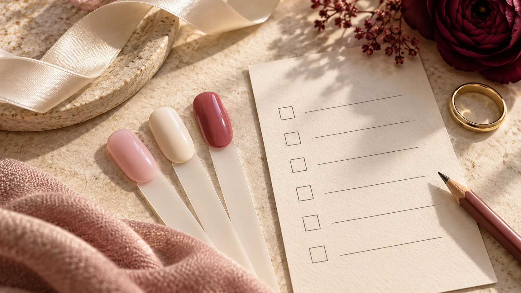
Try a small paper sketch or arrange real sample sticks before applying the full design. Move the accent from one nail to another and compare the balance. You are choosing a composition, not proving a rule about the correct number of colours. A plain single shade remains a complete option.
Keep the polish itself in proper condition
Choose a product that already has the colour and finish you want, and follow its storage and use instructions. Do not deliberately expose a bottle to light or add an improvised ingredient to make it look faded. A visual mood should come from selecting the shade, not from trying to change the chemistry of the product.
If a bottle has changed unexpectedly, consult the manufacturer’s guidance rather than treating the change as a creative effect. The same principle applies when borrowing a colour idea from a photograph: the image can suggest the palette, but it does not tell you how the actual product should be prepared, layered or removed.
Keep what still feels right
You can wear a bright red, a dark shade or a familiar sheer manicure throughout late summer if that is what you enjoy. Seasonal inspiration should expand your options rather than create a deadline for replacing them. Record a new favourite if you find one, but do not assume a whole new collection is needed for a slight change in mood.
Browse Seasonal & Bridal for other palettes and Nail Art & Trends for small design variations. Choose a colour and finish that work with your current wardrobe, keeping the seasonal label as inspiration rather than a rule.
To adapt the plan to related occasions and outfits, compare Nails for a Linen Outfit: Soft Whites, Terracotta and Muted Greens, Early Autumn Nail Colours: Olive, Chestnut and Dusty Rose and Back-to-Routine Nails: Short Shapes and Easy-to-Style Colours. For the underlying care, colour or service choice, see Mocha Nails: Choosing Chocolate, Taupe and Coffee Tones.
Common questions
What does faded pastel mean in this guide?
It describes a softer or less vivid colour mood, not polish that has deteriorated. Choose a product that already has the appearance you want. Do not expose bottles to sunlight or add improvised ingredients to create the effect; follow the manufacturer’s storage and use instructions.
Do I need to stop wearing bright colours in late summer?
No. Seasonal inspiration offers options rather than a deadline for changing your manicure. Keep a bright favourite, a dark shade or a sheer tint if that is what you enjoy. A quieter palette is only useful if it suits your current preferences and clothes.
How can I move from a bright manicure to a softer look?
Change one element first, such as the depth of the colour, the amount of contrast or the number of accents. You can keep a familiar shape and service. Comparing one change at a time helps you identify what you like without replacing the whole design at once.
Are all soft blue polishes matte?
No. Soft blue describes colour, while matte, cream or shimmer describes aspects of finish. The linked Bikini So Teeny page specifically describes shimmer. If you want a non-sparkling effect, inspect a product described and demonstrated accordingly rather than assuming every pastel has the same surface.
Can warm neutrals and cool blue be worn together?
They can be compared as an editorial palette, with one shade leading and the other used as an accent. Decide whether you enjoy the contrast beside your clothes. There is no fixed rule requiring all colours in a manicure to have the same perceived warmth.
Does a creamy neutral suit every skin tone identically?
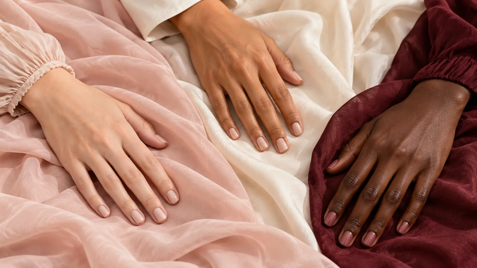
No. Neutral is a broad colour description, not a promise that a shade will look the same or blend in on every hand. Compare actual depth, coverage and contrast on yourself, and choose the relationship you enjoy rather than relying on a universal flattering claim.
Should I buy a complete new collection for late summer?
Not necessarily. One suitable colour or a smaller amount of artwork may provide the change you want. Compare bottles you already own with your current clothes before shopping. Seasonal labels do not create a need for several new products or a different manicure system.
What should I do if a bottle has changed colour unexpectedly?
Check the manufacturer’s guidance rather than treating the change as a useful faded effect or modifying the formula yourself. This article describes an intentional colour palette, not product troubleshooting. Use products according to their instructions and select an appropriate shade to achieve the appearance you want.
Sources and further reading
- OPI — Dulce de Leche Nail Lacquer — checked 2026-10-23
- Essie UK — Bikini So Teeny — checked 2026-10-23
- Essie US — Mrs. Always Right — checked 2026-10-23