Milky Pink Nails: How Sheer Layers Change the Finish
Separate shade from coverage, compare a sheer finish with a cloudy one, and plan layers without chasing a filtered photograph.
Archive edition: 2026-05-06 · This is an editorial allocation, not the first-publication date.
Key takeaways
- Pink describes colour; sheer, milky and opaque describe different expectations about coverage.
- Decide how much of the natural nail you want to see before comparing shades.
- Use the manufacturer’s application directions rather than a universal coat-count rule.
- Compare samples in consistent light and change one variable at a time.
In this guide
- Key takeaways
- Separate colour from coverage
- Choose how much natural detail to keep
- Understand what another layer can and cannot answer
- Assess undertone without turning it into a rule
- Compare the finish, one question at a time
- Distinguish transparency from uneven application
- Use milky pink as a design decision
- Common questions
- Sources and further reading
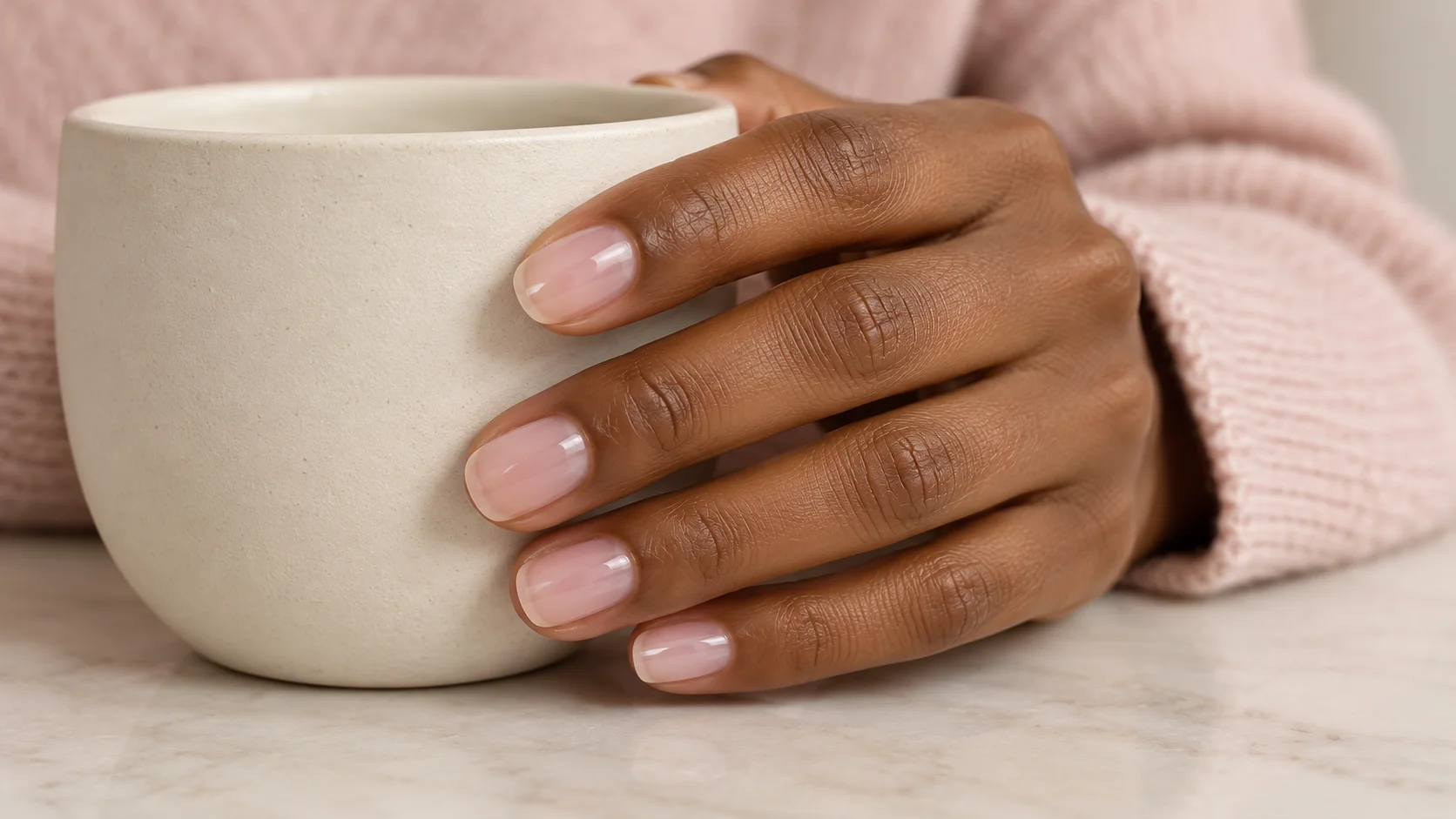
Milky pink nails sit in a useful space between a barely tinted manicure and a solid block of colour. The appeal is often the softened appearance of the nail beneath the polish, rather than a particular shade name. That is also what makes a reference photograph difficult to copy. Two pale pink bottles can produce very different levels of coverage, and the manicure you like may depend as much on its base and lighting as on the colour itself.
This guide helps you describe the result you want, compare ordinary polish options and assess a sample without treating every translucent area as a mistake. The suggestions are an editorial approach to choosing a finish. They are not findings from a product wear test, and the illustration is not a verified swatch of any named brand.
Separate colour from coverage
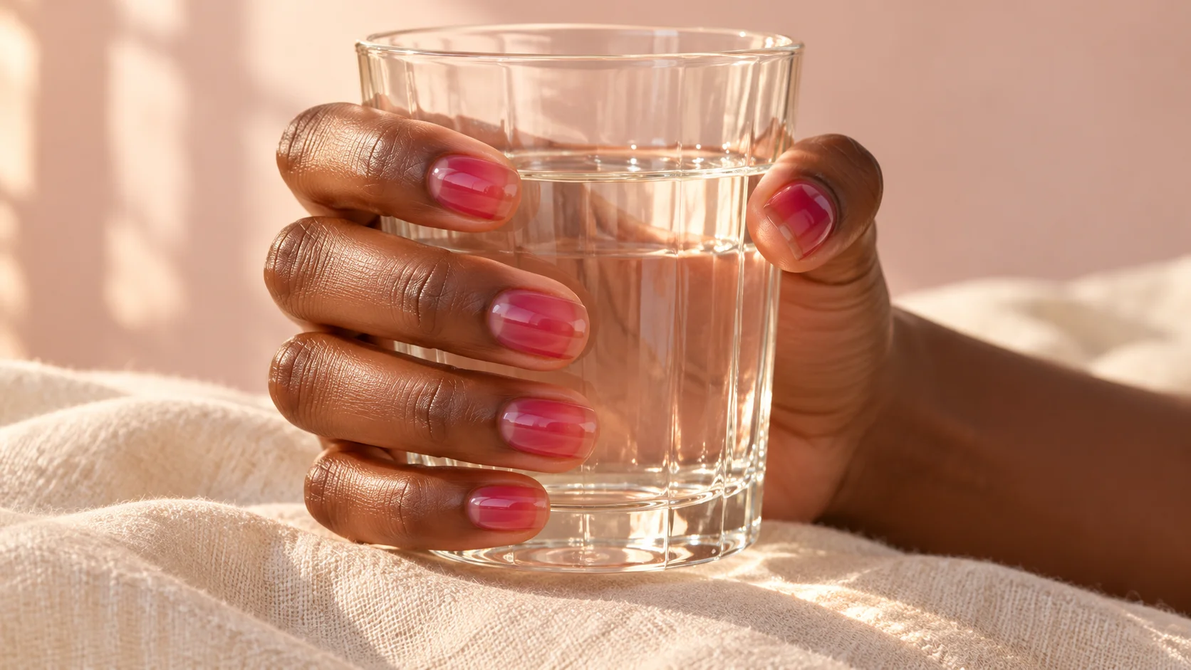
Start with two questions: how pink do you want the manicure to look, and how clearly do you want to see the natural nail underneath? Those are separate decisions. A noticeable rose tint can still be transparent, while a very pale pink can hide most of the nail. Describing both qualities makes a request more precise than asking for the softest or most natural-looking shade.
For this guide, “milky” means a soft, cloudy-looking finish with some visual depth. It is a descriptive styling term, not a standardised formula category. Brands may use sheer, translucent, creamy or other terms differently. Read the description for the actual product and assess its images as examples, without assuming that two similarly named shades will perform in the same way.
As a specific vocabulary example, Essie describes Inside Scoop as a sheer tea-rose pink with a slight blue undertone. That tells you about the brand’s intended colour and coverage; it does not establish how it will look on your nails. We have not tested it, and the US reference page does not confirm a UK stockist or an identical regional formula.
Choose how much natural detail to keep
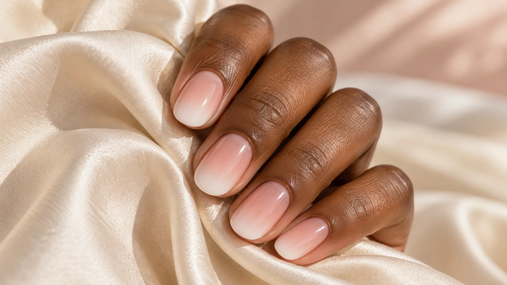
Look at an unpainted nail and identify which features you are happy to see through the finish. You might like a faintly visible free edge but prefer a more even-looking central area. Alternatively, you may want an almost transparent tint that leaves the whole nail recognisable. Neither choice requires a perfectly uniform natural nail surface to be aesthetically valid.
A useful way to brief the result is to choose between three descriptions: tinted and transparent, softly clouded, or mostly covered. The middle option is not automatically achieved by adding one more coat to any sheer product. If the polish is intended to remain very transparent, repeatedly adding it may not give the particular finish in your reference. Choosing a formula described for the desired coverage is more informative than counting layers alone.
| The look you want | What you want to remain visible | What to compare in a sample |
|---|---|---|
| Sheer pink tint | Most natural nail detail | Whether the colour shift is noticeable enough for you |
| Soft milky pink | Some depth and a softened free edge | Whether coverage looks even without becoming solid |
| Mostly opaque pale pink | Little natural colour variation | Whether you still enjoy the colour as a continuous surface |
| A pink base for nail art | Whatever supports the chosen detail | Whether the base competes with the tip, dot or line |
These categories describe appearance rather than quality. A sheer result has not failed because the tip remains visible, and an opaque result is not inherently less refined. The right comparison is between the sample and your own design brief.
Understand what another layer can and cannot answer
Think of a second sample as a controlled comparison. Keep the polish, lighting and background the same, and change only the application variable permitted by the product instructions. Then ask whether the result is closer to the coverage you wanted. If the change mostly deepens the colour while the feature you hoped to soften remains obvious, you have learned something useful about that option.
Do not turn a general layering idea into a rule for every product. OPI’s Bubble Bath Nail Lacquer instructions specify its base coat, two thin colour coats and top coat. Essie’s Inside Scoop page gives a different routine, including no base coat and no UV lamp. These are product-specific directions, not interchangeable instructions. Always check the packaging and current guidance for the version you own.
There is also a practical stopping point. If you keep adding polish only because a photograph looks more opaque, step back and reconsider the starting product. A different coverage description may be the better choice next time. You do not need to finish a bottle, buy several colours or keep painting today to justify changing your mind about the finish.
Assess undertone without turning it into a rule
Compare your sample with something familiar: an ivory sleeve, a cool grey fabric or your usual jewellery. This is a personal styling exercise, not a test that assigns you a compulsory colour family. You might prefer a rosy contrast against your skin, a warmer beige-pink, or a pale shade that looks deliberately distinct. “Matches my skin” is only one possible goal.
When looking at online images, pay attention to what else appears in the frame. A white background that looks strongly yellow or blue suggests that the photograph may not be a neutral colour reference. A screen can still help you compare broad directions, but it is a poor basis for insisting on an exact match. Save a note about the quality you like, such as warmth or transparency, alongside the image.
Compare the finish, one question at a time
- Colour.
Would you prefer more rose, beige or cool pink? - Coverage.
Should the natural free edge stay clear, soften or disappear? - Surface.
Do you want a plain glossy finish or a separate decorative effect?
Keep the other two choices steady while adjusting one. This avoids buying a different product for a problem that is really about the design brief.
Distinguish transparency from uneven application
Before deciding that a sample is streaky, consider where the variation appears. A visible natural free edge under an otherwise consistent sheer layer is different from a darker strip or an obvious gap in the polish. Naming the issue helps you decide whether to accept the transparency, review your application or choose a different level of coverage.
For ordinary polish, follow the stated preparation and drying directions, and avoid repeatedly revisiting an area simply because it looks different while wet. Do not import curing times from a gel tutorial into an air-drying polish routine. If the label is unclear, ask the manufacturer rather than inventing a timing rule. “Gel-like” wording on a finish is not, by itself, an instruction to use a lamp.
Do not use coverage to judge nail health. The American Academy of Dermatology recommends professional assessment for nails that change, swell or hurt. A pleasing sheer manicure cannot tell you whether an unexplained change is harmless.
Use milky pink as a design decision
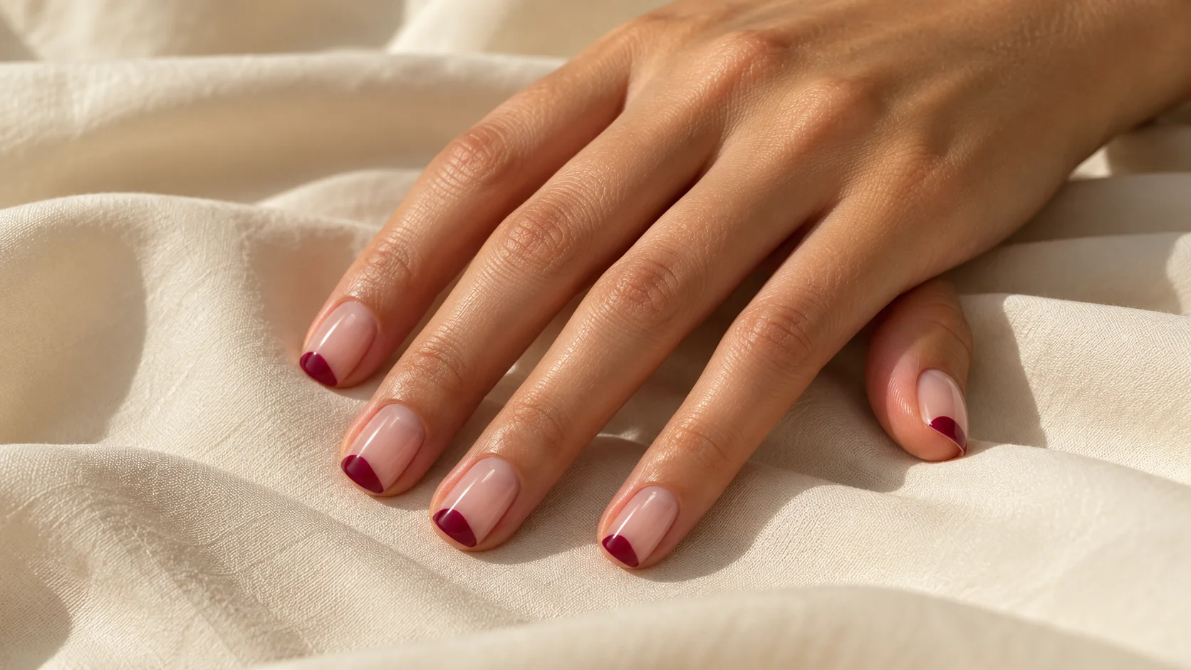
A plain milky pink set can stand on its own. If you want to add something, choose one detail with a clear purpose: a narrow contrasting tip, a small dot on one nail or a fine curved line. Consider whether that addition still leaves enough quiet space for the cloudy finish to be the main feature. There is no obligation to add art simply because the base looks understated.
For a salon appointment, describe the coverage before naming a reference shade: “I want a softly clouded pink with the natural tip still faintly visible.” Explain whether you want ordinary polish or another service, and ask to see the proposed colour in a sample where possible. That conversation is more specific than asking for the exact manicure in an edited image.
Keep a record of the product, the labelled application routine and what you liked about the result. If your next manicure needs a change, make it a deliberate one: warmer colour, less coverage or a quieter decoration. You can explore other approaches in the Nail Art & Trends edit while keeping those personal preferences as your starting point.
For the related design decisions, compare Jelly Nails Explained: Sheer Colour, Gloss and Layering, Pearl and Glazed-Look Nails: Choosing a Softer Shine and French Ombré Nails: How the Fade Differs from a Classic French. For the practical details, use OPI Bubble Bath vs Funny Bunny: Colour, Coverage and Finish.
Common questions
Are milky pink nails the same as sheer pink nails?
The descriptions overlap, but they do not guarantee identical coverage. In this guide, sheer leaves clear natural detail, while milky describes a more clouded appearance. Read the actual product description and decide how much of your natural nail you want visible.
How many coats make a pink polish look milky?
There is no reliable universal number. Follow the instructions for the particular product and judge whether its intended coverage fits your brief. If a very sheer option remains too transparent, a different formula may be more appropriate than repeatedly adding layers.
Should I still see the natural white tip?
That depends on the result you want. A faintly visible free edge can be part of a translucent manicure. If you prefer it hidden, describe that preference before choosing a polish; do not assume that all soft pink shades are designed for full coverage.
Why does the pink look different from the online picture?
The image may use a different base, number of layers, nail surface, background or lighting. Your screen is another part of the comparison. Use photographs to identify a general direction, then assess a relevant sample rather than expecting an exact colour match.
Is a darker strip always a sign that the polish is too sheer?
Not necessarily. Transparency and uneven distribution are different observations. First identify whether you are seeing natural detail beneath an otherwise consistent layer or an obvious gap or strip in the polish. That distinction helps you choose between changing coverage and reviewing application.
Do I need a base coat under every pink polish?
Check the specific product directions. Different systems give different routines, including some that specify a base coat and some that do not. A general pink-manicure guide should not override the manufacturer instructions for the bottle and range you actually have.
Does gel-like wording mean I need a lamp?
The wording alone does not tell you to use one. Read the product type and instructions, and ask the manufacturer if they are unclear. Do not borrow curing times from another range simply because both products describe a glossy or gel-like finish.
What is a clear way to request this look?
Describe both colour and coverage, for example a softly clouded rosy pink with the natural tip still faintly visible. Add your preferred length and service type. This gives a professional more useful information than a shade name or a filtered photograph alone.
Sources and further reading
- Essie — Inside Scoop — checked 2026-10-21
- OPI — Bubble Bath Nail Lacquer — checked 2026-10-21
- American Academy of Dermatology — Healthy nail tips — checked 2026-10-21