French Press-On Nails: Finding a Natural-Looking Tip and Base
Compare base shade, opacity, white-tip depth and fit to find the French press-on effect you prefer.
Archive edition: 2026-07-07 · This is an editorial allocation, not the first-publication date.
Key takeaways
- Base: choose the shade and coverage you prefer.
- Band: compare contrast, depth and boundary shape.
- Outline: check the actual length and silhouette.
- Fit: confirm the design sits correctly without force.
In this guide
- Key takeaways
- Define the level of contrast you want
- Compare base shade and coverage separately
- Judge the tip band in relation to the whole nail
- Use named examples to understand the range of styles
- Let fit determine where the design sits
- Be cautious about buying a design to file down
- Check the complete routine before an event
- Base, band, outline, fit
- Common questions
- Sources and further reading
A natural-looking French press-on manicure usually comes down to the relationship between the base, the contrasting tip and the fit. Decide what natural-looking means to you: a barely noticeable finish, a softly defined white edge or a polished version of a classic French design. There is no single pink shade or tip width that suits everyone’s preference.
Start with the proportions you enjoy, then compare the actual product rather than a heavily enlarged inspiration photograph. This is a styling and selection guide. It does not rank skin tones, promise an invisible fit or report a hands-on test of the example sets.
Define the level of contrast you want
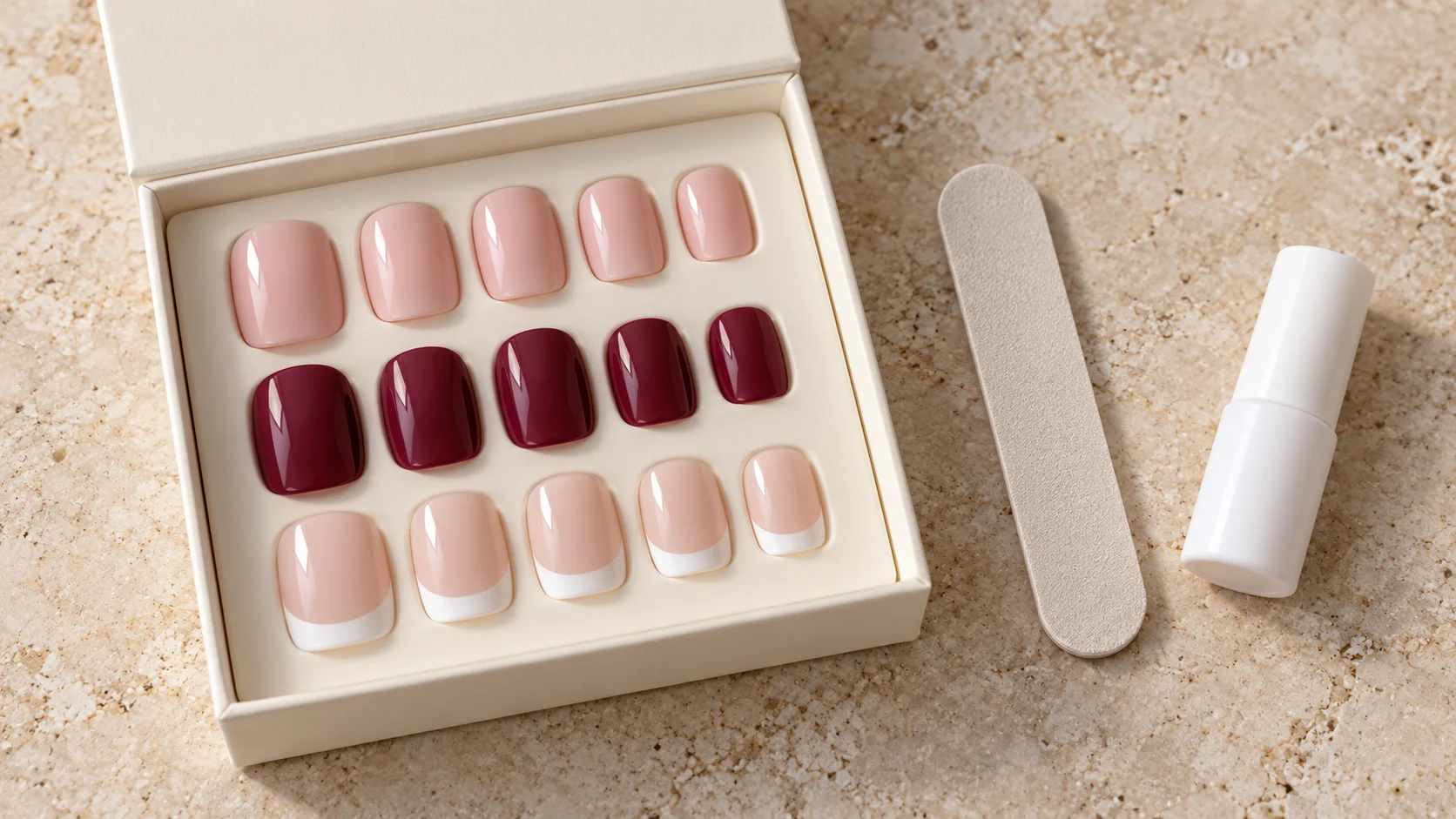
A crisp white tip against a translucent base creates a clear boundary. A softer ivory edge against a similar-toned base can look quieter. Neither is more correct: the difference is how strongly you want the design to read at normal hand distance.
Try describing your preference in one sentence before browsing. For example, you might want a short rounded nail with a narrow ivory band, or a medium oval with a more obvious white edge. That description helps you avoid buying a familiar French label whose proportions are different from your intention.
Look at the complete hand as well as close-ups. A tiny detail that appears dominant in a macro photograph may be subtle when the hand is relaxed. Conversely, a deep white band can remain visually prominent even on a compact set.
Compare base shade and coverage separately
Base colour and opacity are different features. A rose-toned base can be translucent or opaque; a beige-looking base can also vary in coverage. Read the description and inspect several product images before assuming the shade will conceal or reveal the natural nail underneath.
A label such as nude is not a universal match. Treat it as the seller’s colour description, then decide whether you prefer harmony with your own colouring or a deliberate contrast. You do not need an exact skin match for a French design to look considered.
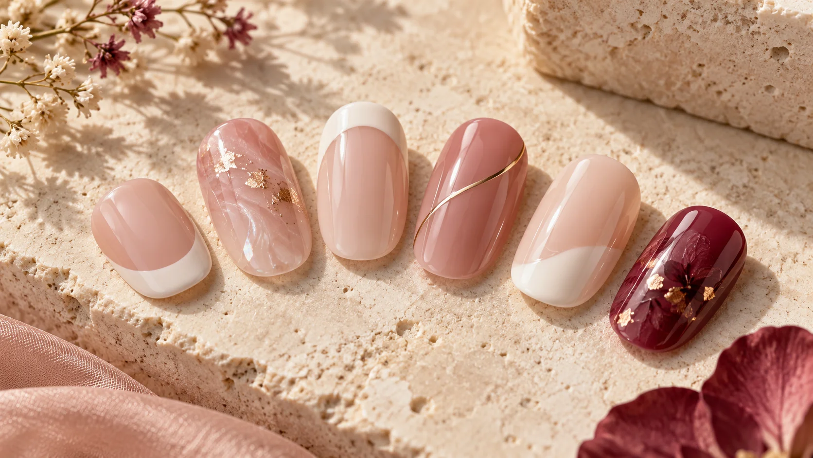
Lighting, editing and your screen can change the apparent warmth and transparency. Where the colour decision matters a great deal, ask about a sample or additional photographs. Generated inspiration images are useful for discussing a direction, but they cannot verify a commercial shade.
Judge the tip band in relation to the whole nail
The depth of the white or ivory section changes the visual balance. A narrow band leaves more of the base visible, while a deeper band makes the tip a stronger feature. Compare that relationship across the thumb and the smaller nails in the actual set.
The curve of the boundary matters too. Some French designs have a more pronounced curved line; others use a flatter or angled edge. Choose the line you enjoy rather than assuming that every traditional French set uses the same shape.
If your natural free edge may show through a sheer base, consider where the printed band would sit when the tip is fitted correctly. Do not move the artificial nail away from its intended position simply to align the decoration. Ask about a different base coverage or design instead.
| Detail | Quieter direction | More defined direction |
|---|---|---|
| Tip colour | Soft ivory or a lower-contrast edge | Crisp, brighter white |
| Band depth | A narrow line with more base visible | A deeper contrasting tip |
| Base coverage | A translucent effect, if preferred | A more opaque, uniform surface |
| Length | A compact outline close to your usual length | A longer visible extension |
| Decoration | A plain base and tip | Added shimmer, a line or a small accent |
Use named examples to understand the range of styles
OPI UK’s French Press is described as a short, rounded French-tip set. That is one specific interpretation of French styling, rather than a definition that all French press-ons are short or round.
For a different manufacturer-described outline, KISS Leilani is listed as a medium coffin French Nude style. These examples show why the French label alone does not tell you the length, silhouette or base colour. Check the exact regional listing before buying.
The examples are not a best-product ranking. We have not compared their fit, opacity in person or wear performance. Use them as references for the details to investigate, then shortlist a product according to the combination you want.
Let fit determine where the design sits
Dry-fit the tips according to the manufacturer’s instructions before using adhesive. The base should not be forced into a position solely because the white line looks attractive there. The fitting shape and the printed design need to work together.
Olive & June’s sizing advice emphasises avoiding force and notes that different styles have different curves. A promising-looking French set can therefore still be the wrong physical fit for a particular nail.
Check all ten fingers rather than deciding from the thumb alone. If a required size is missing or uncomfortable, ask about another range. A narrow-looking painted tip does not compensate for an artificial nail that overlaps surrounding skin.
Be cautious about buying a design to file down
Shortening a French tip can remove part or all of the contrasting band. It may also change the relationship between the white section and the curved boundary. Before planning that alteration, ask whether the manufacturer supports it and whether the design will remain intact.
A set already close to your desired length can make the visual result easier to predict. Do not assume that a long French design becomes an identical short version simply by removing material from the end. The proportions were created for its original shape.
Likewise, changing the side outline can affect a printed border. If an exact micro-French line is the feature you want, compare a purpose-made design rather than relying on a substantial home alteration.
Check the complete routine before an event
A natural-looking finish still needs the correct adhesive, application and removal process. Read what the kit includes and what must be obtained separately. The calm appearance of a pale French set does not change the handling requirements of its glue or tabs.
If you are choosing the set for an event, allow time to check sizes and understand the process beforehand. A last-minute first application can leave little room to resolve a missing size or an unexpectedly long tip. Keep the removal directions with the set so the plan extends beyond the photographs.
Choose your final shortlist in ordinary terms: base shade, coverage, tip depth, outline and length. Once those details and the fit information are clear, you can compare the visual effect without chasing a claim that one product is universally the most natural.
Base, band, outline, fit
- Base: choose the shade and coverage you prefer.
- Band: compare contrast, depth and boundary shape.
- Outline: check the actual length and silhouette.
- Fit: confirm the design sits correctly without force.
Save one clear reference image and a sentence describing the proportions you want. Use the Press-On Nails section to check practical sizing and removal questions before attaching the chosen set.
To complete the fit, wear and removal plan, read How to Measure Your Nails Before Buying a Press-On Set, Press-On Nail Lengths: Comparing Short, Medium and Long Sets and OPI xPRESS/ON: How to Compare Shapes, Colours and Kit Contents. For the related care, tool or design decision, see Micro French Nails: Choosing Tip Width, Shape and Colour.
Common questions
What makes a French press-on look natural?
Natural-looking is a personal visual preference rather than a fixed standard. Compare the base shade and opacity, the contrast and depth of the tip band, and the finished outline. Fit also matters because the design needs to sit in the product’s intended position without force.
Is nude one universal colour match?
No. Treat nude as the seller’s description and inspect the actual base shade. You may prefer a close harmony with your colouring or a deliberate contrast. There is no requirement to find an exact skin match for a French design to look considered or appealing.
Should I choose a narrow or deep white tip?
A narrow band leaves more of the base visible, while a deeper band makes the tip a more prominent feature. Compare the effect on the actual smaller nails as well as the thumb. Choose the proportion you enjoy rather than a rule about what your hands should wear.
Will a sheer base hide my natural free edge?
Do not assume that it will. Coverage and the position of the printed tip vary by product. Ask about opacity or inspect suitable product images if this detail matters. Do not reposition an ill-fitting artificial nail just to conceal a line underneath the design.
Are all French press-ons short and round?
No. French describes a design direction, while length and shape are separate features. Manufacturers offer different interpretations, including longer and differently shaped sets. Read the exact listing and dimensions rather than assuming the familiar design name tells you how the product will fit or look.
Can I file a long French set into a micro-French?
Do not assume that shortening preserves the printed band or its proportions. Check whether the manufacturer supports alteration of that exact design. A set made close to your preferred length and band depth may be easier to assess than one needing a substantial change.
Are generated inspiration images accurate product swatches?
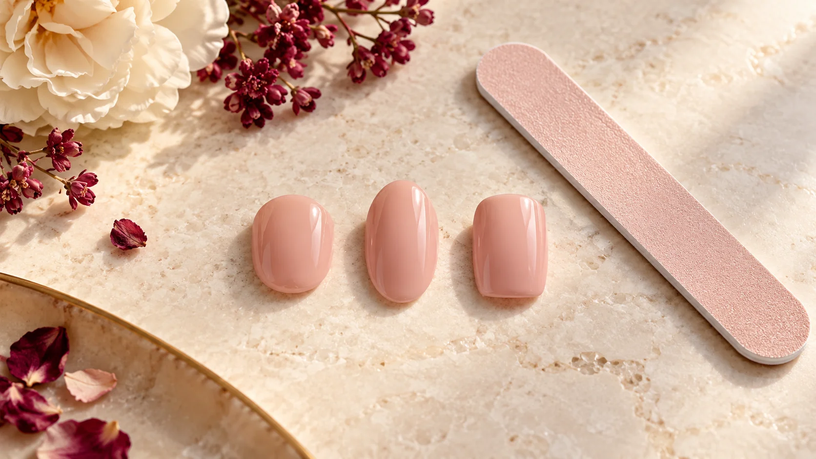
No. They can help describe a visual direction, but they do not verify a commercial shade, material or opacity. Use the actual product listing and suitable samples where available when colour accuracy matters. This article’s illustration is not a photograph of a tested brand set.
How early should I check a set before an event?
Allow enough time to identify the correct sizes and understand the supplied application and removal directions before the event. There is no universal timing that suits every system. The useful aim is to avoid discovering a missing size or unsuitable length during a rushed first application.
Sources and further reading
- OPI UK — French Press — checked 2026-10-22
- KISS — Leilani French Nude — checked 2026-10-22
- Olive & June — Choosing fit — checked 2026-10-22